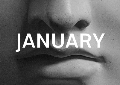
First month? Down! You can watch all the Poster Design that I realized for the Month of January from the last to the first one. There are 31 posters , and I think no one looks the same from one poster to another. Some are typography-based, others are pictural, made with Photoshop and Illustrator, or both. Except one or two, they all use the same picture of Apollo’s statue because it’s a rule I defined in my manifesto for this Poster a day Design Challenge titled Apollo 365°.
What I Learned (Again)
- Decision making
- Discipline
- Organisation
- Classification
- Naming
- Record-keeping
- Documentation
- Consistency
- Take your time
- Things take time
1. I learned to make and take quick decisions — again.
2 – 7. They increasingly depend on the number 8, which is consistency.
Discipline in organizing my files, classifying them, naming them, keeping records, and documenting everything relies on consistency. I noticed that consistency is the foundation. If I don’t do something today, it must get done the next day, which means falling behind. This slows down the next project and disrupts my focus. Whatever the task, finish it to start the next day with a clear mind, even if it means losing some sleep.
9. There are many daily tasks. Regular personal time is challenging, especially when balancing family, updating skills, and learning new things, including sports and casual activities. I haven’t found a perfect solution except to optimize every second of my day, from toilets to showers to sleep, and manage all the minor details of daily life more efficiently.
10. Things take time. This might seem obvious, but before starting Apollo 365° — A Poster a Day Design Challenge — I thought I could continue doing what I did last year and handle this project without much additional time. I was completely wrong! Creating a poster can take 5 minutes to several hours. Once I started the project, I realized there was no turning back without compromising my ego. I don’t want to give up!
Best Posters of January
The Minimalist
Day 1
Full of motivation, I tackled the first design late in the day. I opened Photoshop and quickly decided to present Apollo’s picture and the chosen font in a streamlined version.
After finishing the design, I used Premiere Pro CC for the first time to compress the video. The panel and options were confusing, and despite watching tutorials, I ended up using Quicktime Player for simplicity. After struggling with video editing, I faced challenges animating my logo and presenting the poster.
Goodbye 2018
Day 2
For the second poster, I reflected on leaving 2018 behind. Video editing issues persisted, with quality and conversion times needing to be improved. I illustrated the transition from 2018 to 2019 in this design.
Sleepless Night
Day 3
Video editing continued to be a major challenge. I worked into the night, and this poster was the third I finished after midnight. The poor video quality and slow computer due to screen capture and video compression made every action in Photoshop take forever.
For this poster, I wanted to illustrate my feeling of tiredness and my scattered attention.
World Braille Day
Day 4
I discovered that it was World Braille Day and decided to use the Braille system instead of text to illustrate the poster. This generated many circle shapes surrounded by colorful circles. The result was satisfying, and I remember sleeping happily that day. Take a closer look at Apollo’s eye! If you’re curious about how I made this poster, check the World Braille Day Speed Art Poster Video on YouTube.
Galileo Galilei
Day 7
I recalled a tutorial about creating a starry sky with Photoshop. It took me around 20 minutes to find a way to make it, which wasted time. I should have found the tutorial to save time, but I didn’t because I made Speed Art Videos of my screen while working. Ego again…
120% Vector
Day 12
This poster was made entirely with vector elements. I illustrated Apollo’s face cutely, avoiding using a picture. Take a look at the Speed Art Videos to see how I created this poster.
Primary
Day 19
This poster is one of the most appreciated I made in January, according to Pinterest. Its simplicity in terms of color and form made it popular. Check out the Primary Poster Speed Art Video on YouTube to see how I created this poster.
High Five
Day 30
Sometimes, a burst of creativity surprises you. The High Five poster was one such instance. It is playful, simple, fun, and visually appealing, with bright colors and fresh ideas. Take a look at the High Five Poster Speed Art Video on YouTube to experience the fun I had designing this poster.
Conclusion
January was an awesome month of new experiences and design experimentation. I’m so glad I took on creating a daily poster for a year. It has brought me many positive things, like self-confidence and new ideas. See you next month!

