Attraction Poster #115
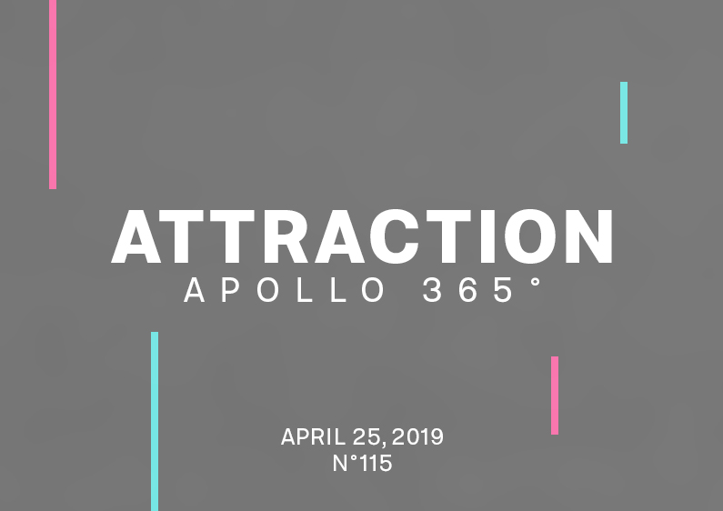
Poster #115 is an odd creation of geometric forms and two blurry pink and aqua-blue shapes. The design Today has probably been the shortest poster design I’ve ever made. There was just no time to create and think about it! It was frustrating. I took on my sleeping time more than usual, and that’s not […]
Proximity Poster #114
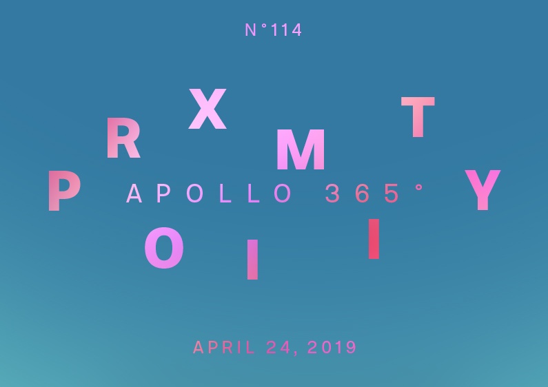
The poster #114 is an abstract yet geometric and colorful form that looks fresh. The design I drew an imperfect rectangle with different colors using the brush tool to create this poster. I then used the options Edit, Transform, and Deformation to manipulate the shape until I got a satisfying result. I previously duplicated the […]
Heptagon Poster #113
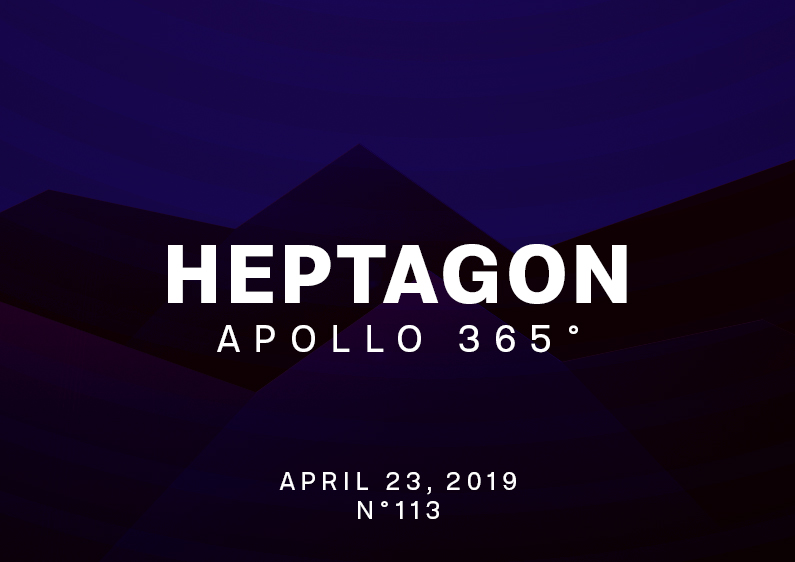
Poster #113 is a lighting effects experimentation and geometric-based design made as a landscape. The design The design is relatively simple. The hard part of the poster was finding the idea and the ideal blend mode to apply on the correct layer. If you follow my poster design challenge, space and the universe have attracted […]
Speed Ice Poster #112
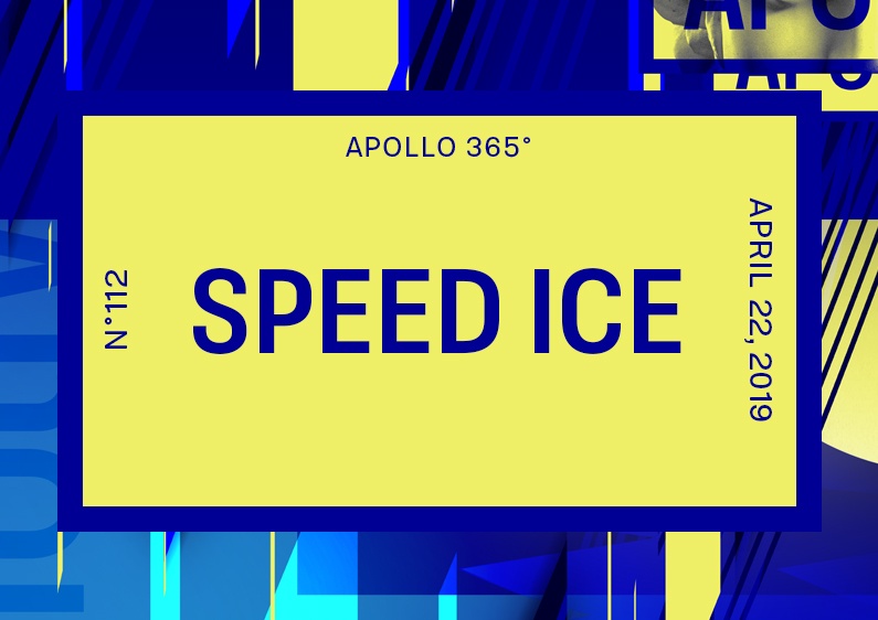
I wanted to break the mini-series “Design Without a Cause” because using the same layout and elements was too easy. The design It was hard to come up with something good today! I tried many different things because I was trying to find my true self in my design practice, but on the other hand, […]
Design Without a Cause #3 Poster #111
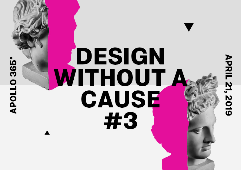
The poster #111 is the third design of a minimalist mini-series made for the creative challenge Apollo 365°. The design I made a few changes to this poster layout compared to the two precedents. I placed the light grey background horizontally, replaced geometric forms with triangles, and used pink colors to hide a part of […]
Design Without a Cause #2 Poster #110
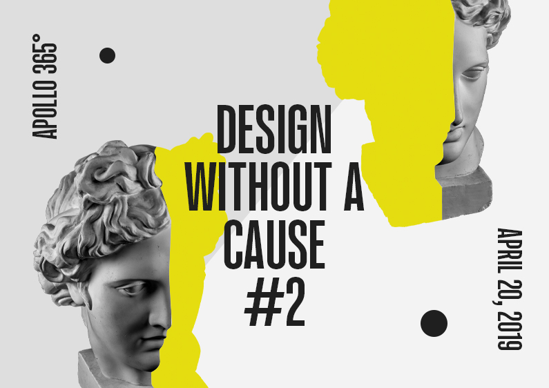
The poster #110 is the second design of a minimalist series made for the creative challenge Apollo 365°. The design For the first time in the Apollo Project, I created a mini-series of posters because I liked how I did the first poster, “Design Without a Cause.” As previously stated, the poster is minimalist and […]
Design Without a Cause Poster #109
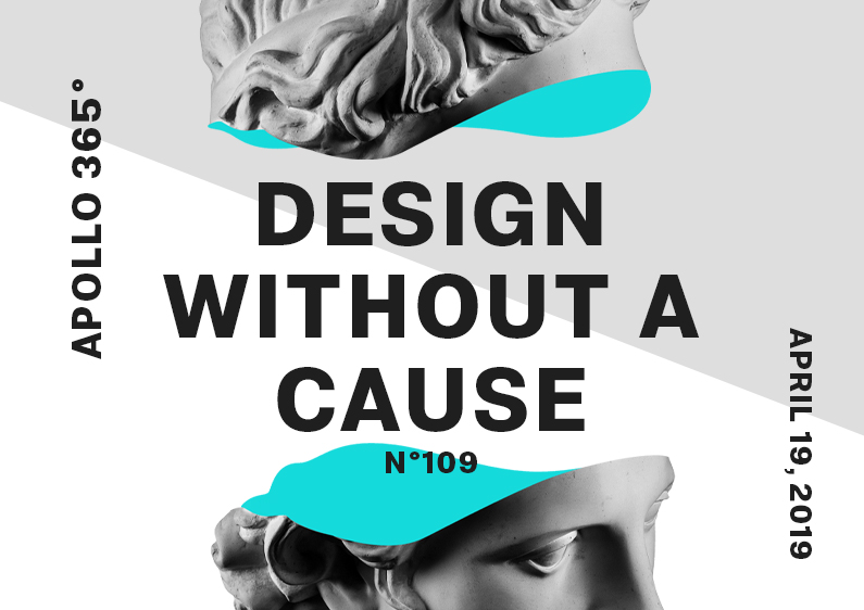
Poster #109 is a minimalist design in aqua blue, dark grey, light grey, and white. The design To realize poster #109, I used a short sentence inspired by an old movie title that I changed to “Design Without a Cause.” These words perfectly reflect the Apollo 365° Challenge and helped me to use letters. I […]
Forfeited Pieces Poster #108
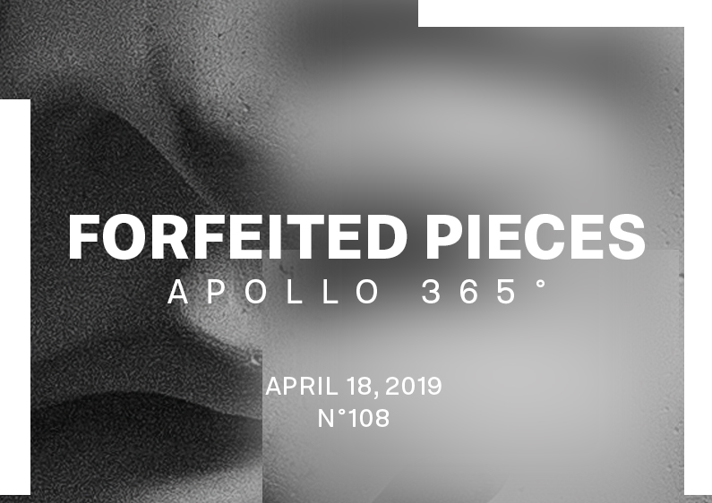
Forfeited Pieces is a black & white and shade of grey poster design #108 made with geometrical forms. The design For this poster, I was about to create another Liquify background—that’s something I already did. It was too easy, and I quickly removed it. I noticed now that it was the only color I was […]
Scorch Poster #107
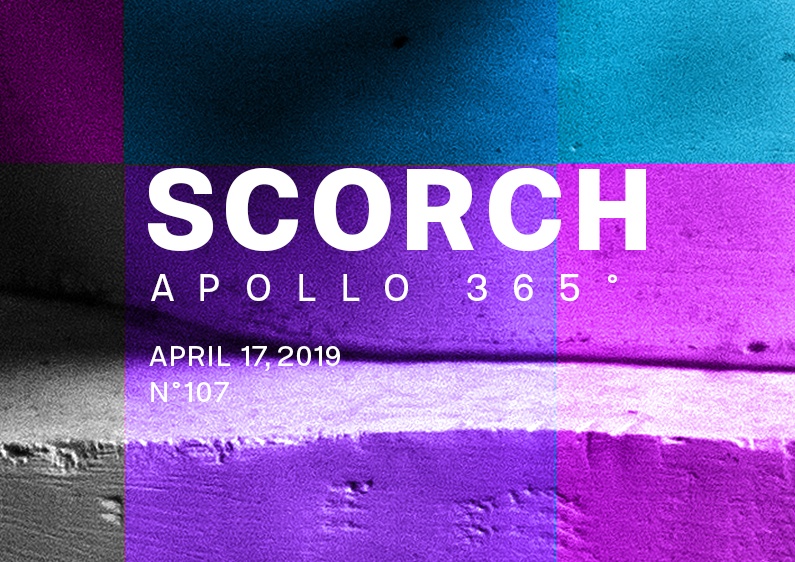
Another weird and odd poster design made in total improvisation! The design I started to set a mint green background and create a circle in the center with the same colors. It wasn’t good! But I continued to use this color and added a gradient that I desaturated and applied a blend mode on its […]
Disparate Poster #106
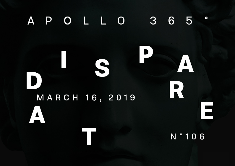
The poster #106 is a minimalist and dark design with colorful and bright geometric shapes. The design I am sketching to generate more ideas and feel more confident about my design. Sketching is magic! It takes a little time to make, but it frees your mind and inspires me when I look at it three […]