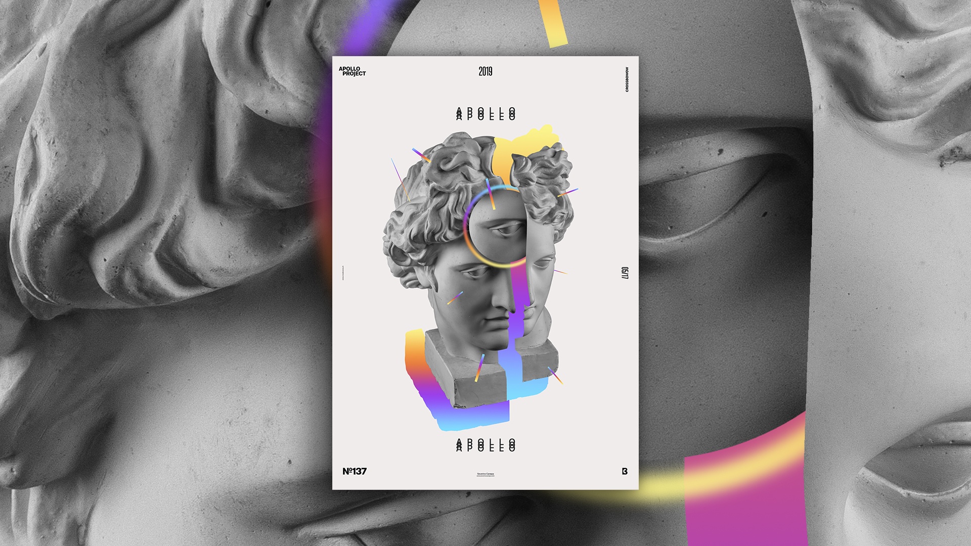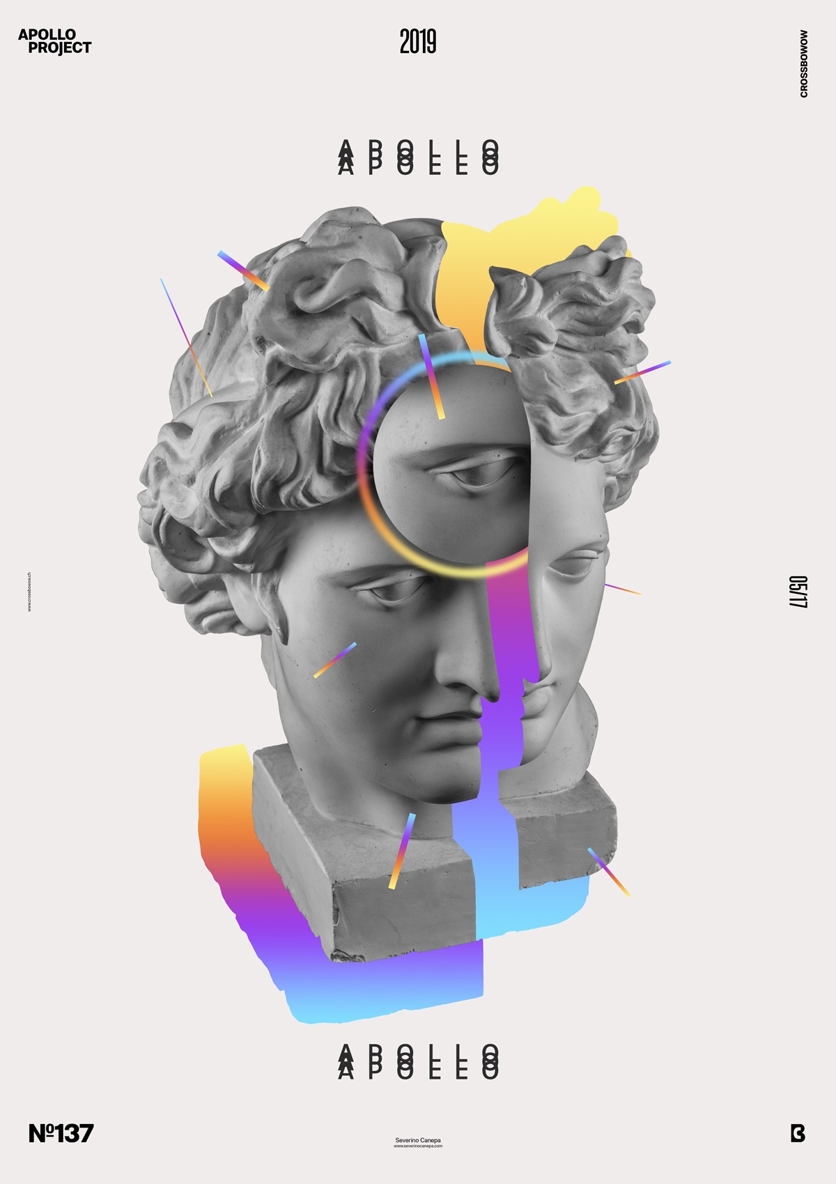
Welcome to the third Poster made for the Mini-Series titled Up-Gradient, which is a colorful gradient explosion.
The design

There is not a lot to say about Up-Gradient #3. I use the same elements that I used to create Up-Gradient #1. A warm light grey is a background without shade, and there are slices of Apollo’s head with a colorful gradient between them and smaller duplicate pieces of Apollo.
On the last poster, I made many lines filled with a gradient that I dispersed everywhere. I liked the result so much that I did the same on this one with fewer lines. It looks minimalist if you compare its design to the two first posters. It is cleaner and more sensitive to the shapes.
Speed Art Poster #137
Here we are again with the speed art video #137. You will watch me working on the poster and know how I did it. See you tomorrow for the poster #138!

