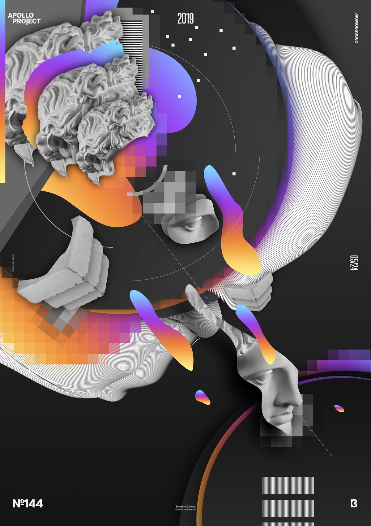
Poster Up-Gradient number 10. I think I will end the mini-series soon, but I will do only one more because too much is too much, and I feel I am starting to get bored with them.
The design
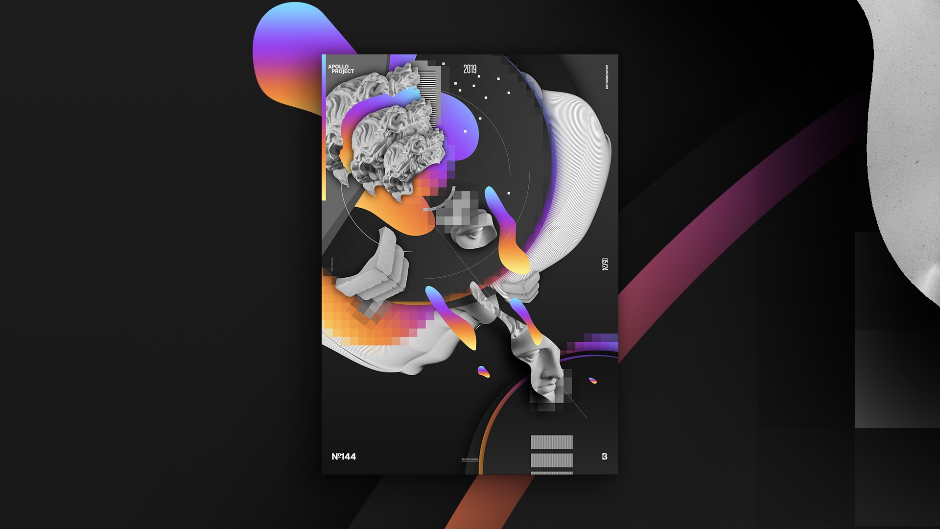
Dark colors contrast with colorful gradients. I used the same receipt and elements to create Up-Gradient #10. As previously stated in another post, I use the Statue of Apollo almost on every creation. I used many duplications of Apollo to make this poster, including its hair, eyes, and pedestal. I also repeat the circles and the Pixelate effect, creating a visual unity in the canvas.

As you notice on the canvas, the direction of the viewer’s eyes goes from top left to bottom right because of the focus points. Some elements are between the two big circles, on the top and the bottom, which makes a smooth transition. These elements look more organic and bring a sense of attraction to the bottom.
Speed Art Poster #143
The end of the poster mini-series will end tomorrow with the number 12. I already invite you to take a look.
For now, you can watch me working on Up-Gradient 10!
Have a nice day, and see you tomorrow!

