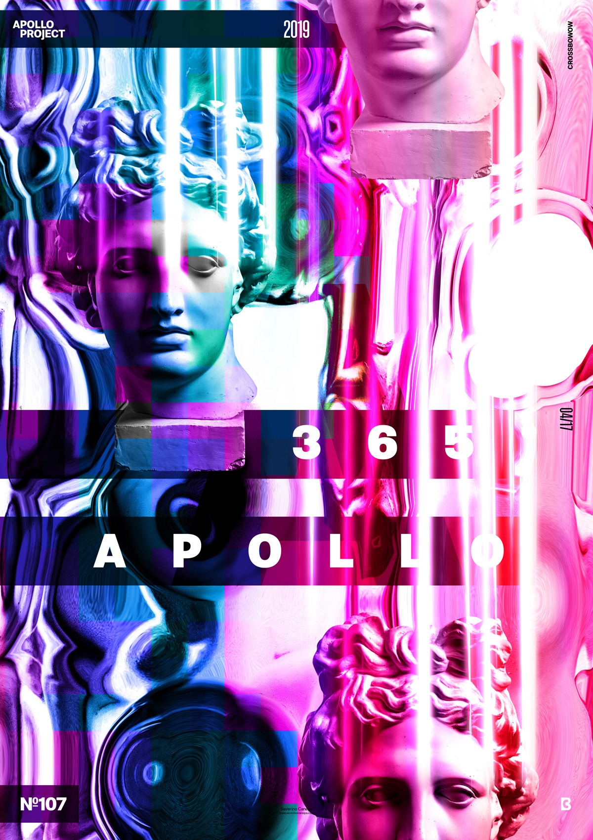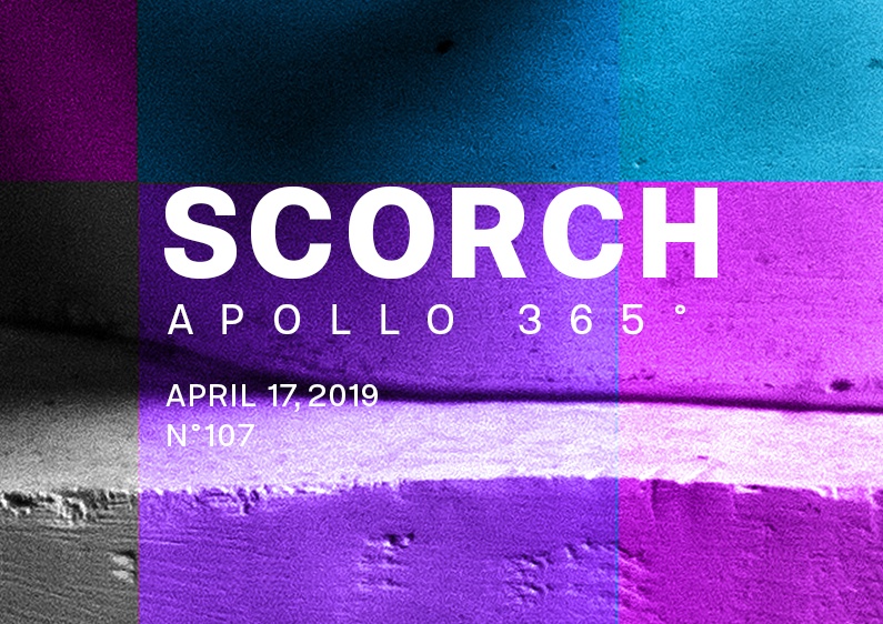
Another weird and odd poster design made in total improvisation!
The design
I started to set a mint green background and create a circle in the center with the same colors. It wasn’t good! But I continued to use this color and added a gradient that I desaturated and applied a blend mode on its layer. While doing that, I also tried to play with fonts in the composition. Finally, I decided to Liquify Apollo’s statue and see what it would be possible to generate with this option. I found the result was perfect for a strange background.

For a second time, I used to create a traditional layout with a large, white, and opaque rectangle on half of the poster. It was good-looking but too conventional. I tested some different font organizations, such as putting them horizontally and vertically, but neither worked. I tried for a long moment to find a way to integrate the white rectangle with the background, but in the end, I changed it because the visual felt too heavy.
When I removed this large rectangle, the poster started to breathe, and I saw what I would do next.
I added text, placed rectangles behind, and set their layers in Multiply Blend Mode.
Speed Art Poster #107
I have to say that I had many difficulties removing the white rectangle I added! I liked the result and wanted to improve the composition by adding or subtracting something. I also knew I could do a better job. Whatever I can say, the video will tell you more than me! See you tomorrow to discover what will look like poster #108!

