Today, I get inspired and wake up late, which may be a factor in my success—I hope not.
I ate some bread, opened Photoshop, and started designing. Ideas came to me fast. While creating the red rectangle, the final vision of the design came to my mind more clearly. I felt lucky, and I made today’s poster quickly and nicely.
The Design

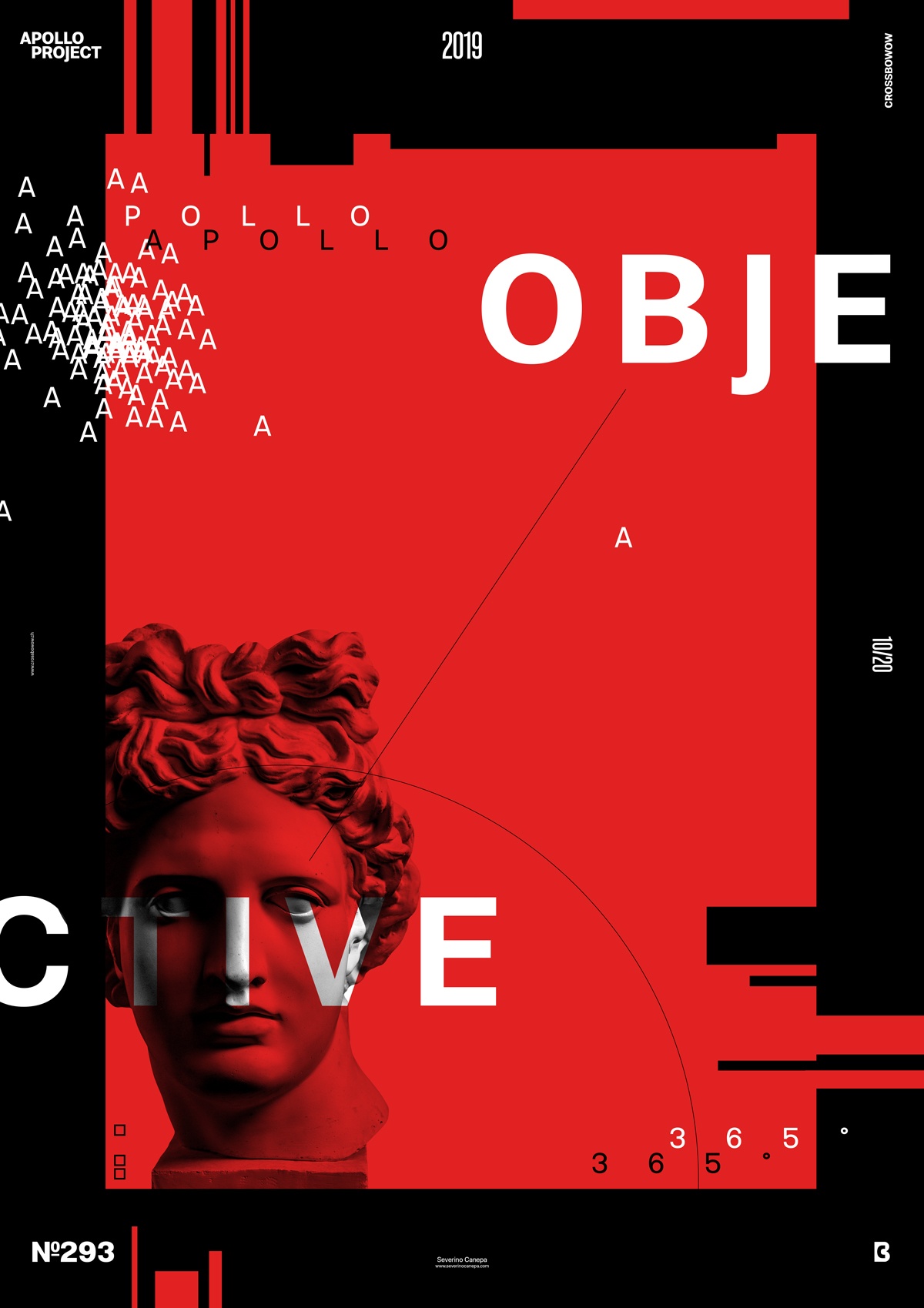
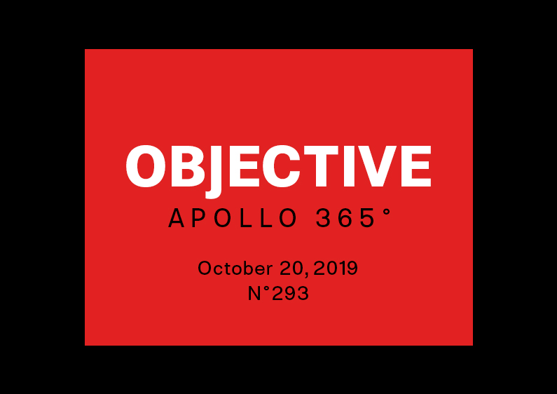
I created the objective poster using Apollo’s picture, geometric forms, and typography. I made it with Photoshop but noticed I had to create a design with Illustrator to change it. This will open a new perspective for me.
Objective Poster is satisfying. It sometimes happens that after creating a poster, I don’t enjoy watching it again. But this one is good for me! The duplication of the later A contrasts nicely with the title. It is on the right way to attract and redirect the eyes to the title from the top right to the bottom left. The colors also have an impact. They are simple and effective, but the red, black, and white amount is correct. Okay, maybe too much red.
To create this poster, I let my instincts work for me. Without overthinking every detail, I am adding to their placement. I realize that overthinking about the element on the canvas removes the spirit of freshness. I should keep that in mind for future posters!
Speed Art Poster #293
On the right, you can enjoy the speed art tutorial number 293 and watch me working from the start to the end of the process.
I thank everyone who subscribed to my YouTube channel, Pinterest account, and other social media platforms.
See you tomorrow for poster #294. Have a nice day!
Music Credits
The fresh and pleasant song you can hear on my speed art video has been realized by Dyalla.

