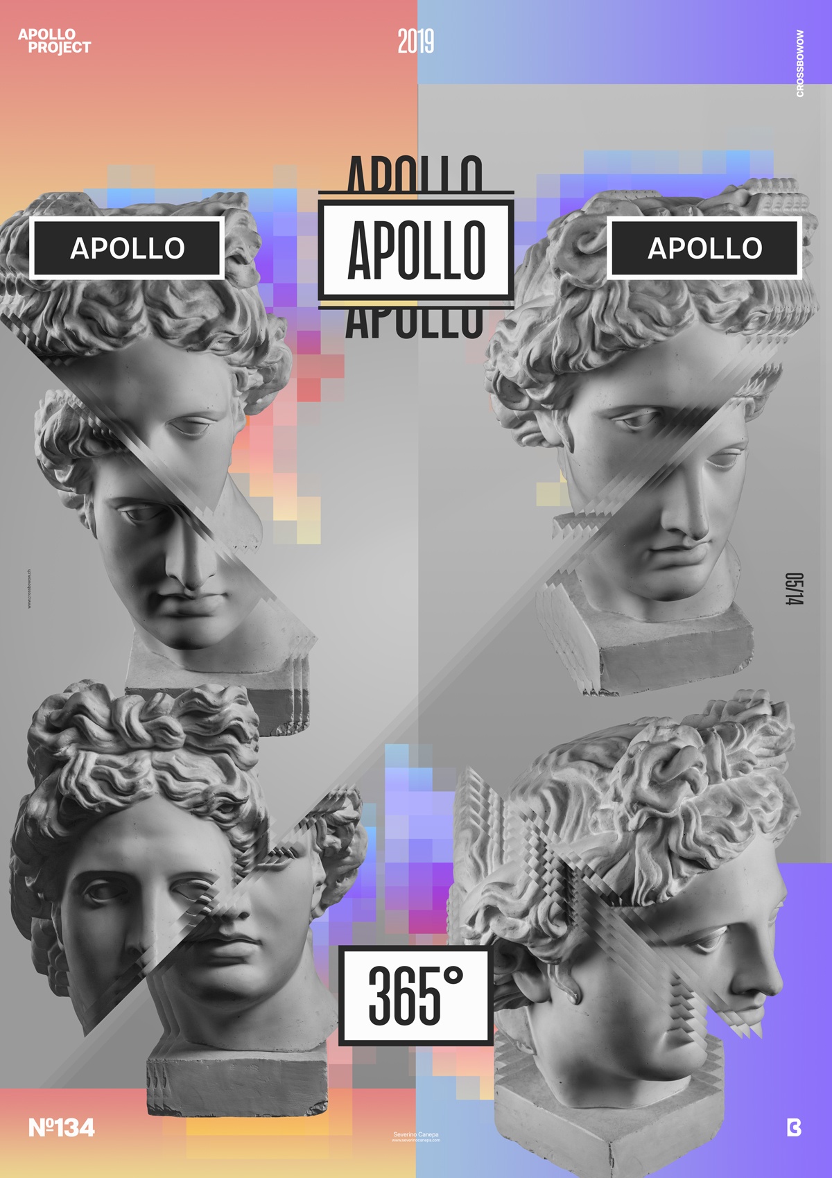
Gradient Stratum mini-series is over, and this Poster Creation is the proof.
The design
I start the poster by importing three pictures of Apollo’s Statue. Two times, its head and hand are in a different posture. I position them on the side of the poster and fill a grey to light grey gradient background. I use a radial gradient on the left half of the poster and a linear one on the right. Then, I write Apollo, add a rectangle with a stroke, and try some colors.

It was the starting point of the creation. Soon after placing my elements, I noticed that the hand didn’t belong to the composition. The disposition of the heads was the most challenging part of the poster. I also hesitated a few times to find the correct way to cut and separate them gracefully. They also have to respond to each other.
After that, I played with the title and added two other “Apollos” with different font variations. I also used the Filters, Pixelate, and Mozaic, which I filled with a colorful gradient behind each Apollo to add color.
To better understand what the poster with Apollo’s Statue in the center could look like, I duplicated the file and tried it. But it wasn’t convincing, so I returned to the original version.
Speed Art Poster #134
Besides catching a cold, designing a poster was a lovely day, and I had a lot of fun doing it! I’ll let you enjoy the speed art video, and I’ll see you soon for poster #135!

