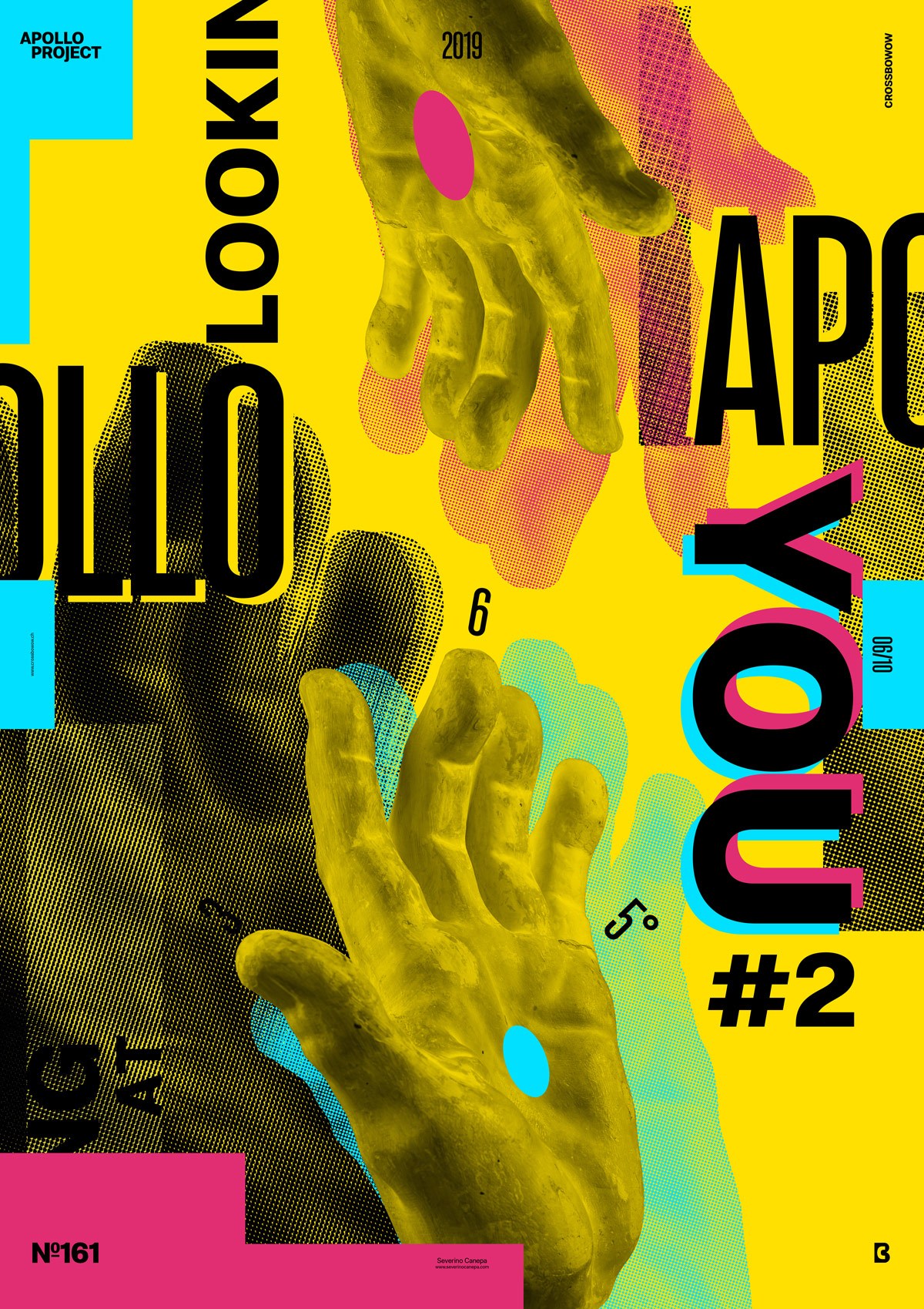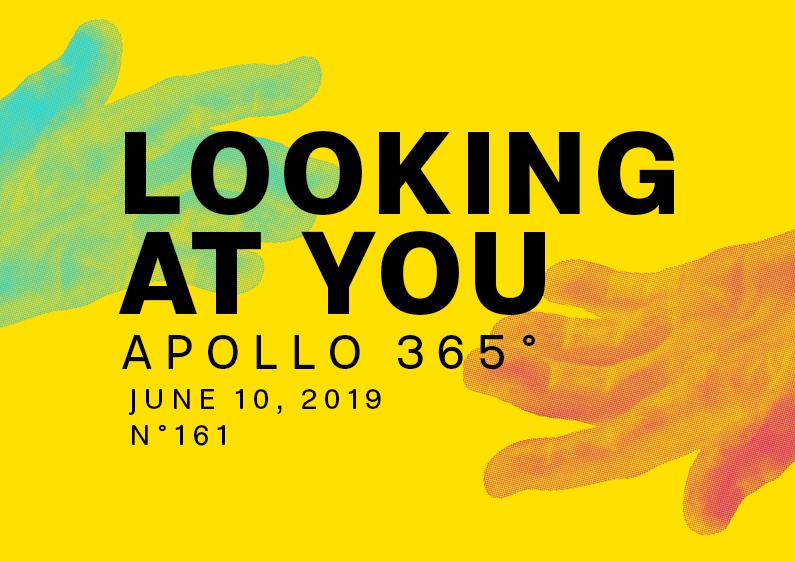
It looks like I am starting a new mini-series. Less minimalist than yesterday’s Poster, Looking at You number 2 features more pictures and typography elements in the canvas.
The design

I finally realized they are the same colors- Cyan, Magenta, Yellow, and Key Black—the same typography and Halftone effect, but this time, I made it on Apollo’s hand.
I prefer to introduce the title in the poster because I know it earlier than I usually find one after finishing the design. It is an element I like to play , bringing more visual interest to the poster.
I took Apollo’s hand and did the same thing yesterday: apply a Halftone filter and finally brush it in black, red, and blue. A nice effect that I made is on the typography. I duplicated the text two times, slightly moving it on the top left and one on the bottom right to finally colorize each differently.
Speed Art Poster #161
The Speed Art Video #161 is there too. Don’t forget to look at my process — a bit draft, I have to say — and let me a comment too! I enjoy hearing what you think about my work. See you tomorrow for the number 162!

