Preparing the luggage was a struggle and took more time than I expected. The result was an addition of stress and irritation about “how,” “it is too heavy,” and “we don’t need this…”, which can bring troubles to the couple.
The Design

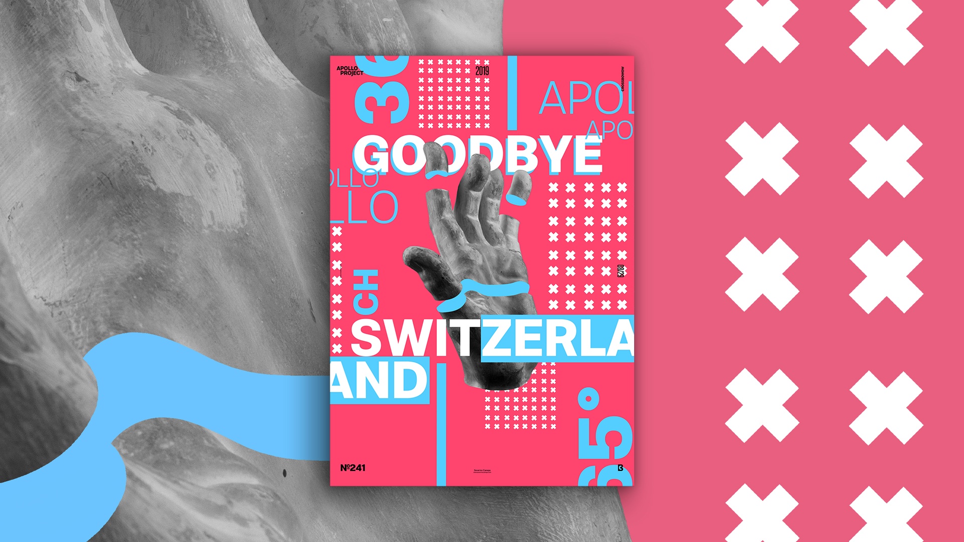
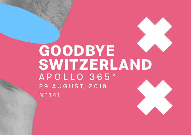
Everything is in the title! I felt a bit sensitive about leaving family and friends, so I made a poster. I didn’t express sensitiveness in the poster; it wasn’t the aspect I wanted to explore. Instead of translating a feeling into a visual creation, I tried to remember the good times spentwith my relatives.
My wish was to create a playful and fun design. Nothing that can remind me of the sad feelings of leaving the family. I cut into Apollo’s hand, extracting some fingers from its material. I also added some cross patterns here and here. I didn’t want to re-create the flag of Switzerland a thousand times with the Swiss cross everywhere. That’s the reason why I bent them down.
Finally, I want to say I based the poster on image, typography, and pattern. The colors also play an essential role. I knew red would be the predominant color, but this one was obvious, right? Since then, I have let my creativity make the rest!
Speed Art Poster #241
It’s another day when I go to bed late and wake up early, charged with going to the airport, taking the flight, and returning to my wife’s fantastic town.
The same with no time—I made the poster one day later! I found the necessary time to create the speed art poster of Goodbye Switzerland. Look at my YouTube channel and see what good things she can bring you.
See you later for poster #242!

