This afternoon, I fell asleep while watching YouTube. It doesn’t often happen to me. I woke up three hours later. My body took control and made me remember that he had to sleep! Fortunately, I made the poster this morning, but how do I explain that I didn’t finish a job because I was asleep? Again, there are no excuses.
The Design

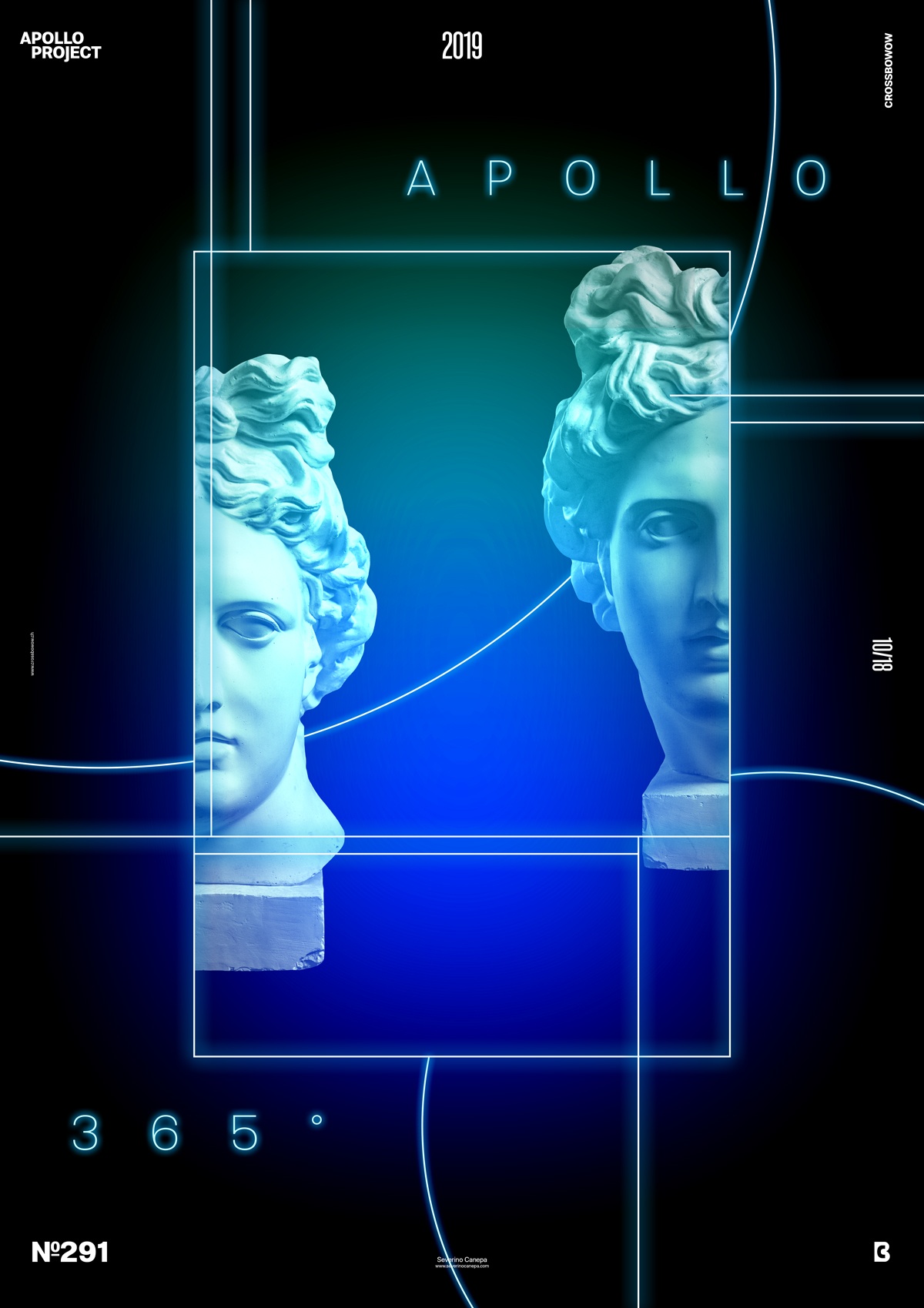
When I started to add a light over the rectangle, I heard a voice telling me, “Don’t do that; you don’t want to get there!” I should listen to my inner voice. I didn’t want to go this way, and I didn’t want to create that kind of poster, but I continued to explore this way instead of going somewhere else with my design.
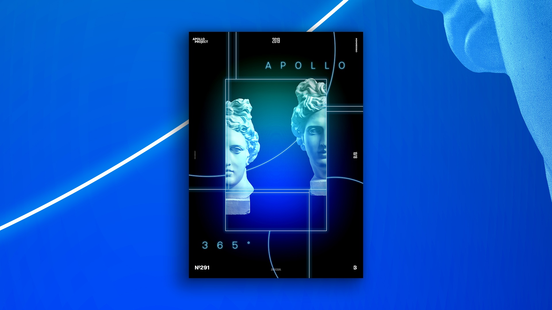
So, I continued to explore where I could go and create more thin lines around the rectangle that contained the picture of Apollo. The image that I separate from the middle and place on the rectangle’s side.
I use the Pen Tool to create the lines and the lighting effect. I make the first line in blue, duplicate the layer, and change the color to white. I double-click on the layer to open the Layer Style panel and add a blue Outer Glow. I also change the blend mode to Linear Dodge (Add). I obtain this lighting effect by following the previous steps.
Then, it is a question of placement, sizing, and spacing. It is about my current taste, and I first try to follow my intuition. Then, I step back and question the basic principles of graphic design.
Speed Art Poster #291
If you like my poster today, know I made speed art tutorial number 291. So, look if you want to see how I created it!
Thank you for your time, and see you tomorrow for poster design number 292!

