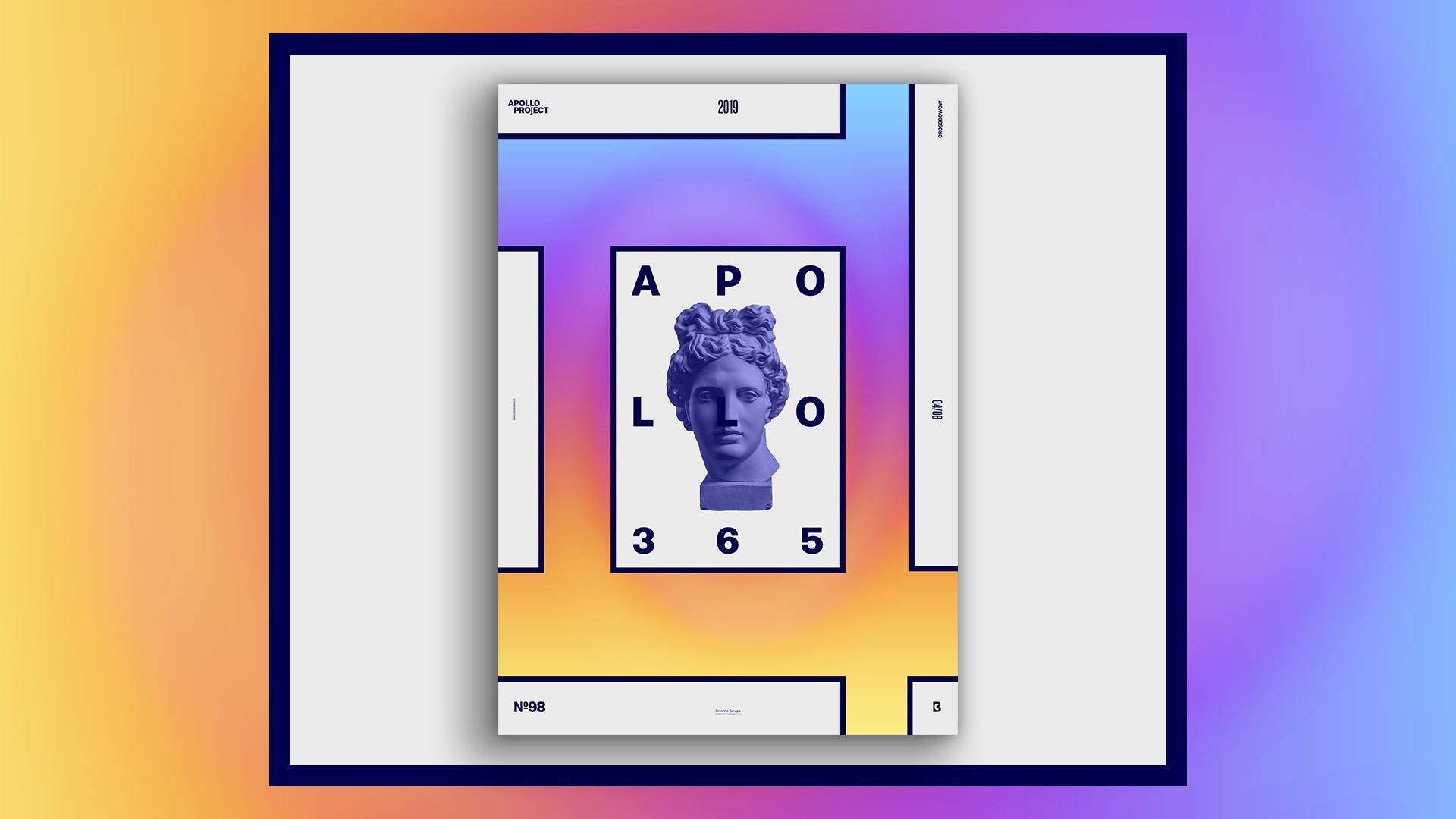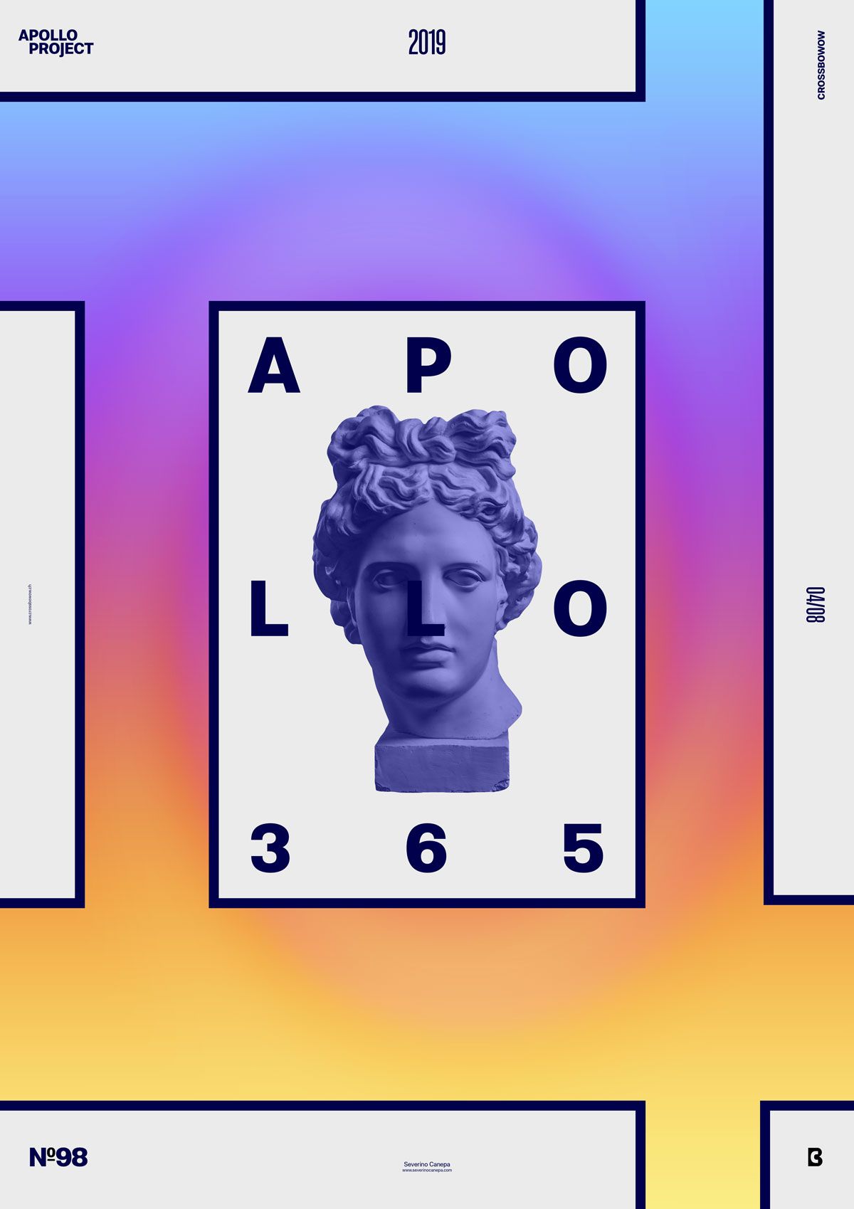
Poster #98 is a minimalist and colorful design with typography, vector forms, and a picture of Apollo.
The design

The poster looks fresh because of its colorful background, typography layout, and the dark blue I used in the fonts and the rectangle strokes. I also filled the rectangles with light grey.
I Filled the background with a gradient made of colors, duplicated it, and added a pixel filter above. Then, I used a torsion filter to obtain this result. That’s all! It is pretty simple! For the rest, I played with typography and the rectangles to make them look good.
Speed Art Poster #98
Tomorrow, you can enjoy poster#99!
As usual, you can watch me working on this poster design to figure out how I made it.
Music Credit
Dreams Electric, made by Geographer

