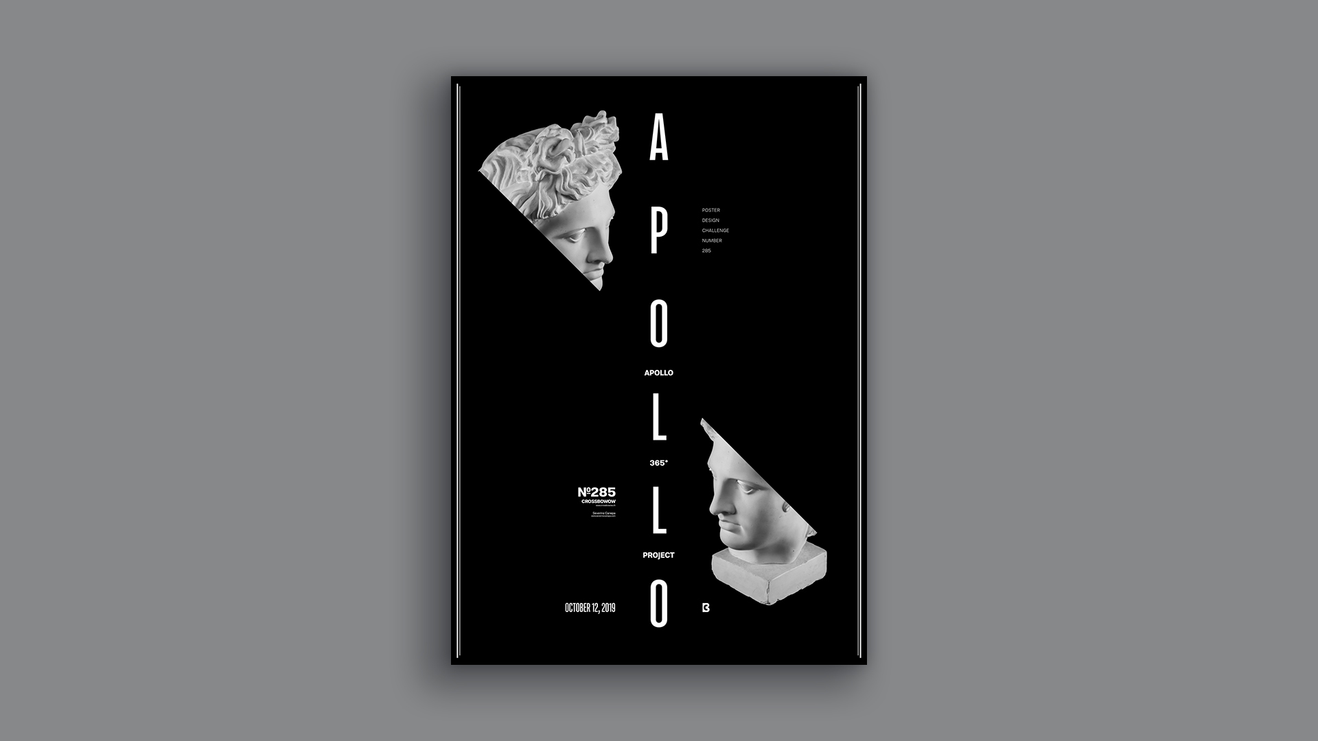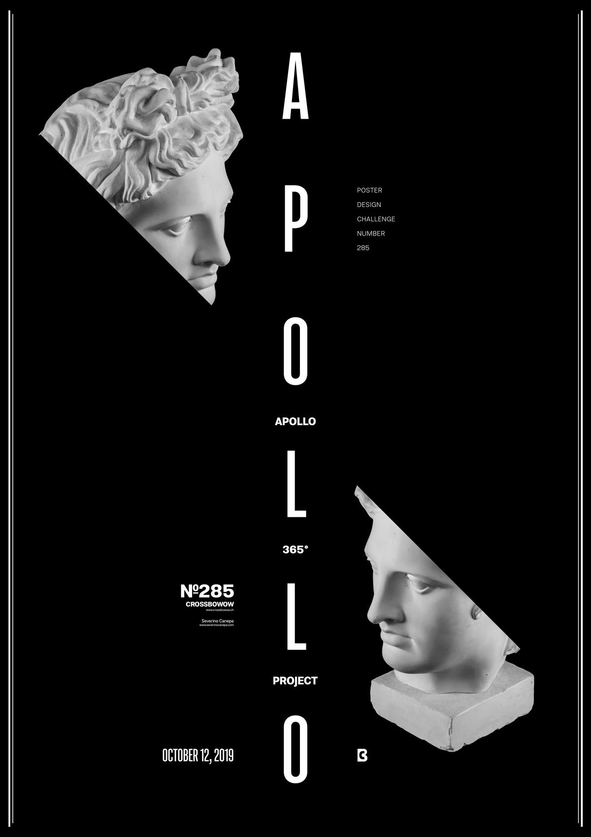
As you see, I made a minimalist poster. It is not the first time I have broken the layout to insert these pieces of information inside the canvas. It is a good thing because it generatese a change in my mind. This change makes me think differently; I find new ideas and have more elements to play with. These items are already there. I don’t have to search or invent a new one. In other words, I save some of my time.
The Design

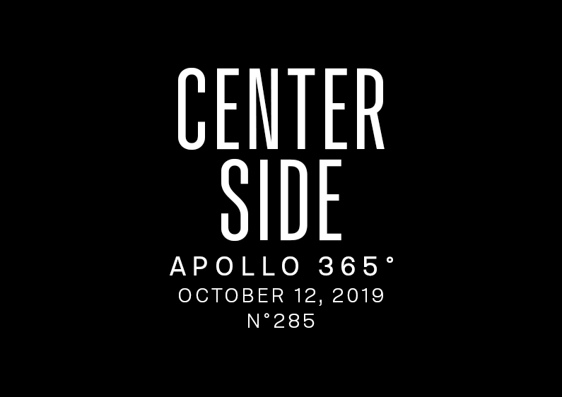
I used a vertical symmetry to design the Center Side Poster. The large font in the canvas’s center defines the symmetry’s separation. To embellish the composition, I arrange the elements around the title to care for and balance the weight of the fonts and the two images of Apollo. Because each component has a weight, for example, the photos don’t have the same weight as a title with a thin weight, but approximatively the same as a text written with a thin font. It is up to you to find the good weight between elements and balance them.
To break the vertical symmetry, I added a black shape over the Apollo with a 45° angle, creating an imaginary line from the Apollo on the top to the one on the bottom. The line is not there, but when I cut Apollo, your eyes follow this path automatically, as if it were there. Your brain makes the connection. This is a crucial remark: You can visually suggest things to the brain.
Speed Art Poster #285
Take a look at the speed art video tutorial #285. There is luck that it will bring you some inspiration for your projects.
If you follow along with what I am doing, you may notice that I am starting to call the video a tutorial. It took me ten months and twelve days to use the word “Tutorial.”
I felt this word was pretentious, so I didn’t use it until now. A tutorial is where you learn something; with my videos, you can learn something.
Come back there tomorrow to take a look at poster #286. Have a nice day!

