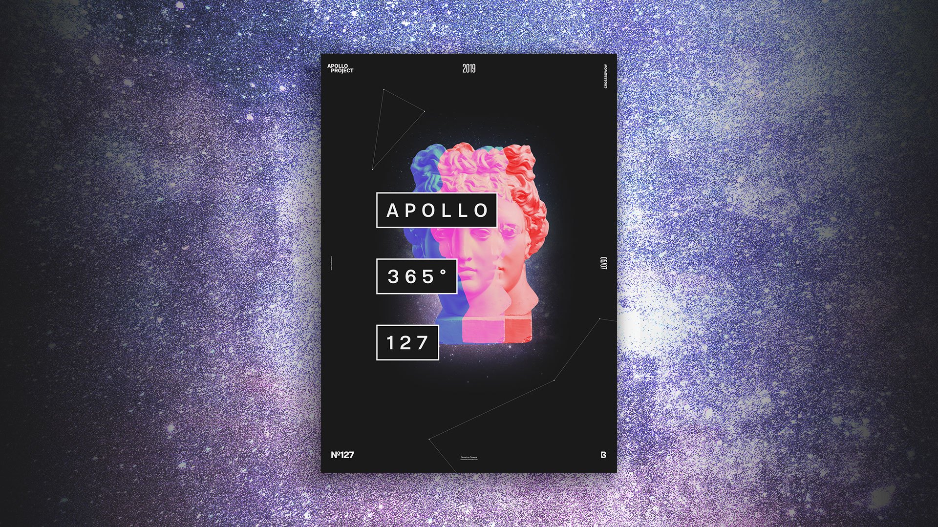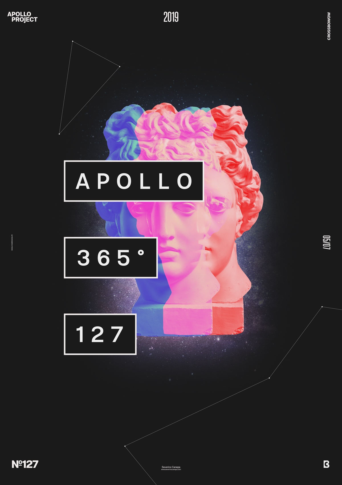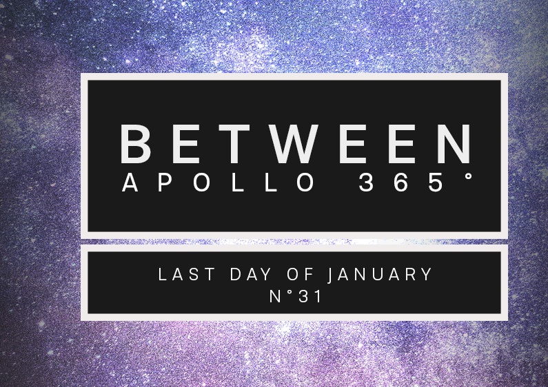
Minimalist and space-inspired, Between Poster features design elements such as three Apollo statues, text, and rectangles.
The design
Between Poster is the fastest poster design I ever made for my Creative Challenge, Apollo 365°. And on the other hand, it was one of the toughest. It’s tough because when the design comes to minimalism, you must evaluate and question every slight shape, color, placement, size, image, etc. You have to consider everything, and each element you place must also have meaning.

Abstracting design is complex, and let’s place to doubt after your 50th revision. That happened to me today when I was creating Between Poster because I wanted a more complicated design with many elements and a colorful gradient. When I realized Apollo’s Pictures and the typographic element had a good interaction, I wanted to continue to add forms to sublimate and enhance these two elements. The more I thought about how to add elements, the more I felt it was powerful enough like it was. I tried some things that you will see in the video below, but nothing worked well. I made the most of the process in my brain. The more I imagine things, the more I like the simplicity.
After asking myself what this design makes me think about, I integrated a picture of a starry sky at night.
Speed Art Poster #127
As you have noticed, I am slowing down my speed art videos. They are now more accessible and explain how I did them and the options I hit. Please look at them and tell me what you think about them.
I see you tomorrow for poster #128!

