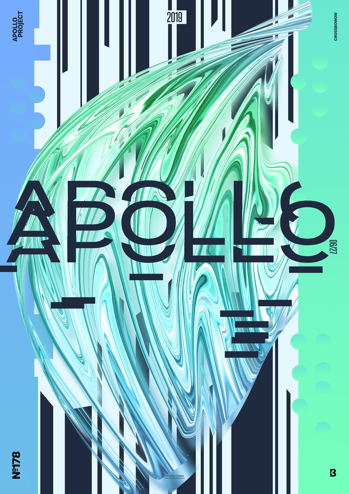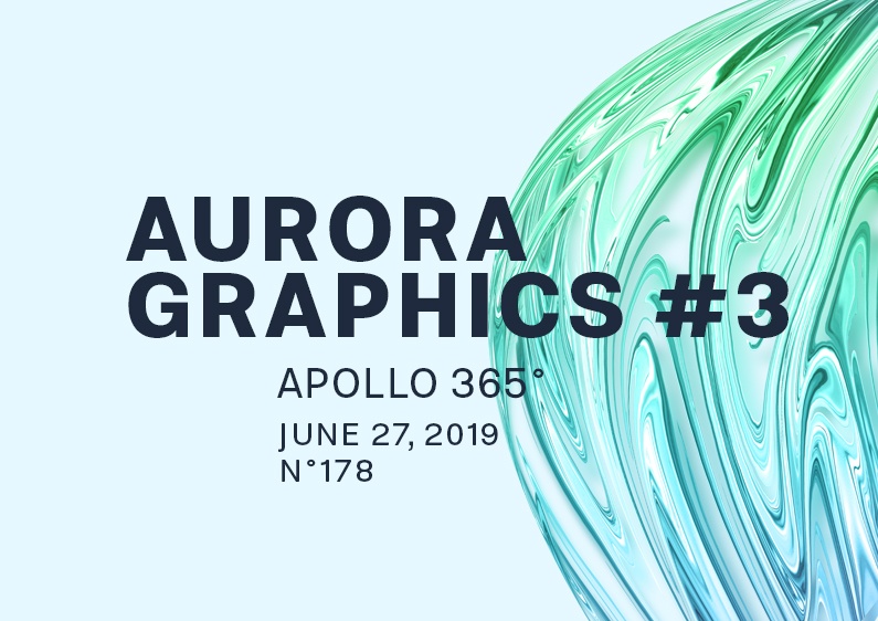
Here is poster creation number three of the mini-series that I titled “Aurora Graphics.”
The Design

If you look at the speed art video of the poster conception below, you will notice that I made full use of the picture of Apollo. I made the liquid and abstract form on the background with its picture and Filter Liquify’s (Photoshop) help.
There is nothing new under the sun! I used the same color scheme for poster number 3, too, except that I colored the title and some lines dark blue. And there is luck: I will use it all the way long for this mini-series.
I started to Liquefy the picture of Apollo and tried to create an elegant and good-looking form by playing with the pencil. I made several attempts before I got a satisfying result. Then, I warped the form to give it more dynamism and a second movement. I think you are getting familiar with the process by which I created this form and its effect on it. If not, watch the video below or other posters on the website because I explain that in detail.
After creating the abstract and liquid form, I made a blue rectangle covering the canvas’s left side and another lighter and bigger one on the right. I also changed the layout a bit to fit these forms better. The rest is just playing and testing to see what works and what doesn’t.
Speed Art Poster #178
Thank you for being here, following, contacting, and commenting on my posters. I truly appreciate it, and it is so valuable to me!
You can watch me working on this design in Speed Art Video number 178.
Don’t forget to check the poster 179 tomorrow!

