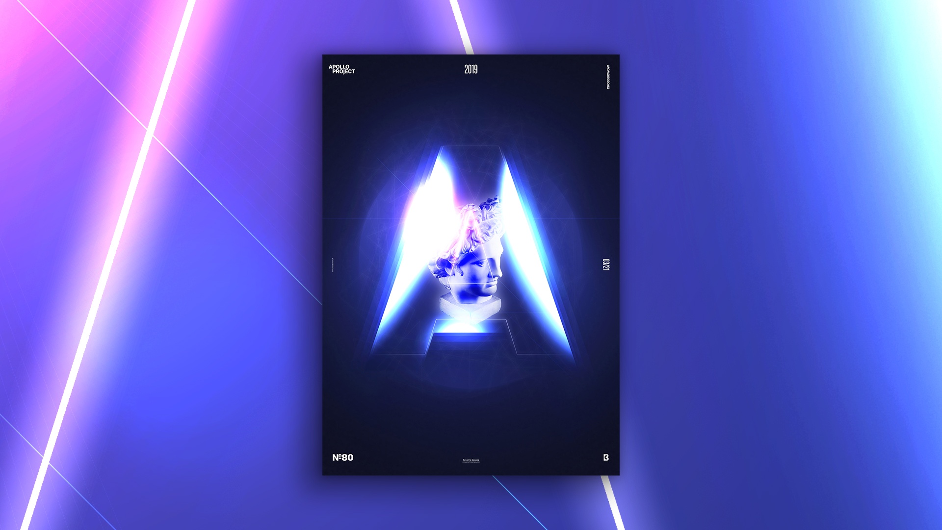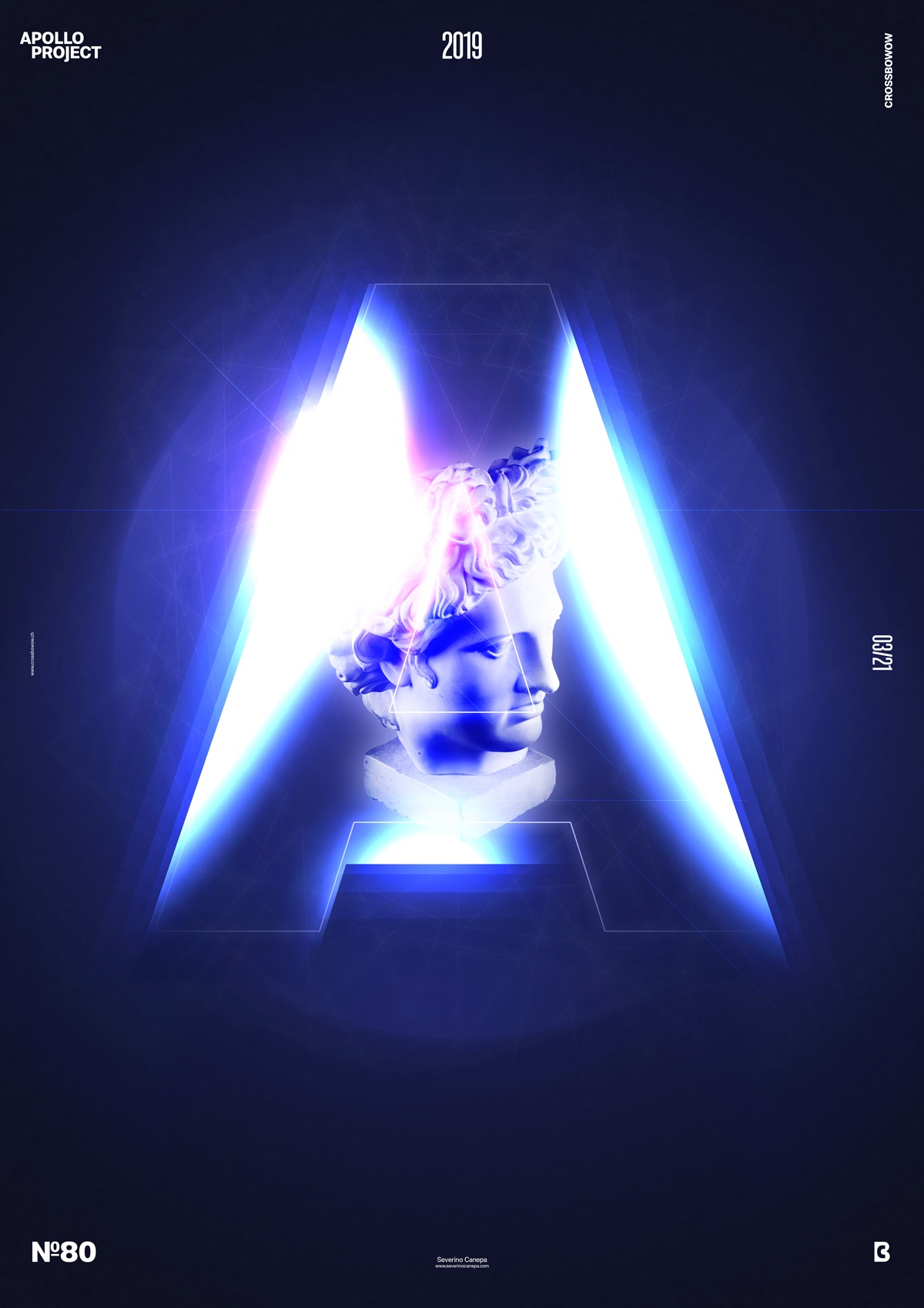
Today’s poster design is another Photoshop light experimentation from out of space.
The design of Apollo’s Aurora

Yesterday, I was working on poster #79 and accidentally masked some wrong layers. They let appear an incredible letter “A” with some lights inside. I took a screenshot of that because it wasn’t what I wanted to create. It only happens by chance.
To design poster #80, I was inspired by that lucky moment when I realized something similar in design because it interested me.
I started by putting the letter “A” in the center of my composition and creating a mask layer with the letter’s shapes inside as a hole. That way, I can add some new layers in between, and the mask only shows the letter’s shapes.
I finally tried different ways, colors, and blend modes to obtain that result.
Speed Art Poster #78
I’m back with a Speed Art video of the making of. You’ll watch me working from the beginning to the end of the creation process. I hope you enjoy it! See you tomorrow to take a look at poster #81!
