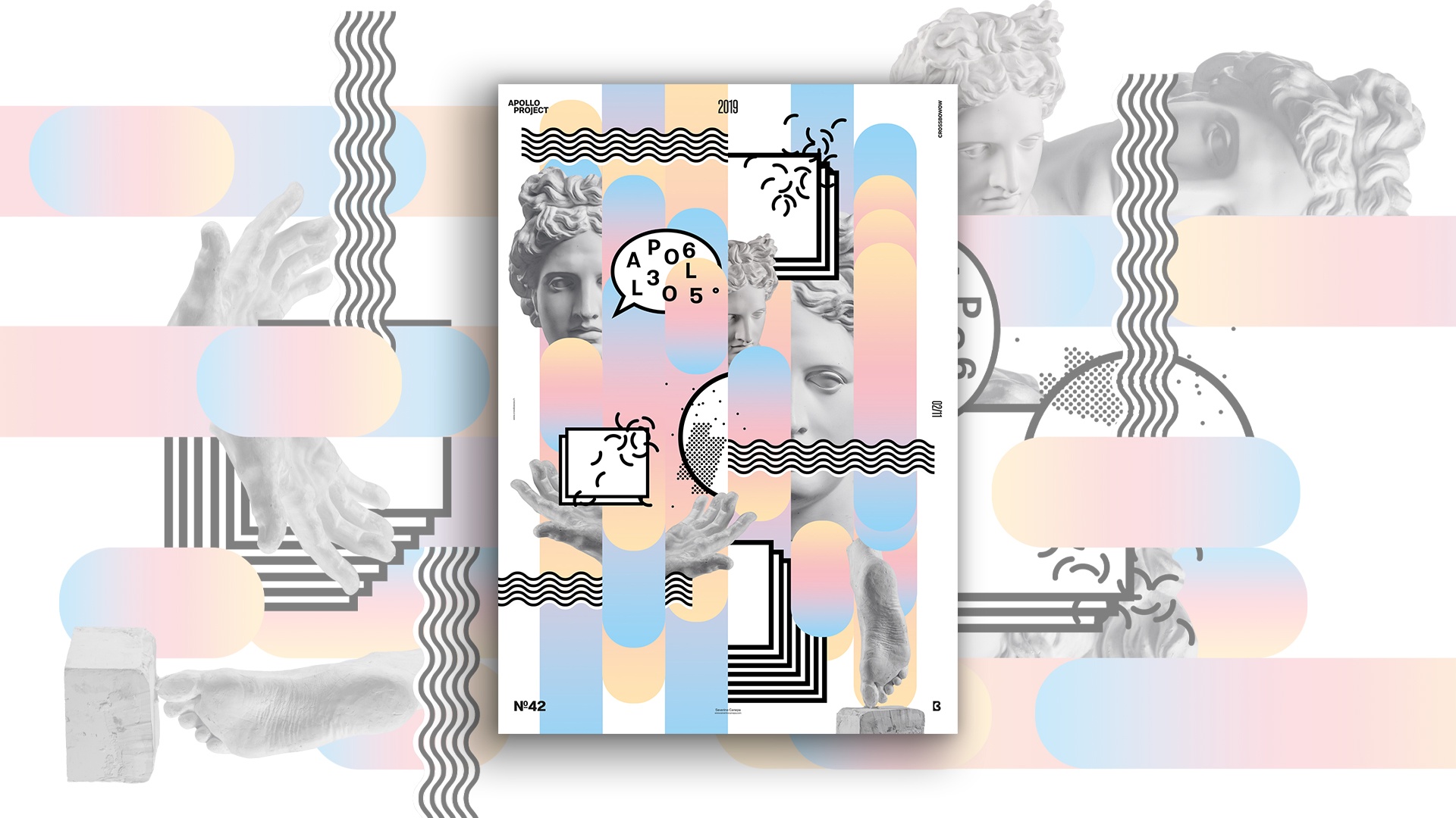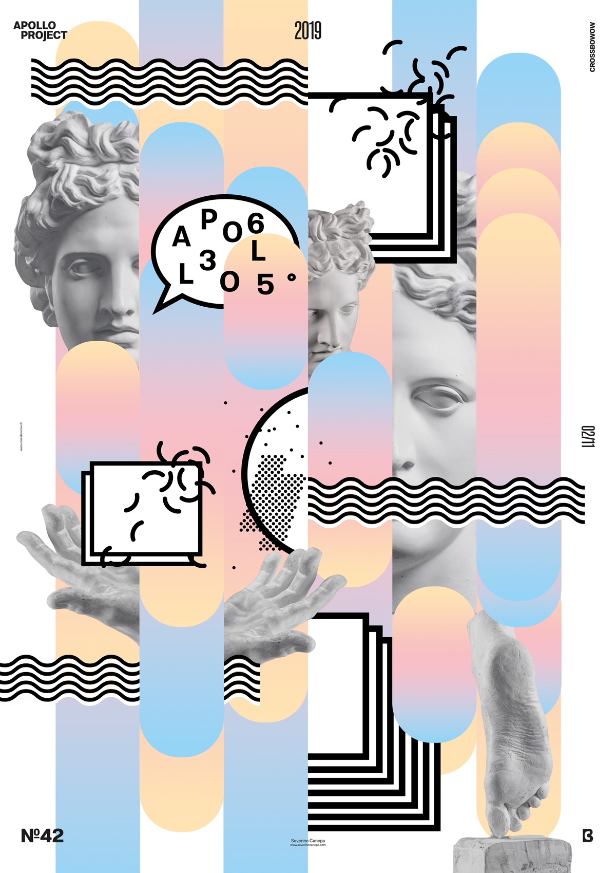
Today, February 10th, 2019, Poster Design: I inspired myself by the 80s with the Memphis style and pastel colors, like Poster Design #15, Pastelight.
Agastopia Poster Conception

I started by modifying Apollo’s statue saturation to make it lighter. After that, I made rectangle shapes with a round corner and filled them with a pastel gradient of yellow, pink, and blue. I played with Apollo’s head, hand, and foot in front and behind the rectangles.
After a moment, I noticed that the poster’s global feel was boring without any contrast. Then, I started to add a colorful Memphis pattern and saw that it clashed too much with the background. I added a few black-and-white Memphis elements , such as rectangles, rounds, waves, and small elements.
Poster Speed Art
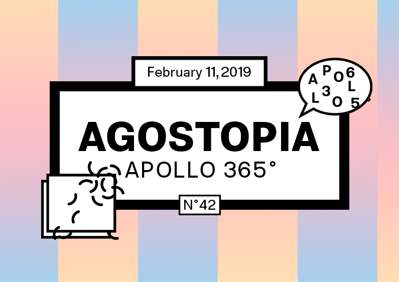
Another lovely morning was spent designing a Poster. I hope you enjoy watching me work on Agastopia Poster Design #42. Have a nice day, and see you tomorrow for poster design #43!

