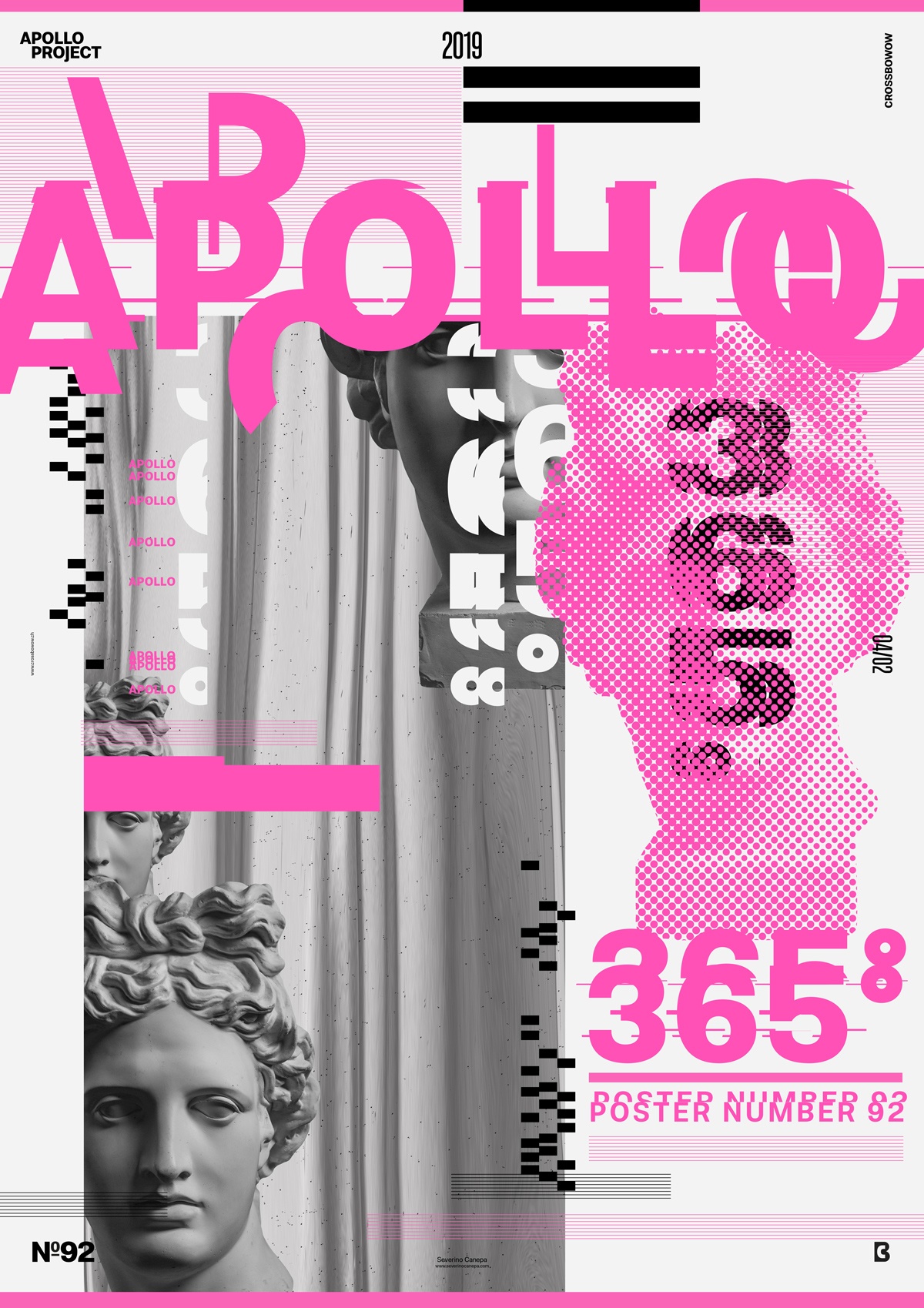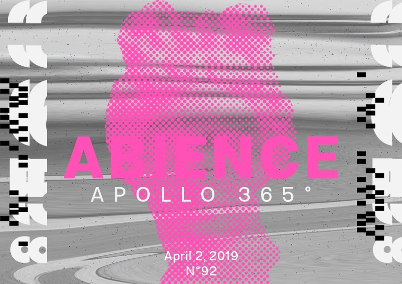
The second poster of April is typography-based and pictural because of Apollo’s Statue image. I promise not to use only one color for the next poster. It’s too easy. It is impactful, but there are no real difficulties in picking only one color compared to mixing many different colors.
The design

Apollo is truly starting to kick and limit my creativity! It is too restrictive. I am already thinking about continuing this challenge next year, and instead of using Apollo’s Statue, I will do abstract stuff. That’s for sure!
These days, I produce my poster using a grid, which is a conventional layout. I am trying to follow the lines with large geometric forms to show and play with white space.
I Am satisfied with the deconstructed title I created by copying and pasting parts of the font around to render a sense of flow between typographic, picture, and form elements. I also successfully created dynamic movements with the font and the grey square with a liquified Apollo inside.
Speed Art Poster #92
It was a satisfying day because I am happy with poster #92’s visual. You can watch the Speed Art Video if you want to look at how I did it. Thank you for being there and to follow my poster design challenge! Have a nice day, and see you tomorrow for poster #93!
Music Credit
Y Files is an awesome electro song by Geographer. Yes, it is the second day I have used his song!

