The Design Poster Challenge Origins
As a graphic designer and creative individual, I continuously learn, experiment, and create digitally and with traditional mediums. I aim to develop unique designs daily, nurturing my inspiration and ideas. I also compile my favorite works on my hard disk for motivation during creative blocks. This collection fuels my enthusiasm and drives me to produce exceptional designs.
Where Does This Challenge Come From?
David Carson
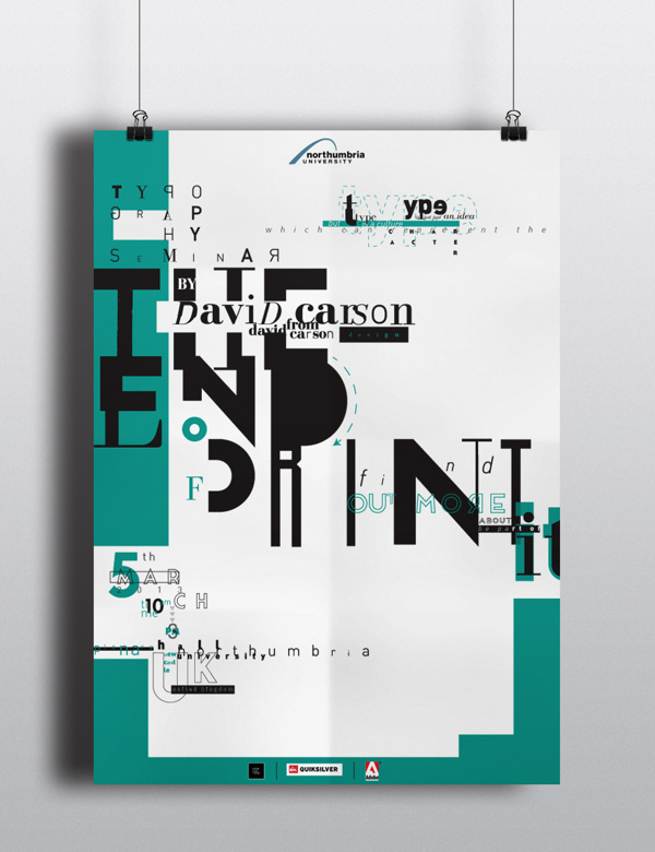
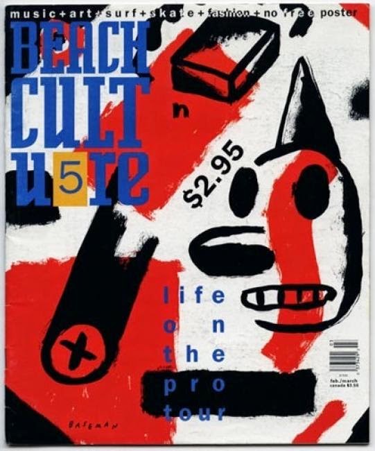
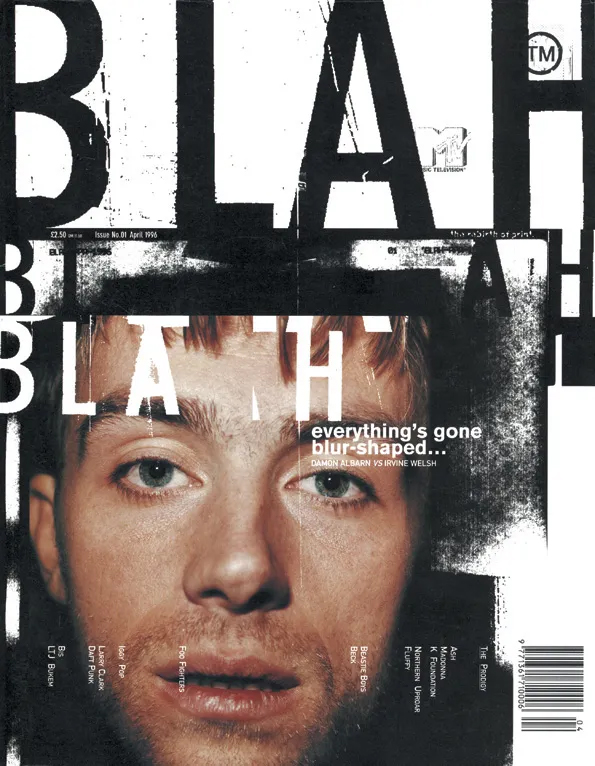
Some years ago, like every designer following graphic design trends, I discovered the iconic work of David Carson, often hailed as the father of grunge typography. His rebellious approach to design, characterized by chaotic layouts and unconventional typography, was and still is a profound source of inspiration for me.
Carson’s ability to break traditional design rules while creating visually compelling work made me realize the power of embracing imperfection in creative processes. This revelation inspired me to start my own daily design challenge, pushing myself to explore new ideas and break out of conventional boundaries, just as Carson did.
Vasjen Katro

In late 2018, I discovered a poster challenge on Skillshare created by Vasjen Katro. He designed one poster daily for a year, a project he named Baugasm. Watching his video, I was deeply inspired by his project and the stunning posters he created. Motivated by his incredible work, I embarked on my poster design challenge.
Magdiel Lopez
What truly inspires me about Magdiel Lopez’s work is his use of partially obscured figures, revealing bold, flat planes of color. These vibrant hues—sometimes pastel, sometimes bright, sometimes dark—add depth and emotion to his compositions. His imaginative approach to color and form creates a surreal, almost dreamlike quality that captivates the viewer and invites them to see the world through a more artistic lens.
This challenge seemed the perfect opportunity to refine my design skills, develop a personal style, and discover my creative voice. However, creating a new daily poster for an entire year would be demanding.
Motivation is Just the Start. The next step is to transform it into determination.
After months of weighing the pros and cons, I realized this challenge could significantly improve my design skills. As someone a bit shy, this is a chance to step into the spotlight and showcase my work online. Committing publicly would hold me accountable and push me to complete the challenge throughout the year. It also served as a powerful New Year’s resolution.
Doubts and Fears
Despite my excitement, many questions plagued me: How should I begin? Am I skilled enough? Can I commit the necessary time every day for a year? What if I run out of ideas or get too busy? These doubts and fears were overwhelming, and many can relate to this feeling.
As existential questions and life matters crept in, I questioned my ability to complete the project successfully. However, with 30 years of life experience, I learned to address my doubts more confidently. I decided to take the plunge and embrace the challenge without overthinking it, trusting my capacity to overcome any obstacles.
How Will I Design One Poster Every Day for a Year
I established some constraints to tackle my fears and doubts and make the project more manageable. Constraints are beneficial for designers, providing structure and focus.
Initially, I implemented two constraints. Firstly, I used the same typographic layout and information placement on each poster, varying only the date and poster number. This would help streamline the design process.
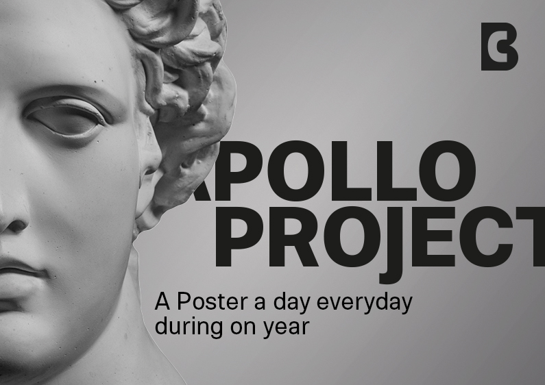
Secondly, I decided to use the same image of Apollo by Kozlik Mozlik from iStockphoto on every poster. This consistent element would create a cohesive visual theme.
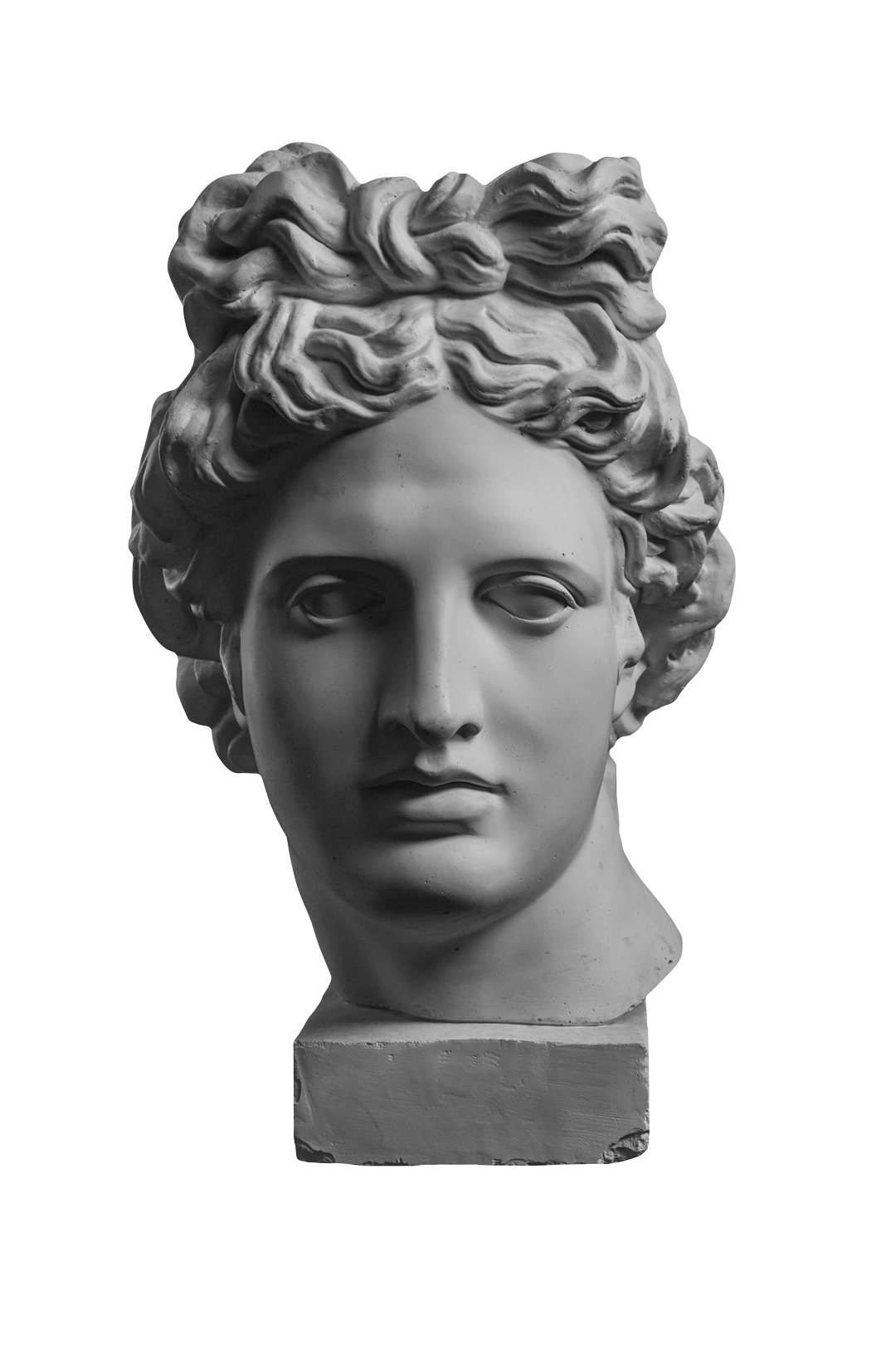
Additionally, I chose to use the Molde font by Juan Pablo de Gregorio, a versatile typeface with various weights that would add visual interest to my designs. I purchased this font from Fontspring to enhance my posters.


Occasionally, I allowed myself to break these rules by introducing new themes, quotes, and images or collaborating with other creatives. However, these deviations would last up to a week. Collaborating with other designers, illustrators, artists, or even musicians was another layer of the challenge, adding diversity and excitement to the project.
Conclusion
I committed to the challenge the day before the New Year. Whatever obstacles arise, I am ready to face them and find solutions. After preparing by refining the Apollo statue image and designing the poster layouts, I feel confident and enthusiastic about this new journey. Let’s begin!

