About the Design
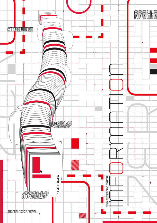
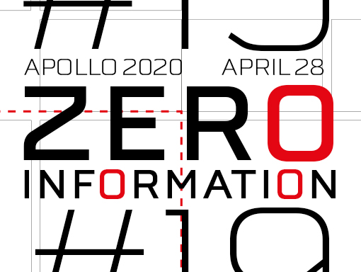
What helps me keep going with this mini-series of posters is that I know it will end tomorrow. It almost hurts me to create them now, so they are repetitive. Of course, I am trying to add something new to improve the visual and go further, but it is not always possible.
I wanted to embellish the poster and change the style with a futuristic font, but I couldn’t find a good one and let it fall because I had already done the research.
Since three posters ago, I have divided the canvas by the middle with two different grids, a larger and a smaller. It brings a bit more contrast to the canvas. I made the grid visible from the start of the mini-series to help vehiculate my designs’ “futuristic” style.
Speed Art Video
If you like the poster, take a look at the video below. If you have the wild idea of leaving a comment, don’t hesitate! I’ll see you tomorrow to discover the last poster of the Zero Information #20 mini-series.
Take care of yourself, and see you soon!
Music Credit
I used another song by The Grey Room (YouTube channel) to add a bit of a beat to my video. Their song is named Voyage.

