About the Design
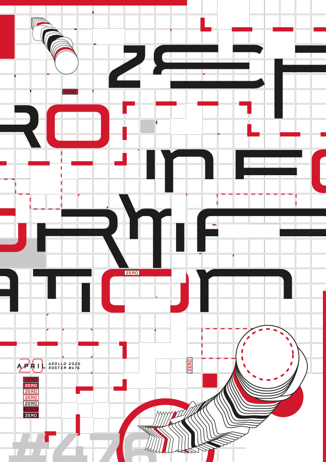
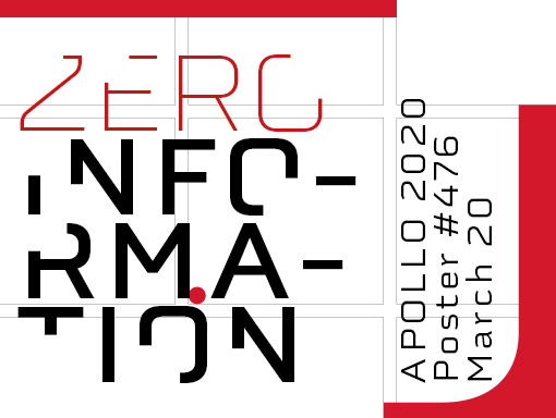
Yes, I continue with the mini-series of posters because yesterday, I think I found a good way to improve the design. I tried to do it with poster number 11, too. Unfortunately, I did too much, and the poster looked messy and too busy.
I enlarged the font and extended some parts. I am lucky because the font is suitable for that purpose. I also used two small blended geometric shapes, which I had used before but were not the poster’s focal point.
Speed Art Video
It may be the last poster of the mini-series, or maybe not. To find out what I will do, come back tomorrow and discover what will look like poster number 476. Have a nice day!
Music Credit
If I remember well, I used one piece of music realized by Jeff Conrad (Youtube) before today. The Electro song I used to create speed art video number 476 is titled Operatic 3.

