I made the Worthy Poster on time, even with the Jetlag effect! You can get inspired anytime; you only have to open your eyes and make things happen!
The Design
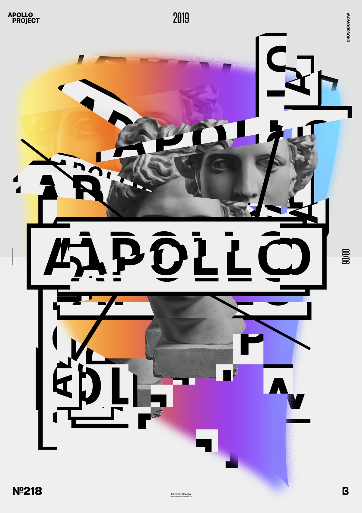
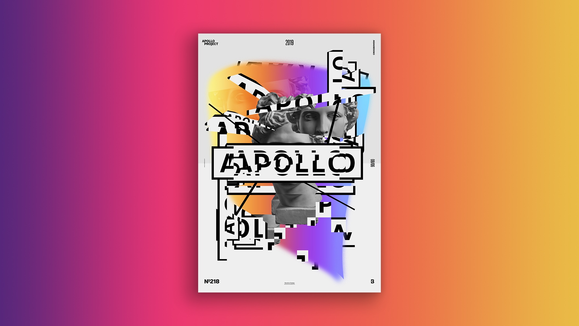
I enjoy playing with types because I love them, and today, I allowed myself to play with Molde typeface. I also used a colorful gradient, geometric lines, the picture of Apollo that I sliced, and the font to create my composition. The visual looks like a digital collage because of the many sliced pieces of typography and pictures I used.
The “Worthy” poster is a game of repetition and variation of these replications , which creates a good contrast between them and the other elements. They resonate as a cacophony, bringing a visual impact and interest to the composition.
Greyscale, black-and-white, and the colorful gradient also play an essential role. They highlight each other because they are highly contrasted. The juxtaposition of elements makes the grid look destructured, which brings dynamism.
Speed Art Poster #218
Returning to the country is good, even if I am tired. It’s late, and I am in a hurry to sleep.
The speed art videos are getting shorter because I spend less time designing posters. I think less, become more abstract, and focus on the visual without overthinking small details or following a strict grid.
Look at the video of poster creation number 218, and I’ll see you tomorrow for poster 219.