Time is going colder when there is no sunshine. But when the sun shows up, the weather turns hot. I am juggling between my pants and my shorts.
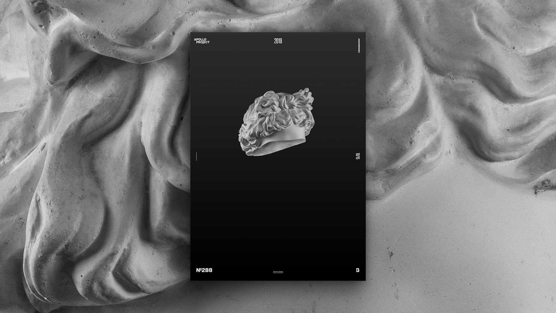
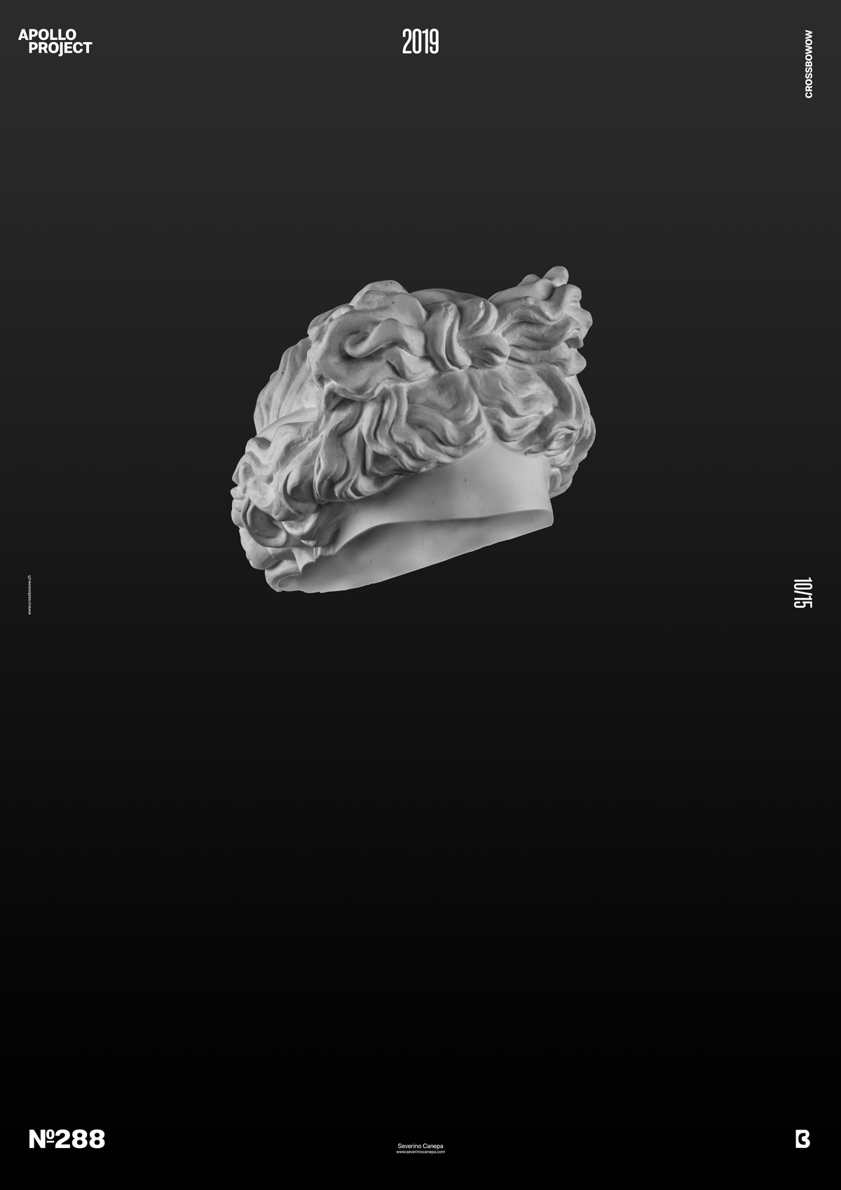
Today, I proudly present a minimalist, intriguing, and mysterious poster.
The Design

This is one of the most minimalist posters I’ve made, if not the most minimalist. I started by creating a gradient as a background because I had a different idea than the visual. Once I made things such as cutting inside the head of Apollo, I changed the design direction.
After separating the top from the bottom of Apollo, I hid the bottom part and worked on the head to have a three-dimensional effect. I did it by adding a circumference line to show what was invisible. I created the texture inside Apollo with the Clone Stamp Tool; I repeated the shadow and highlights where I wanted. I did it on another layer. To polish the effect, I create another layer, select the inside layer, go to the Option Selection, and hit Contract set on 12px. Then, I removed what was inside, which saved the outline and added more highlights. I did that to get a realistic effect.
When I finish with the outline, I get a global view of the canvas, and then I realize that the shape of the head seems to be floating nowhere. I look at the poster for a moment. I was amazed, and I decided to stop and design more. I feel that every element I could add would have been superfluous.
Speed Art Poster #288
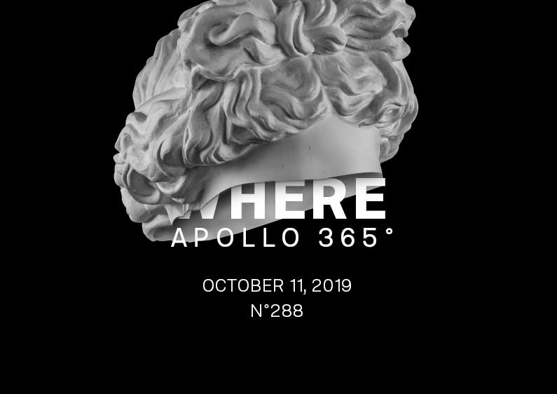
It is no surprise that you can take a look at the speed art video #288. If you cannot understand my English, the video will show you the process better than my words!
I hope that you enjoy my posters. Don’t hesitate to say hello on social media, share, or criticize my work. Please tell me what you like and what you dislike. If you could tell me why, that would be much better.
Thank you for watching my posters and reading this article. If you like it tomorrow, I will create poster number 289! Stay in touch, and have a nice day!

