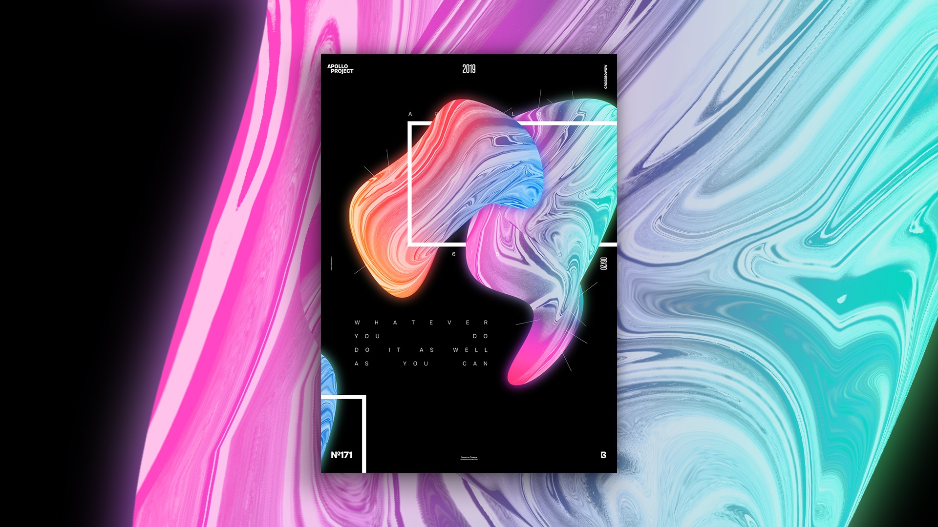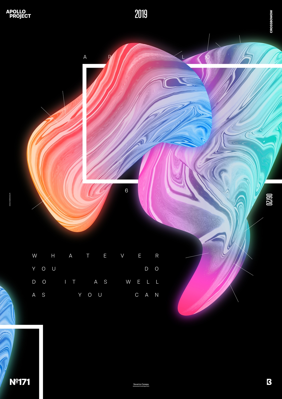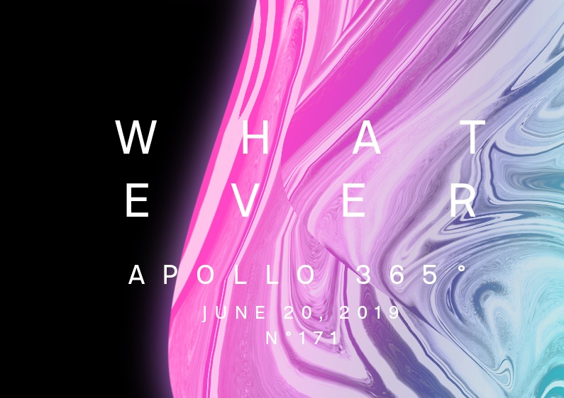
Elegant, minimalist, sophisticated, a bit mystic, and chic are the keywords to describe the Bright Contrast Poster and its design.
The design

I know! I already used to create shapes like that. What? It is my contest, and I do what I want with this challenge! That said, I made these two forms from the picture of Apollo with the Filter Liquify under Photoshop. I repeatedly turned the picture to generate this strange and abstract liquid fluid style. After that, I applied a gradient with three pastel colors and changed its blend mode. I duplicated the gradient layer and changed the blend mode a second time.
I also added two adjustment layers: one with Level and the second where I played with Curves.
To continue, I duplicated all the forms’ layers, compressed them into a single layer, and placed them below the form. I applied a Gaussian Blur and again set a blend mode.
To finish, I typed the text, created a rectangle with a thick stroke, and duplicated the second form to place it on the left bottom of the canvas.
Speed Art Poster #171
Today, I had to go to the hospital because I woke up with a muscular backache. What’s a terrible ache to design a poster? Whatever… I did it, which allowed me to forget about my pain. And I didn’t forget to compile the speed art video about my creation.
See you tomorrow for poster number 172!

