Hello!
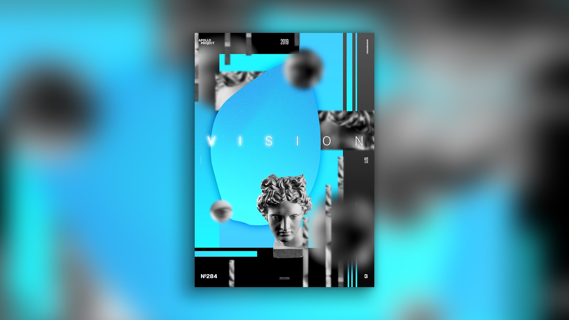
Here we are with a new poster design, number 284, Vision! After finishing the mini-series Pixel Process, I felt it was time to change and experiment with my layout to try new things.
The Design
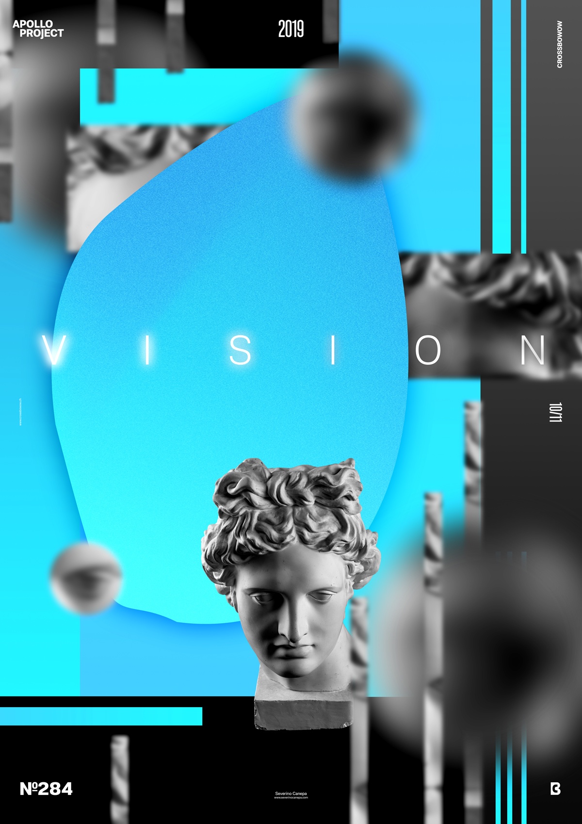
I am not satisfied with today’s design. Blue colors are so standard these days; I should work more on placing the geometric and organic shapes. I also should explore other Blur Filters, play more with shapes, and add more layers to create a stronger feeling of depth.
These are some reasons why I am unsatisfied with this poster. In addition, I added noise to the principal organic shape in the center (the largest one). It generates something disturbing for the eye. I tried to have a complex layout without really having one.
The only good thing about this unsatisfying poster is that he gives some additional motivation for tomorrow. I will remember this creation, and my subconscious will automatically push me to go further and find better solutions without thinking about them.
Speed Art Poster #284
If you want to see the process of what you don’t have to do when designing a poster, take a look at the speed art video tutorial #284 I made.
You will discover some bad practices.
Have a nice day, and come to check if I will design something better tomorrow with poster #285!
