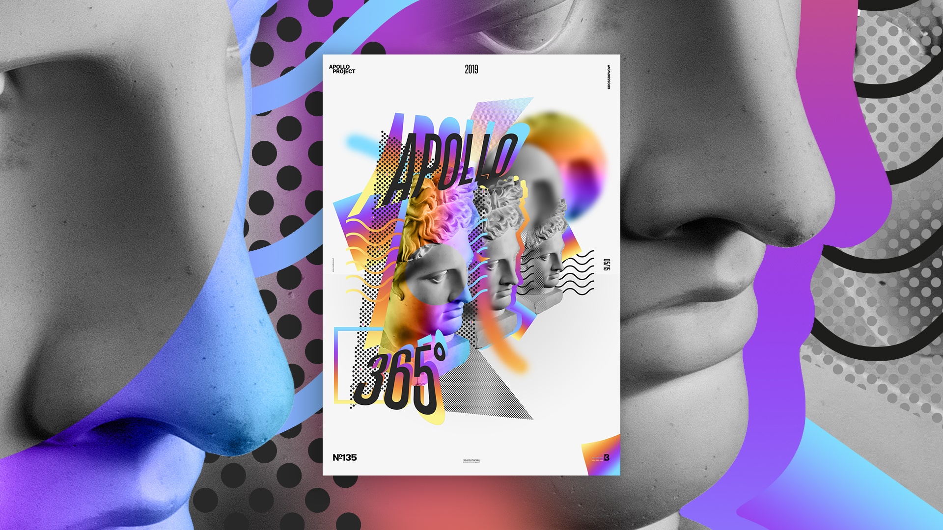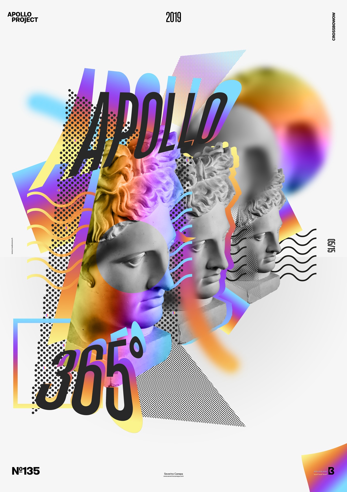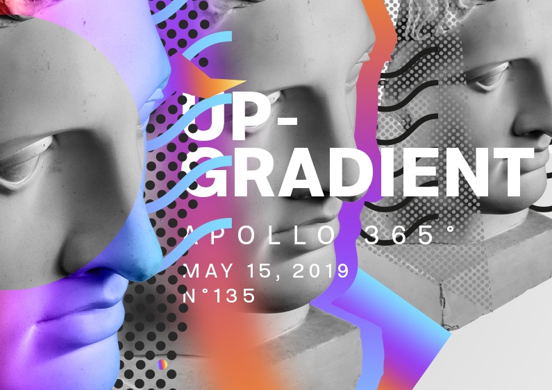
I hope you like the Poster Mini-Series because I am starting a new one named “Up-Gradient” today. I am glad to present you with the first poster.
The design
I filled the background with light grey and added Apollo’s Statue. Then, I opened Illustrator and created a pattern of dots inside a form with sharp edges and a wave pattern.

The goal here is to create depth. I duplicated Apollo’s head three times in large, medium, and small sizes. To accentuate the effect, I added several elements with a color gradient between the three statues.
Speed Art Poster #135
It’s the second day that I’m sick. It isn’t easy to deal with that and the poster challenge! Whatever, speed art video #135 is here, and I hope you will enjoy watching me work on the Up-Gradient poster.

