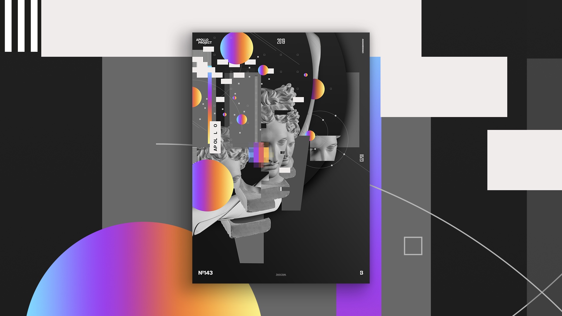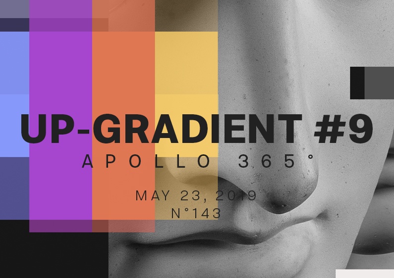
Here we are for poster Up-Gradient number 9. I want to explore this style more, and I am doing it because no customers are behind me—that’s good!
The design
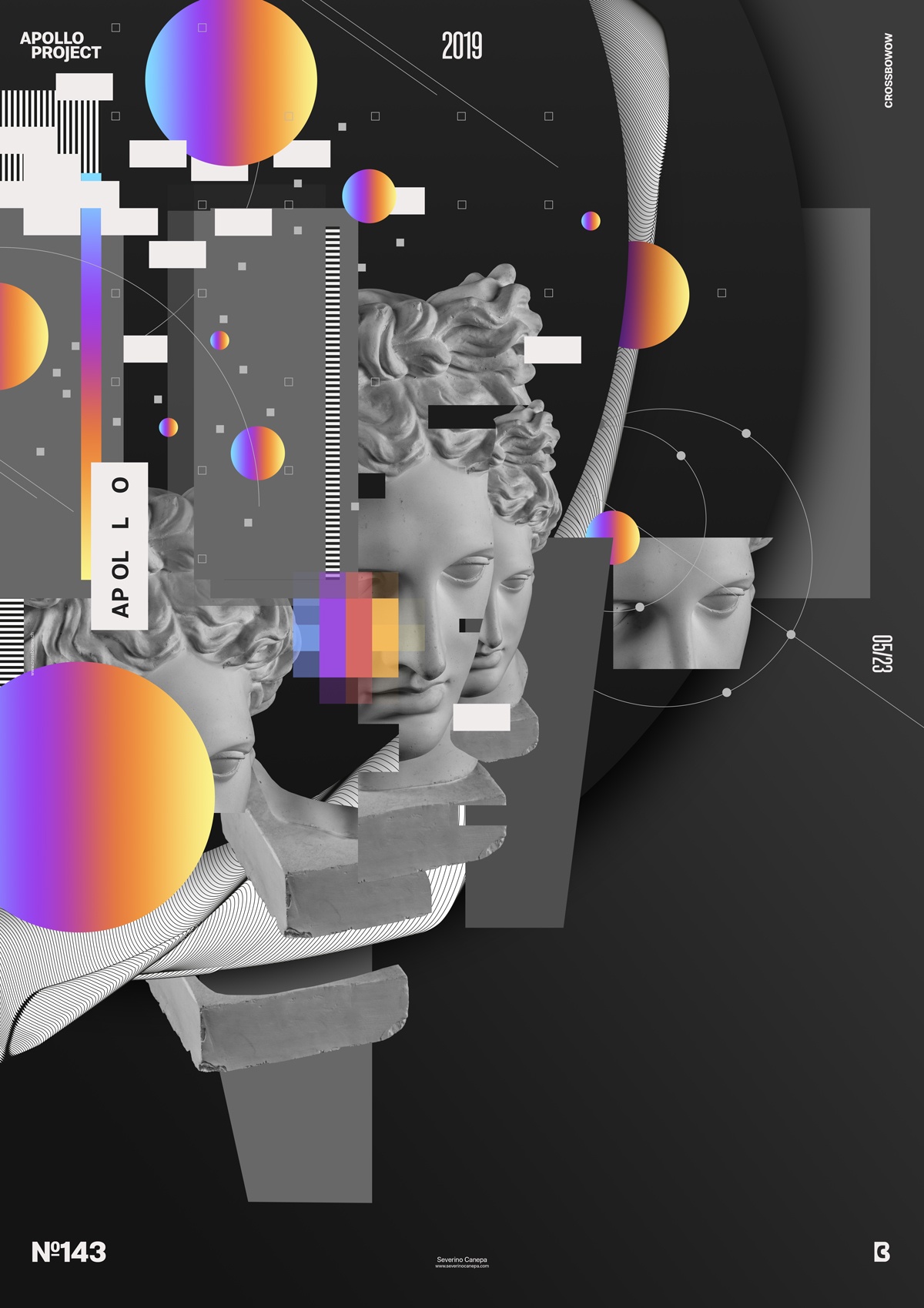
One more time, I used approximately the same elements and idea to create Up-Gradient #9: a lot of dark geometric shapes and a few colorful gradient circles with one rectangle.

This creation is about layering the elements to generate a sense of depth. Except for several layers, I use some shadows on significant elements compared to minor ones, such as the grey light rectangles and squares, which don’t have a shadow.
The goal of the composition is to create dynamism, which I do with the light grey rectangle, the thin lines, and the small square. They attract the viewer’s eyes to the top left corner, give an impression of movement, and bring nervosity to the composition.
Speed Art Poster #143
I am enjoying the poster mini-series Up-Gradient. The number nine proves that I have a lot of fun creating them.
If you look at the speed art video I made, you will feel that fun. Have a nice day, and see you at poster number 144!

