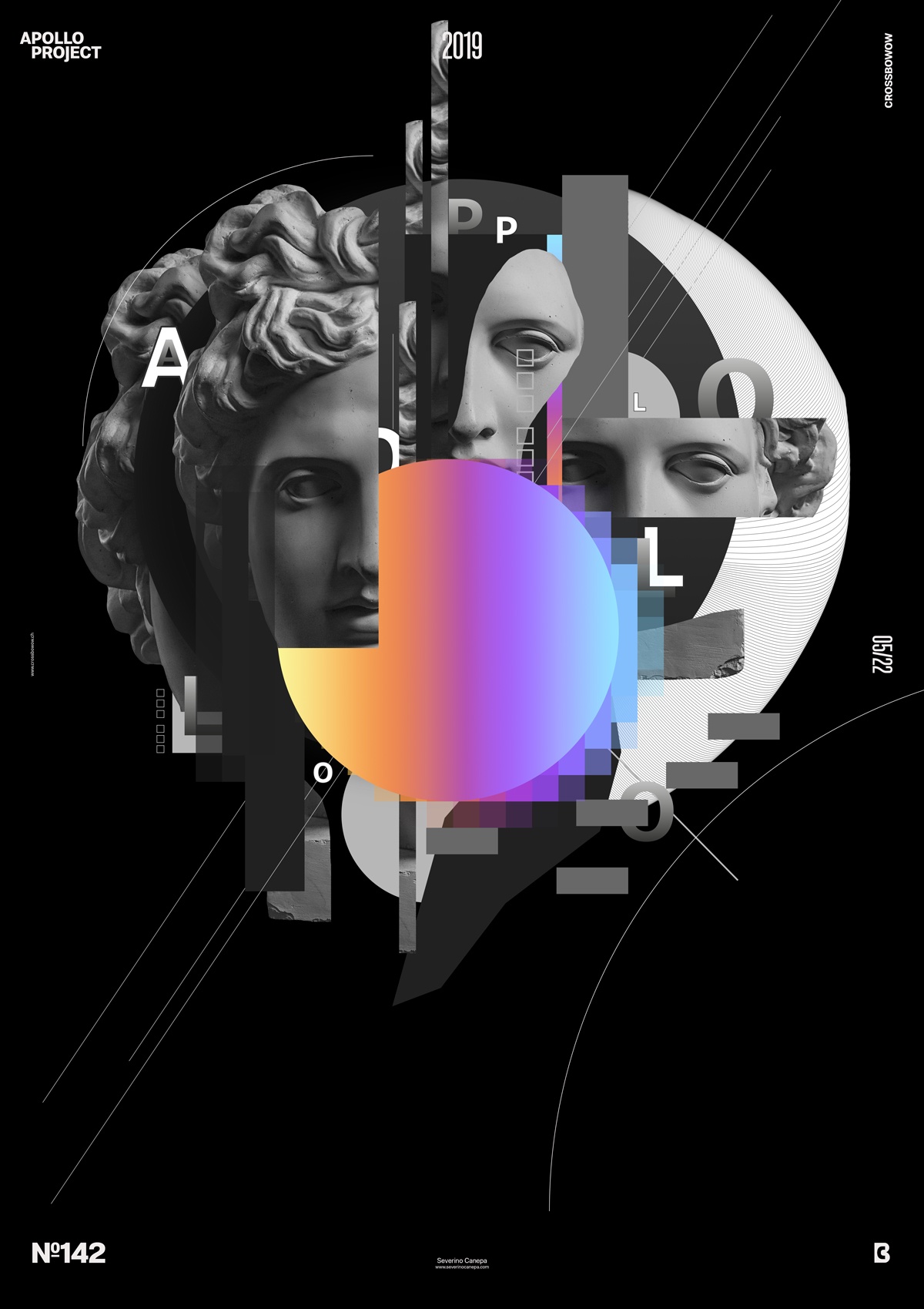
According to the Apollo 365° Design Challenge, I am beating a new record. It is the first time I have made more than five posters for a mini-series. So, I am glad to present to you Up-Gradient number 8.
The design
To change from time to time, I use a dark grey background to start designing the canvas. Don’t ask why because there is no reason, just a feeling. I cut a rectangle in Apollo’s Face and copy/paste it on the top center. I added a circle filled with the usual colors I made for the mini-series and arranged other dark geometric elements around it. I pass from dark to light grey with the forms. I make them first, then position them to interact and contrast with each other.

I use many elements in the canvas, such as strict geometry and other organic shapes, to generate a better contrast. I also use the contrast of sizes from large to small and a very subtle contrast of color.
The result is good, according to me only, because it has depth, repetition, and many different styles of contrast. Of course, this design deserves a lot more attention. But I can’t pass my day on!
Speed Art Poster #142
I have been feeling better about my cough since this morning, and it was a fantastic day designing this poster!
As usual, you can watch me working on this poster on YouTube to see how I made it.
Have a nice day, and see you tomorrow for poster #143!

