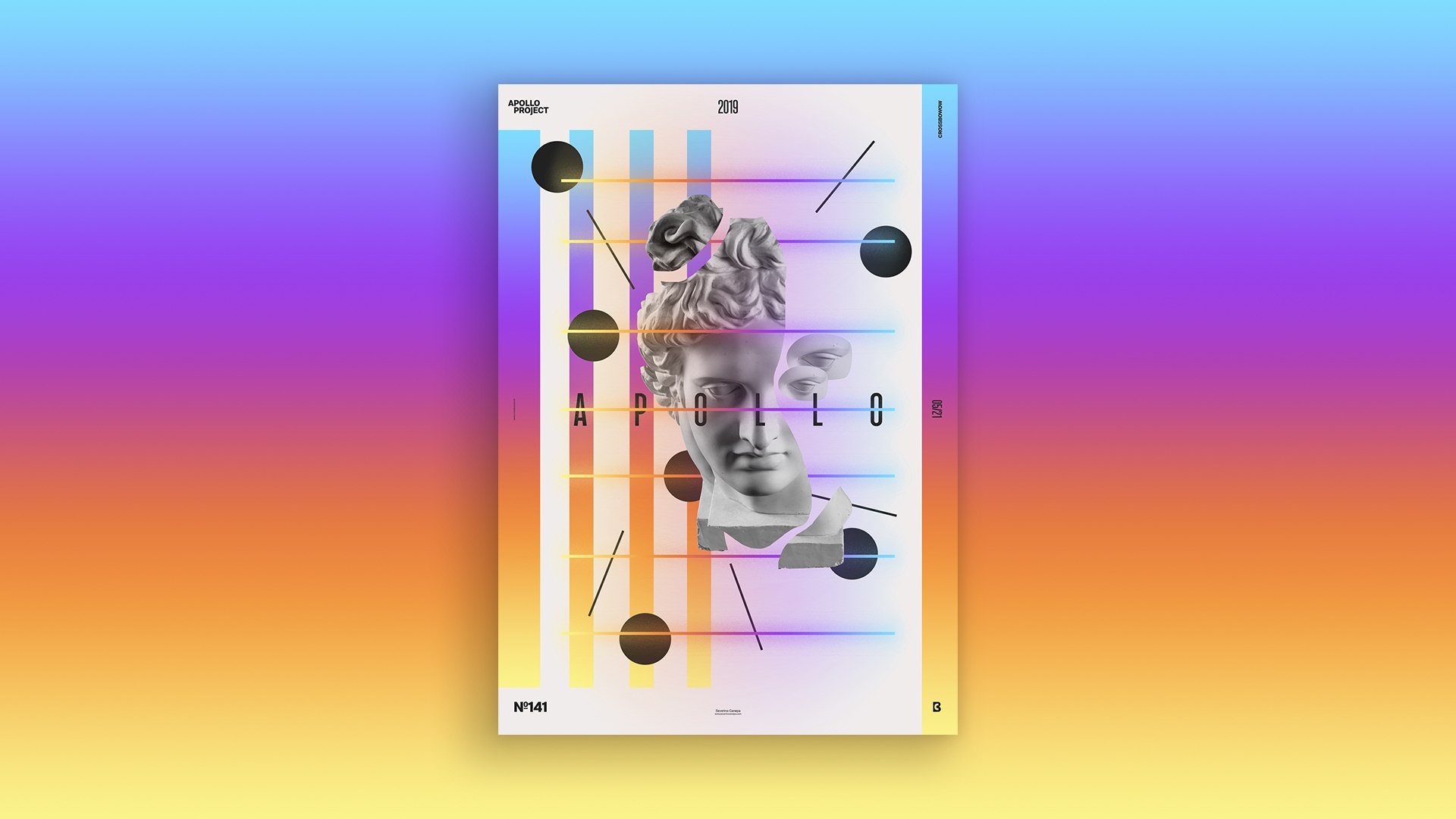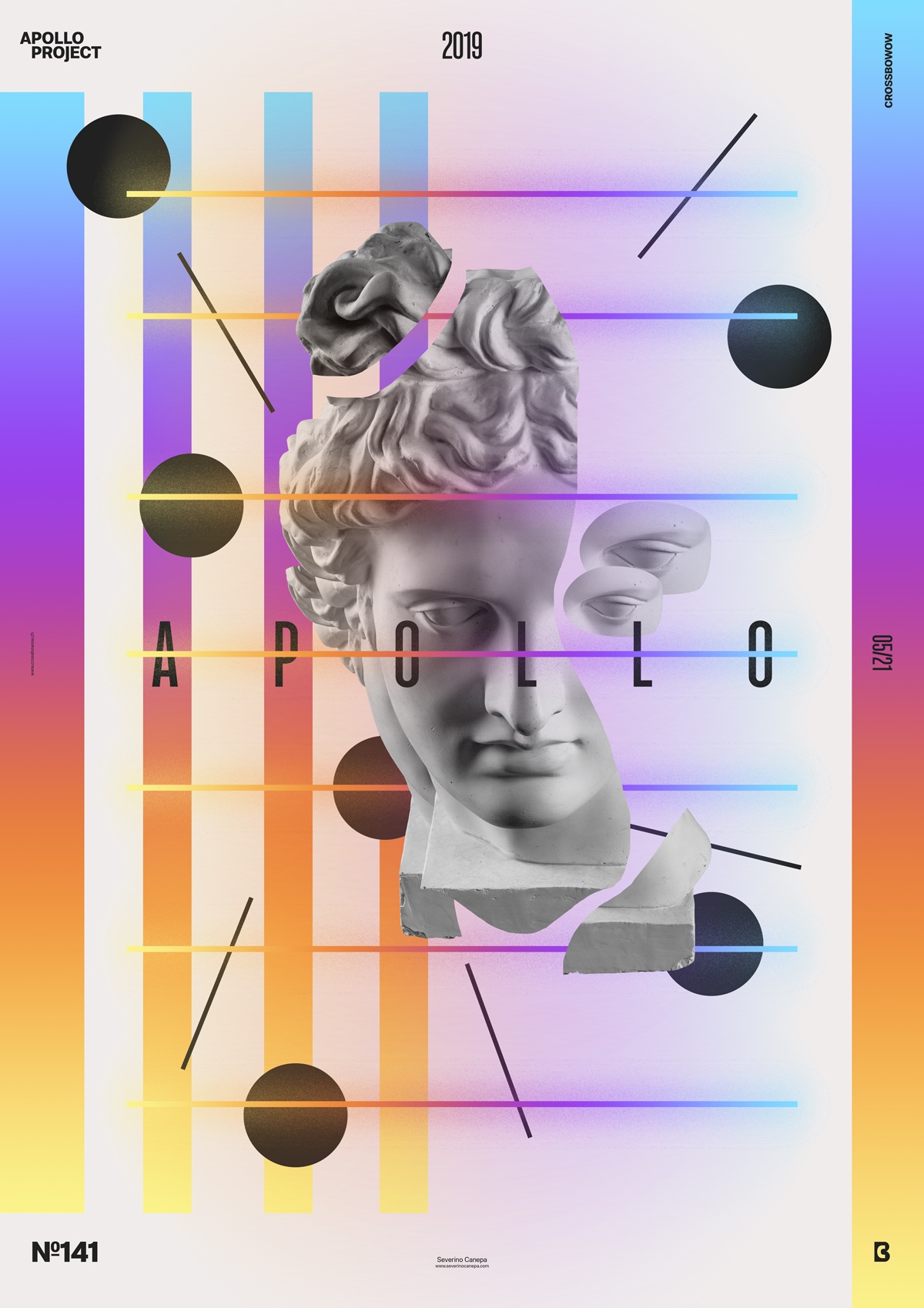
One more poster was made for the Mini-Series named Up-Gradient. This one is less minimalist but not less original than the other creations.
The design

With no exceptions, poster number seven uses the same gradient colors as its predecessors except for a few details. The font is a compressed and bold variation: black ellipses and lines and a textured blur around the horizontal lines. The blurry effect is a duplicated line that I pass under the Gaussian Blur Filter in Photoshop and then apply a Blending Mode, Dissolve, on the layer. This option brings that photo grain effect.
The rest is about composition and balancing shapes, size, and every other element.
Speed Art Poster #141
I am still sick with a throat ache today. I don’t know where I draw my energy from, but I made a poster. Fortunately, it made me forget about my cold, and I enjoyed designing today’s poster. I hope you will like to watch me work on this one!
See you tomorrow for the poster #142!

