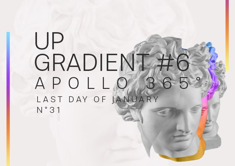
This is the creation number sixth of the Mini-Series named Up-Gradient, a minimalist, clean, and sober design realized with a few elements.
The design
Like yesterday’s poster, I continue to explore minimalism with the Up-Gradient series, and it’s delightful. I hope that it is visually pleasing for you, too!
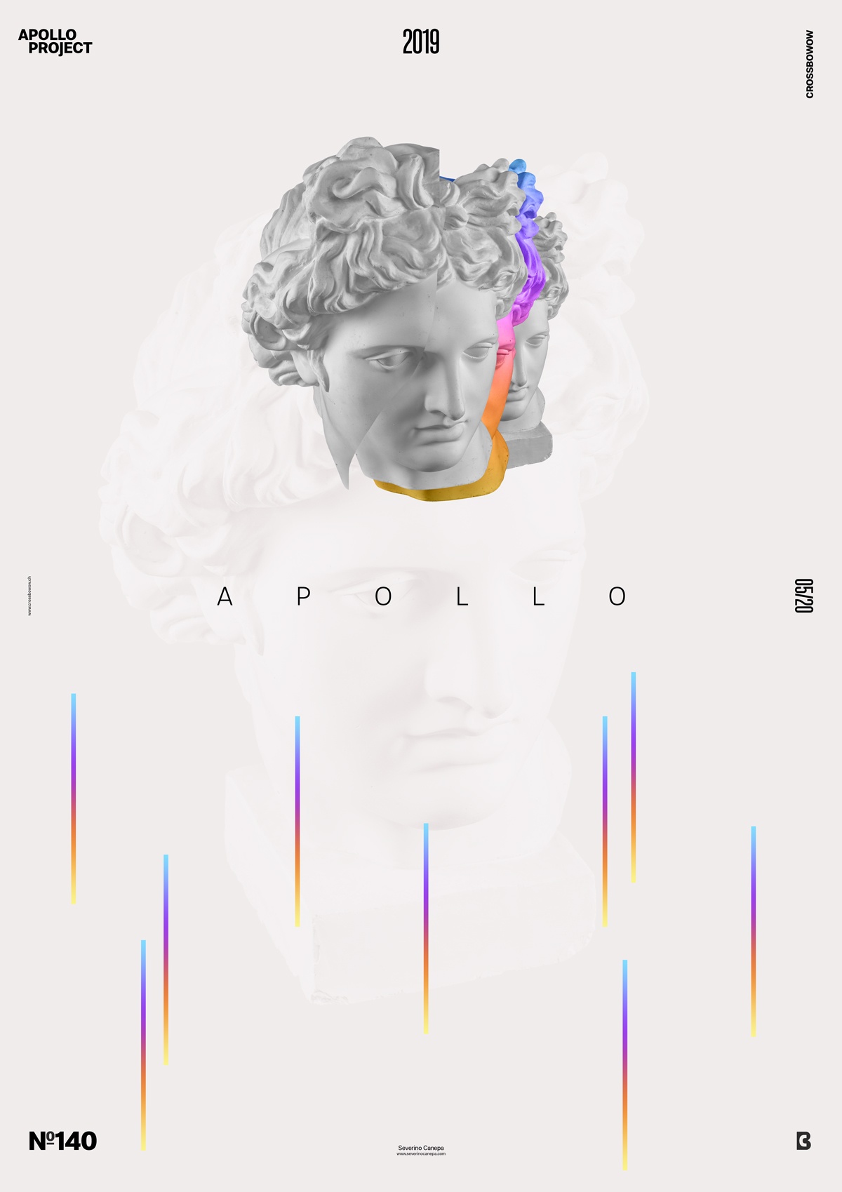
I started by filling the background with light grey and adding Apollo’s Statue, which I duplicated two times. I position the title in the center of the canvas with a 2400 track. Later, I tried to insert a diamond filled with the yellow, orange, purple, and blue gradients down the poster and play around with some lines. I also place two shapes on the bottom corners, but they don’t work. I remove them to allow the layout to breathe.
I divided the poster into three sections. On the top is Apollo’s Statue; in the center is the title, and at the bottom are several lines. I connected them by adding a light shade of a large image of Apollo.
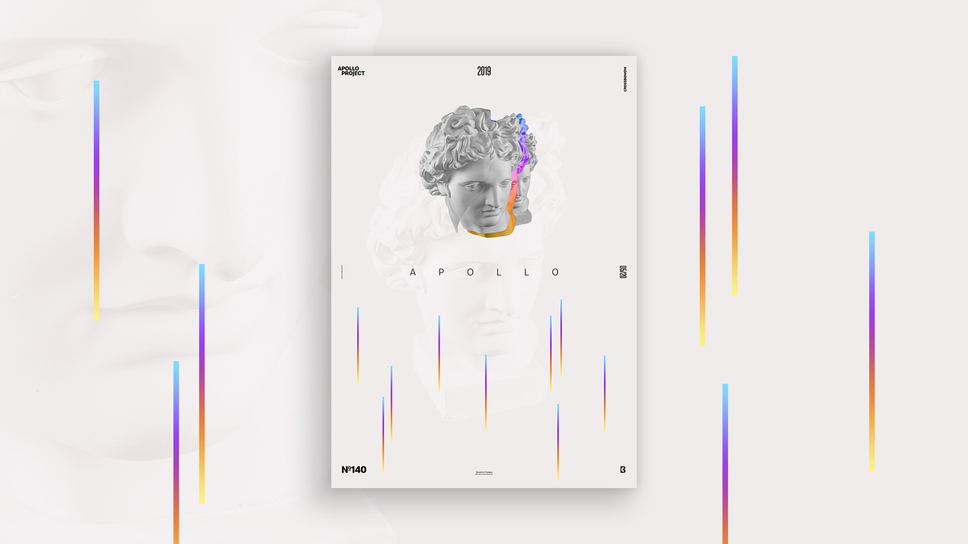
Speed Art Poster #140
It’s another good day to design a poster! I hope you enjoy watching my speed art videos. They will teach you how I made the poster and the options I used in Photoshop. I see you tomorrow for poster #141!