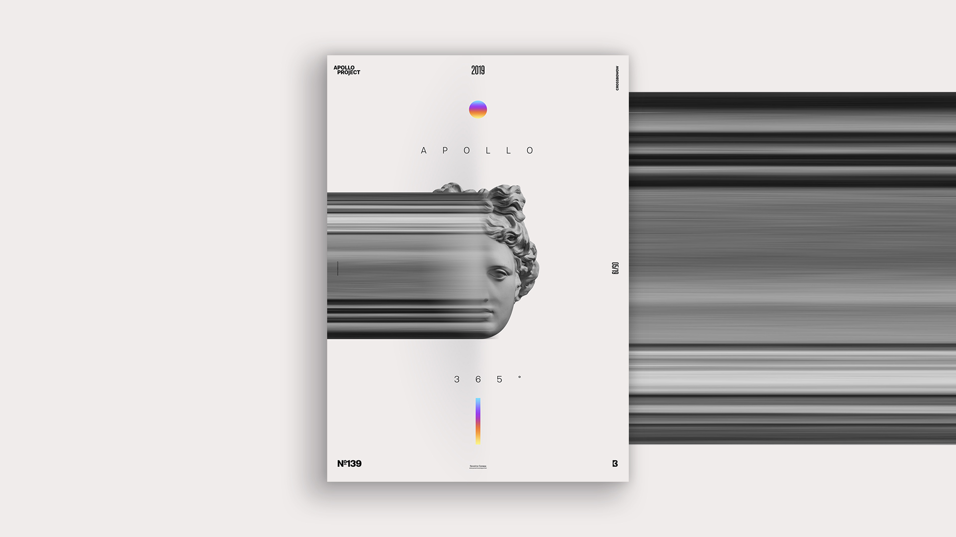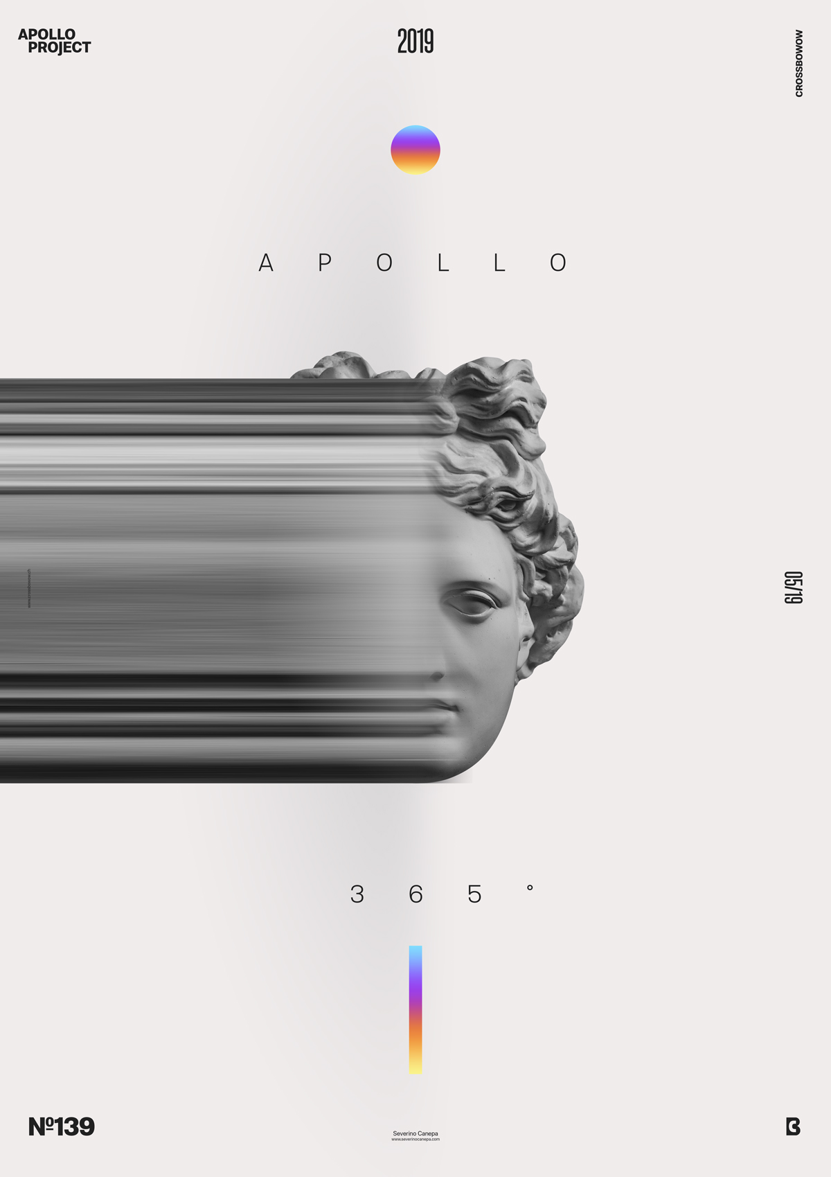
Poster number fifth of the Mini-Series named Up-Gradient. To create the poster, I used Apollo’s Skull. To change than usual Apollo’s Statue.
The design
Contrary to yesterday’s poster, this poster is clean and minimalistic. I already said that minimalist designs aren’t easy to create because every element must be considered in terms of spacing, size, weight, balance…

Up-Gradient #5 arranges its elements in a vertical symmetry except for the half-part elongation on the left of Apollo’s head, which is horizontal. That contrasts nicely and creates visual tension between the poster and the horizontal elements. It is a point of entry to the viewer’s eyes.
To help me get a unifying visual, I cut Apollo’s Pedestal and neck only to show its face. The Pedestal disturbs the eyes and gets tired of it. Apollo’s face floats in the hair and adds a touch of mystery.
Speed Art Poster #139
I hope the Up-Gradient poster inspires you. If you’d like to see me work on its design, check out my speed art video!
Thank you for paying attention to my work, and see you tomorrow for poster number #139!

