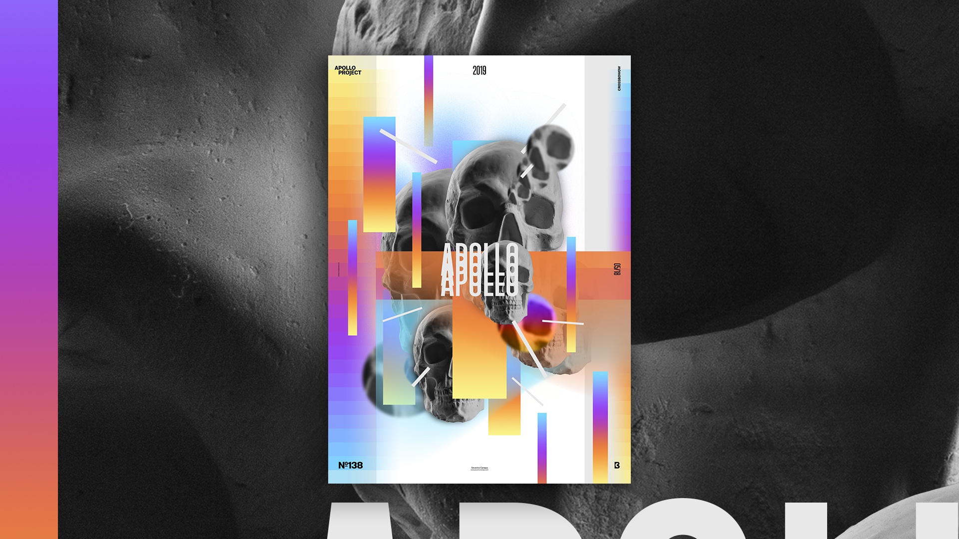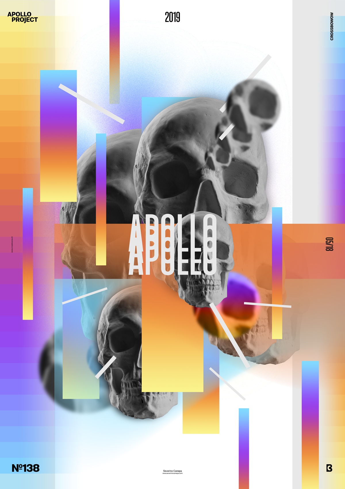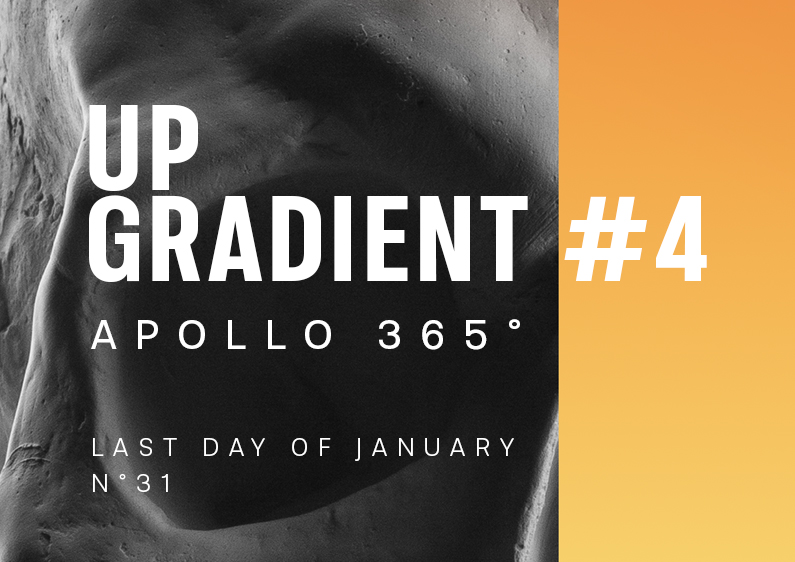
This is the fourth Poster design made for the Mini-Series named Up-Gradient. To create the poster, I used Apollo’s Skull. To change the usual Apollo Statue.
The design

To change from the usual picture of Apollo, I used its skull—let’s pretend it! I made several versions of the design as I progressed. This allows me to view easily the path I made in an hour and come back to check elements if needed. I wasn’t sure where I wanted to go today, so I saved some files.
The third poster, Up-Gradient #4, has colorful gradients, lines, and layers. The idea is to explore different possibilities left by the first posters of the mini-series.
Speed Art Poster #138
I hope the Up-Gradient poster inspires you. If you want to watch me work on its design, check out the speed art video I made!
Thank you for paying attention to my work, and see you tomorrow for poster number #139!

