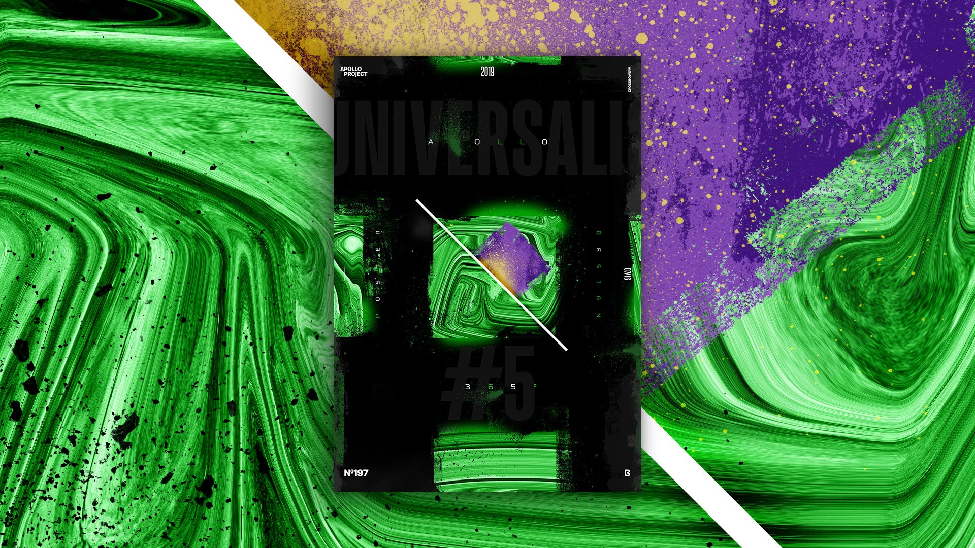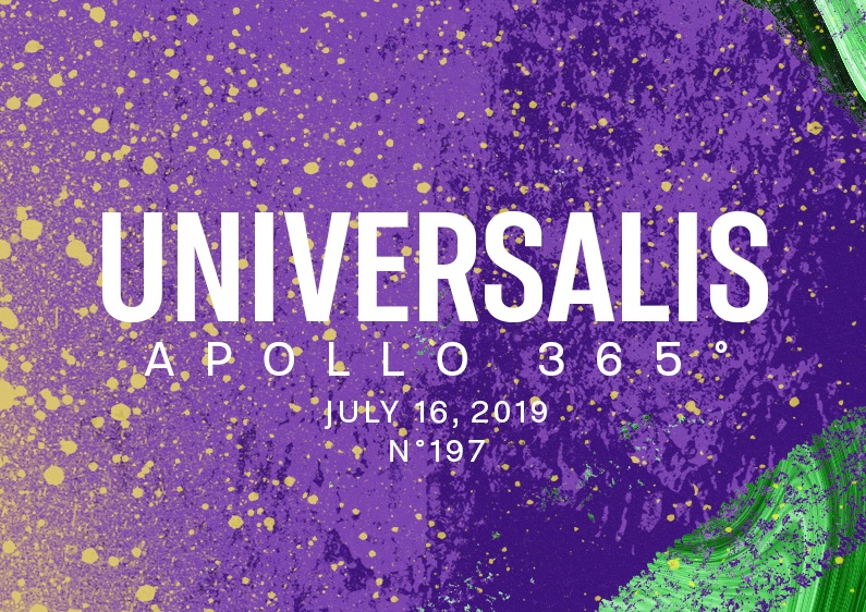
Universalis #5 Poster features a green square and many more dust particles and grunge effects.
The Design

The layout and the idea are the same behind Universalis 5. Except for some details, such as the colors, the square, and the fact that I used many more brushes to create this grunge look.
I know I should find another way to express myself than the Liquified version of Apollo’s picture, but I like it, and it has become my go-to style. After this poster mini-series, I won’t use it anymore! I am making the Apollo 365° Challenge to change my style and discover new ways to express myself as a graphic designer. Grow up, in other words!
Speed Art Poster #197
Today was warm, and designing a poster was a good day! As usual, I have made a speed art video to check how I realized it.
I changed the videos a few posters ago. I also changed their speed, so if you like it that way, let me know! See you for poster #198!

