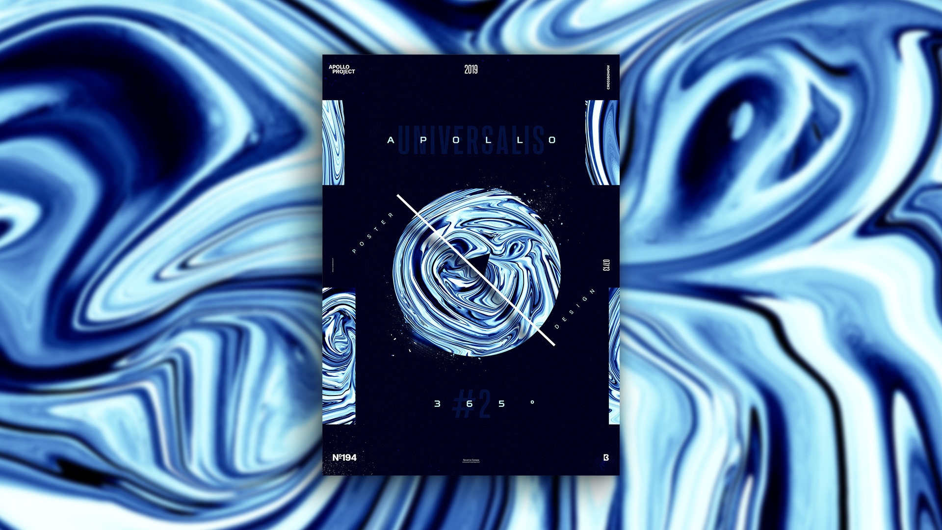
Yes, it is! I started a new mini-series named Universalis Poster because I greatly liked yesterday’s creation! So, I decided to follow up with this style of design.
The Design

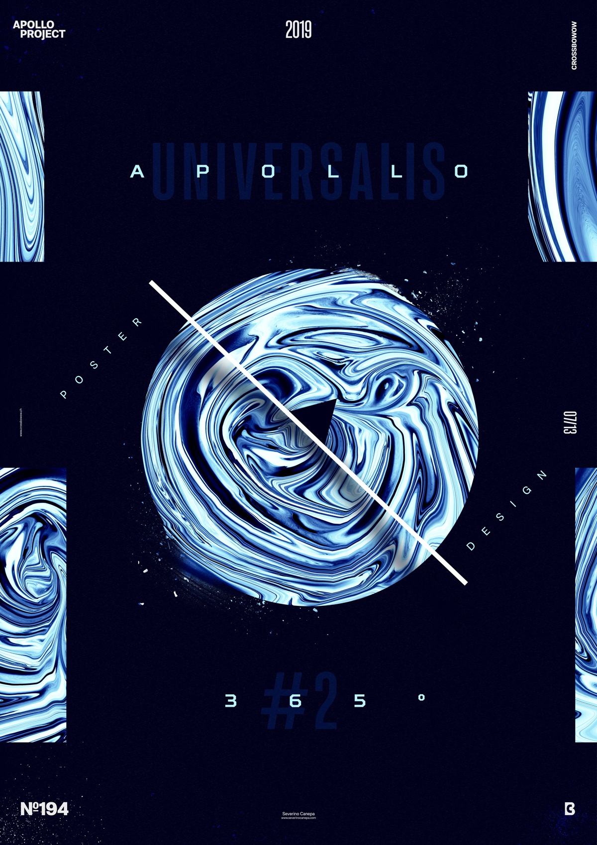
I used a dark blue background and a liquified form of the picture of Apollo’s Statue, which is the form in the center. I created a line with a white stroke and added a shadow below to make it stand out. There is also a title with two different typefaces—for the second time since the Apollo 365° Poster Challenge started. I brushed a dust particle around the circle to generate something more vibrant and add details to the canvas.
The layout looks like yesterday’s poster but with some minor changes, such as the direction of the typography and the rectangle on the side. I also added some very light dust particles around the corners of the canvas, which are almost invisible.
The Challenge of today’s poster was to create something similar to yesterday but not too similar. Finding the right balance was the key. I added a few details—they are small, but they are there!
Speed Art Poster #194
Another satisfying poster! I hope you enjoy the speed art video I upload every day. Is the speed okay for you? Let me know.
I’ll see you tomorrow if you want to see what poster number 195 looks like!

