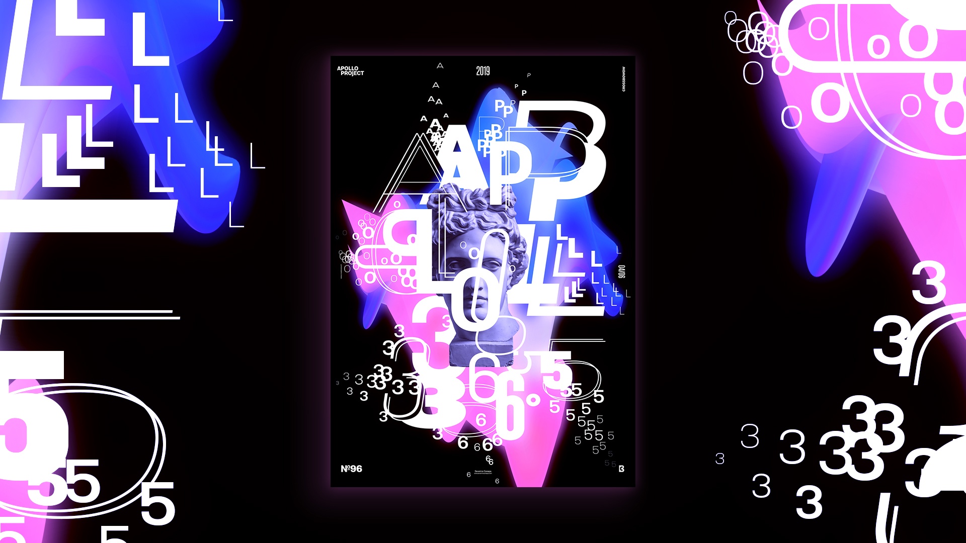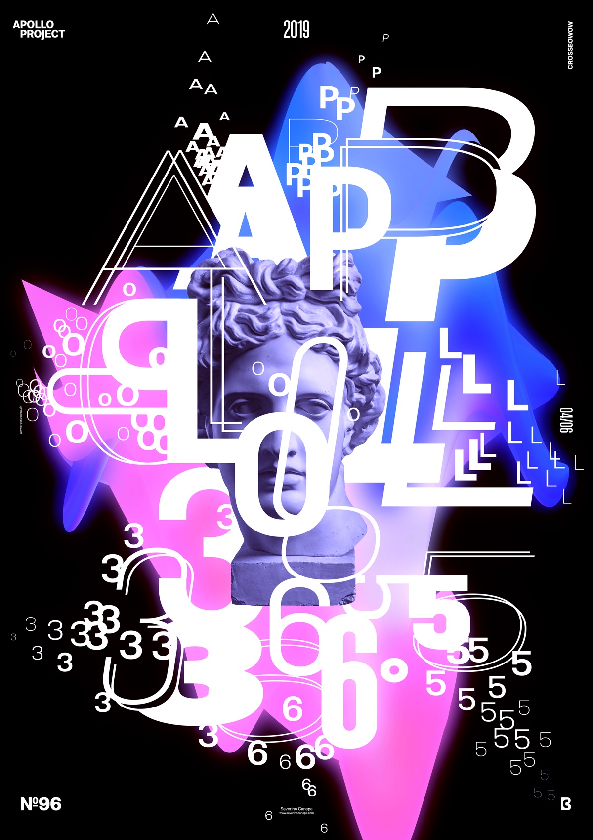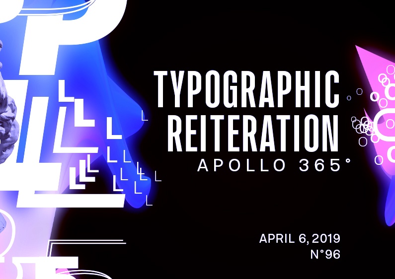
On poster #96, I explored typography and played with different variations and sizes, which I duplicated many times.
The design

I started arranging the letters on the poster’s corners and realized it wouldn’t work. I reduced the font size to play around with font variations. The result was immediately good to my eyes, and I continued this way. I also added a very colorful gradient in the background, added a radial blur, and modified it as an abstract geometric form. I duplicated the form and created a new one to create depth.
I fixed the colors and combined many smaller letters around the biggest to add depth. That brings an excellent senses of movement and dynamism to the composition and fits the background’s abstract form well.
Speed Art Poster #96
I had a perfect time designing this poster, and I hope you will feel it in my speed art video. You will notice how I did it and all my steps to get this result.
See you tomorrow for the poster design #97!

