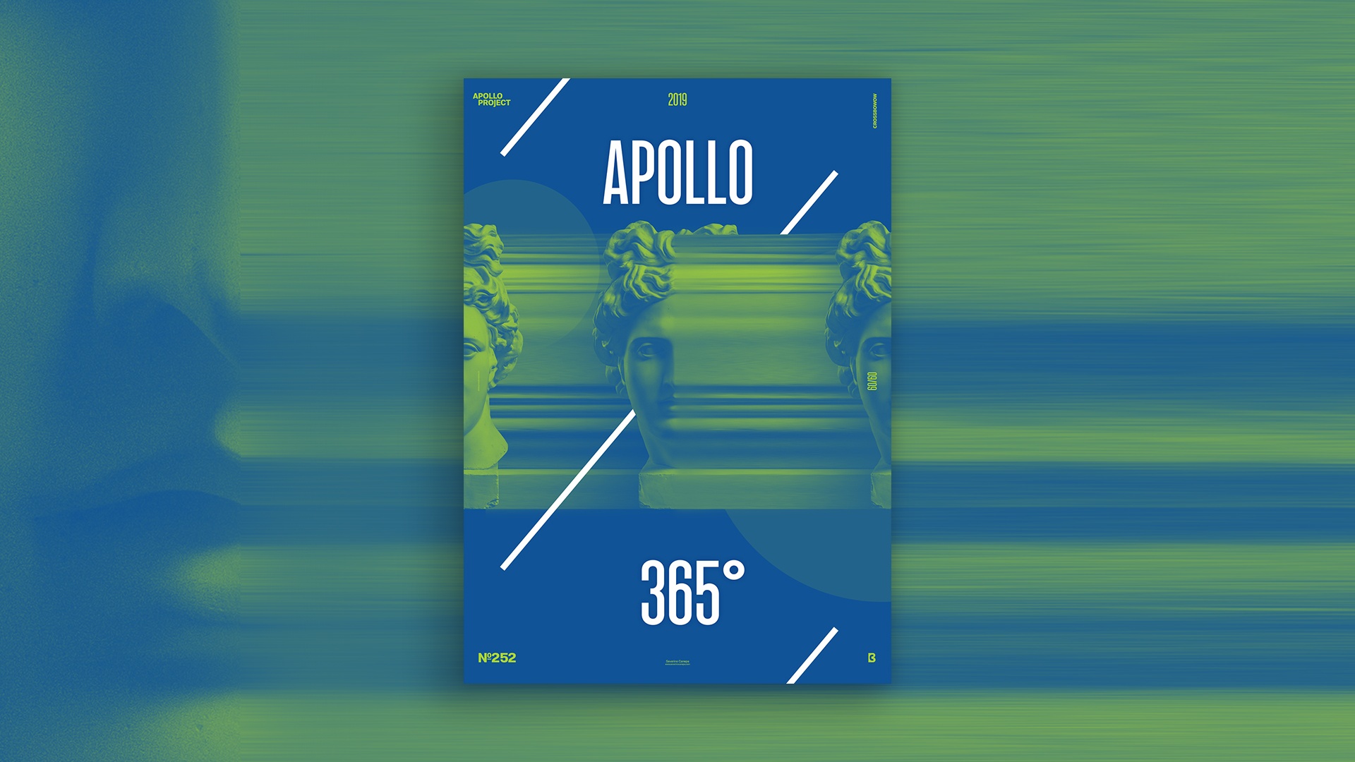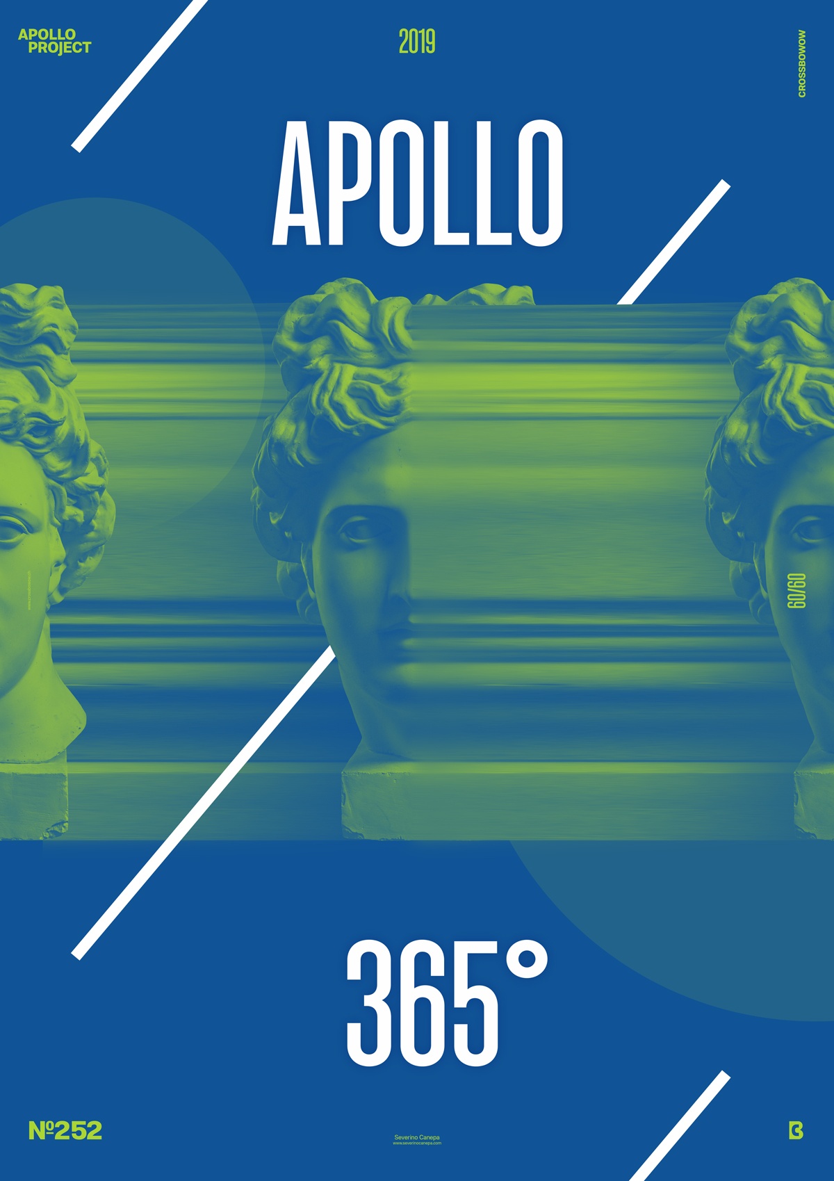
Today, I made another Duotone Poster only because I felt it like that. I wanted a green-blue design with clear white stuff on it. I have a dream, and I make it accurate!
The Design

I know there are two ways to make a duotone poster. The solution I used today is more straightforward than the other and a bit less technical. I used an Adjustment Layer and hit the Gradient Map option. Then, I selected my two colors, and it was done. You must place this new Adjustment Layer above the others; otherwise, they won’t be affected.
After setting my Gradient Map, I duplicated Apollo’s picture two times. I placed one image on the left and the other on the right side of the canvas. I selected a thin area of the center of Apollo, duplicated it, and extended it to the right side of the canvas. One more time, I duplicated this form and put it behind all the pictures of Apollo. I selected the layers of those shapes and added a Gaussian Blur to accentuate the sense of speed.
To get white, I created other layers over the Gradient Map layer with the title “Apollo 365°” and a line that I duplicated on the top and bottom. If you don’t put layers above the Gradient Map, you can only get the green and blue colors because this Adjustment layer affects all the down layers. It colors them all.
Speed Art Poster #252
I can add one more line to my “kill count” today because I made one more poster!
I am glad to introduce you to Speed Art Video #252, which I handcrafted with love for you! You can watch me working from beginning to end my creative process. So, please take a look at the video and let a review or a thumb if you like!
I see you tomorrow for poster number 253!

