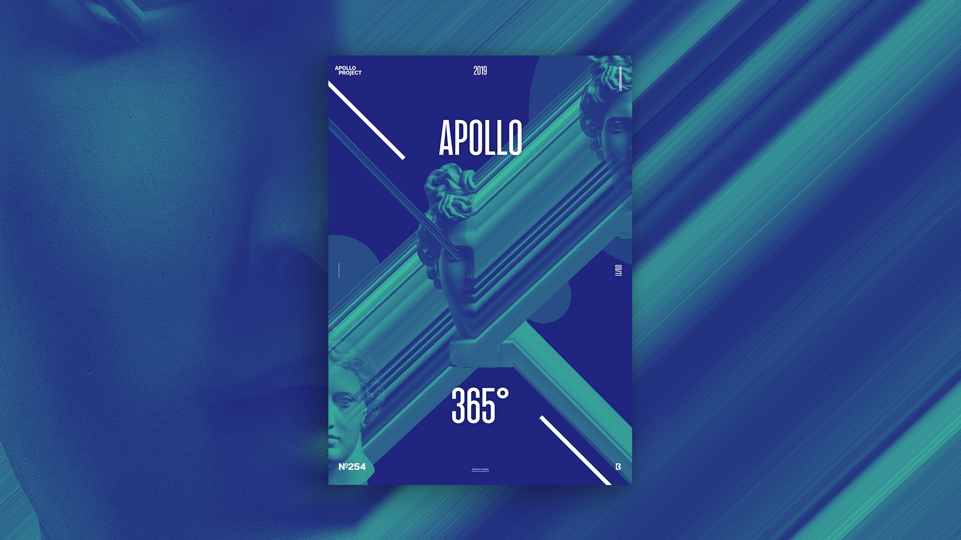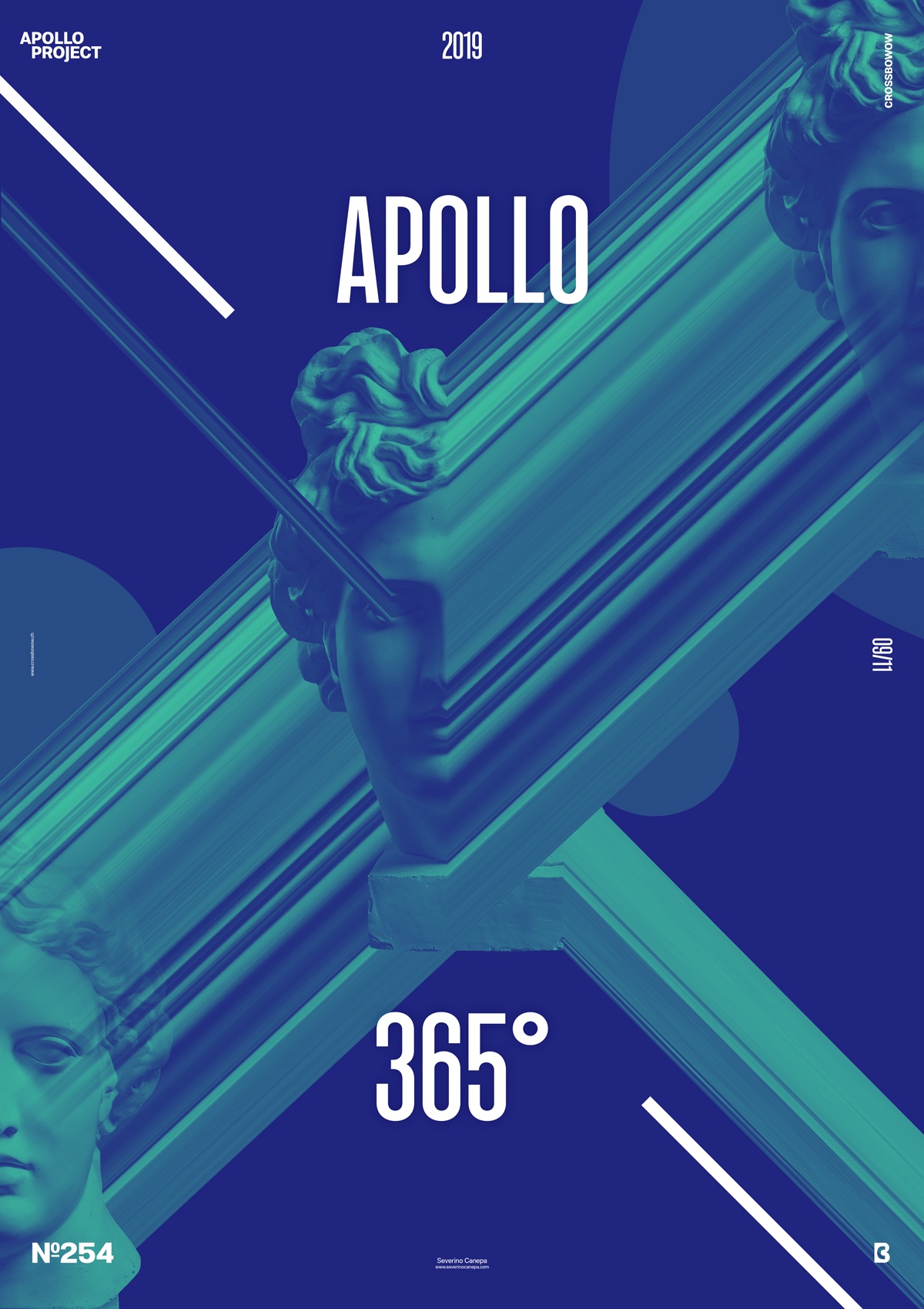
I welcome you to the third poster of the mini-series “Transition.” Today’s design explores the style and composition of the previous creations.
The Design

The two previously made posters used the same style and process except for the colors and composition. On today’s poster, I made it look like a cross with the distorted effect of Apollo and the white lines. The elements follow a 45° angle except for the typography.
Poster Transition 3 is successful because of its dynamism. You don’t know where the pictures start and where they finish. The light aqua blue and the darker blue naturally work well together and help the poster look good and fresh.
I used the same trick as yesterday, such as selecting only a small part of the picture of Apollo and extending it over the canvas. This adds a welcome touch of weirdness to that poster’s style and adds strong visual interest to the overall meaning.
Speed Art Poster #254
For the 254 times, I register my screen while working on the Transition 3 poster.
That means the Speed Art Video #254 is ready to be watched on YouTube if you want to see me working. I am tired, and I wish you a nice day. I also invite you to take a look tomorrow at poster #255!

