I could not follow my alarm clock this Sunday, so I woke up later than usual. At least I heard the alarm—sometimes, I pretend not to listen to it while half sleeping.
Wake up late and, of course, start to design late.
The Design
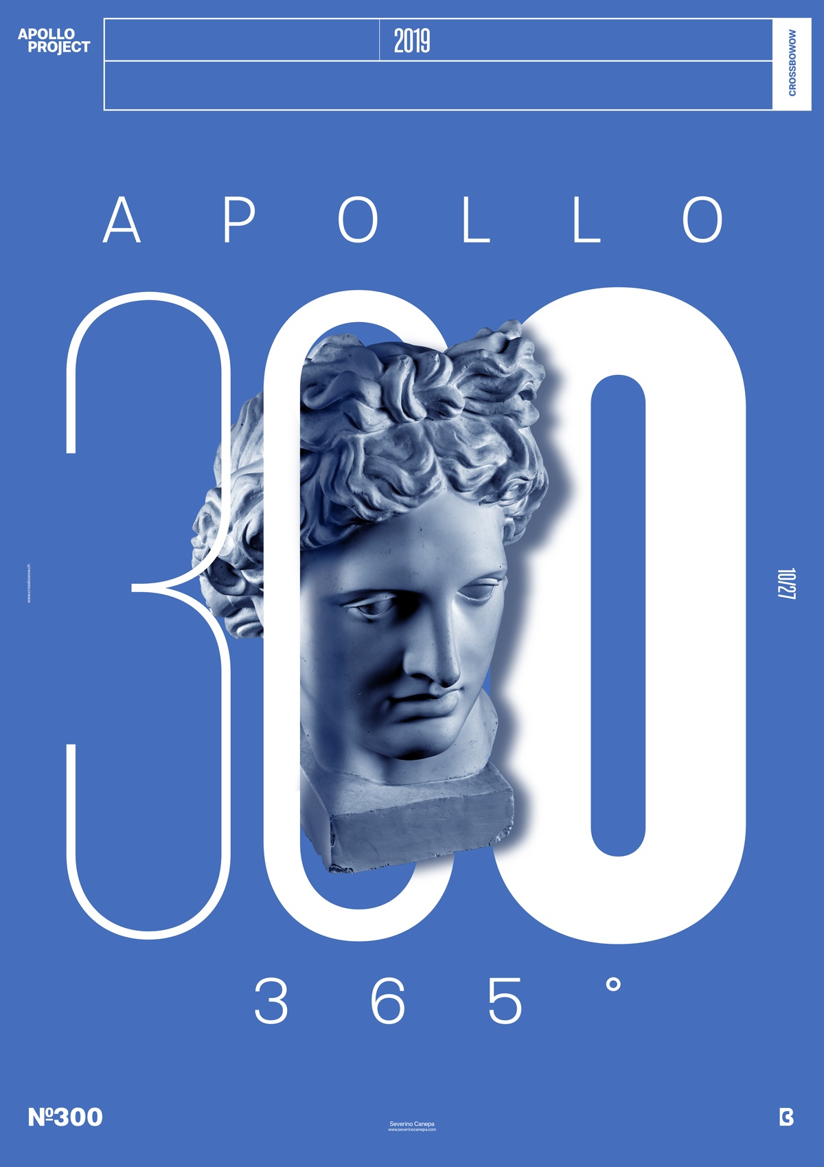
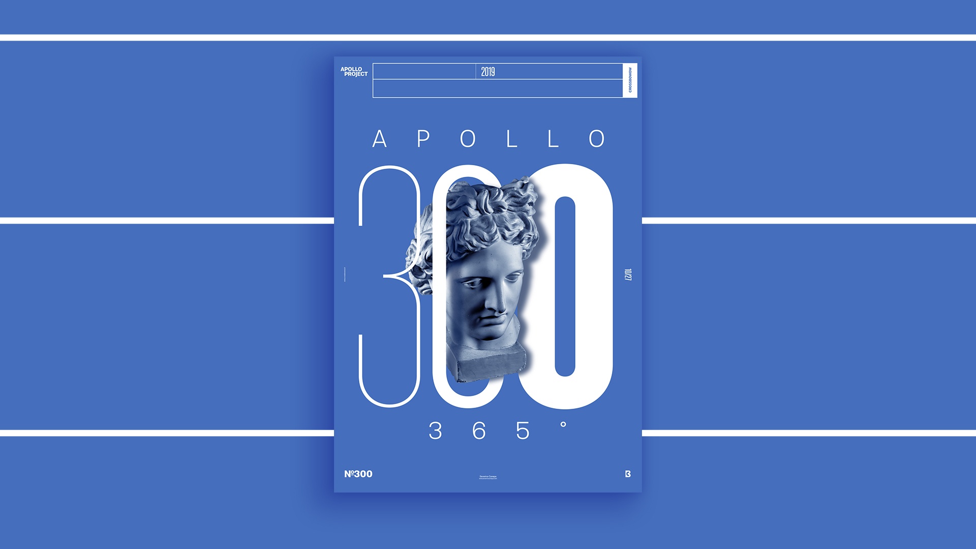
I took a break from the mini-series “Objective” to celebrate poster number 300 because it is symbolic. This number of posters is impressive and represents a lot to me. They mean that I successfully followed a self-imposed goal for one year. Okay, I didn’t finish it now, and I still can fail it, but I think there is not a lot of luck that happens.
I wanted to create a minimalist poster that was simple but effective. I started by writing the number three hundred and enlarged it as much as possible. I set the number three to signify the incrementation with a Thin Variation of the Typeface, a semi-bold, and a heavy one.
I am playing with typography and Apollo on this poster. I created subtle shadows on Apollo passing through the second zero and Apollo’s shadow on the last zero. These little things add depth to the poster and make it stand out.
Speed Art Poster #300
You can look at the speed art video tutorial 300 for the third time. It is not a piece of huge news if you follow me because you know I made a video for each poster I created this year. So, I was hoping you could take a look and let me review them; I appreciate them!
See you tomorrow for poster number 301! Have a nice day!
