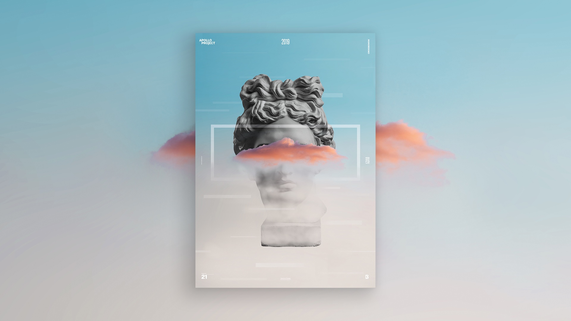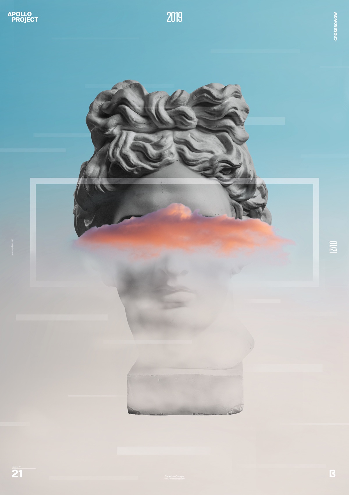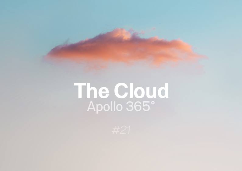
For today’s poster design, I inspired myself with a picture of a cloud in the sky made by Alex Andrews.
The picture is interesting for a photo montage because of its separation generated by the blue sky and the grey smog.
About The Cloud Poster Design #21

Even before I began to design and asked myself what I would do, I knew I’d have to use the blue and grey separation made by the mist on Apollo’s Head to hide its bottom part.
I use a white transparent rectangle that passes in front and behind to create a more interesting composition. In addition, I use some lines in the picture with different blends and thicknesses.
The Cloud Conception
Making Off
From yesterday, I stop to convert the .mov files to .mp4 to make the video montage, and the result is much better.
Please don’t ask me why I did that before.
I hope you will enjoy my working on this Poster Design that I titled “The Cloud.”
See you tomorrow for the number 22!

