Sometimes, an idea looks great, but once you start implementing it in your software, you notice it isn’t so clear. This happened today with Poster Design #227.
The Design
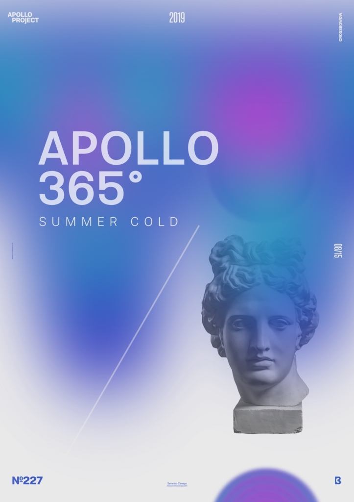
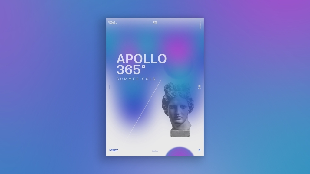
I knew that I wanted to create a minimalist poster with typography and, of course, a picture of Apollo’s statue. I had an idea about the colors because, for one time, I knew the theme I was about to explore. I am in Switzerland. It is summer, but the weather is cold, freezing in the morning and the evening. It depends on whether the sun is shining in the noon and afternoon.
I illustrated this change in today’s poster by using some touches of red inside a large area of blue. I drew them with the Brush Tool and passed the layer under a Gaussian Blur Filter two times to melt the colors better. That is why some parts seem purple. I did that to warm up the poster a little bit.
After finding the correct typeface variations and combinations, I added a light grey line to break the focus direction of the title and Apollo’s statue. I also created two circles with the Liquify Filter, one on the bottom right of the canvas and the second one at the intersection of the title and Apollo.
Speed Art Poster #227
It was another short day because a customer called asking for a quote to design a project. It was a surprise , and it brought additional work.
Whatever time I had to spend designing a poster, I did it, and you can take a look at speed art video number 227.
Check my website tomorrow to see what it will look like for poster 228!