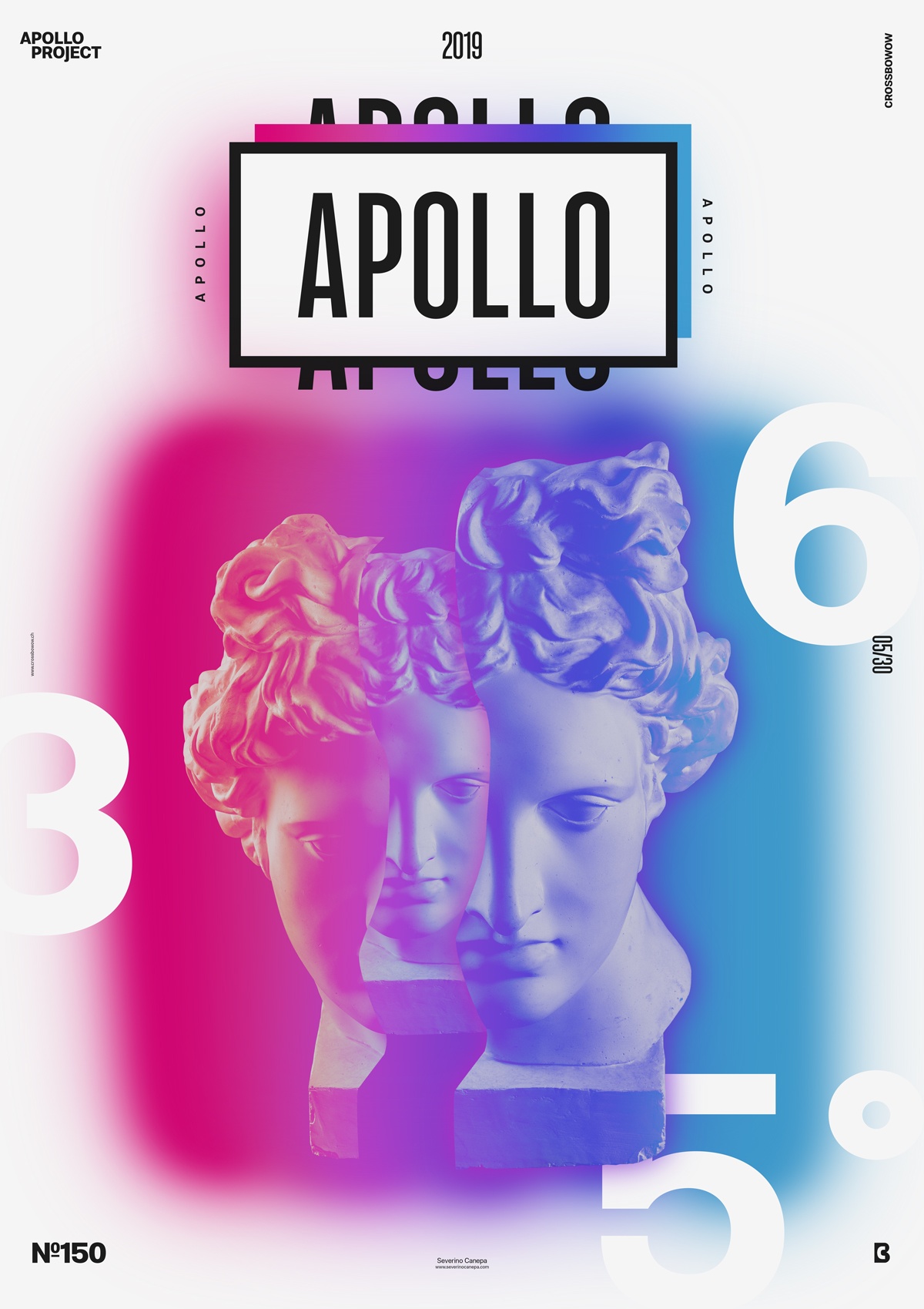
If you follow my work for the Daily Design Challenge Apollo 365°, you will notice that I already used a layout on Divided Attention that looks like today’s poster.
The design
Please don’t ask me why I like it when a rectangle surrounds the title with thick strokes. I have no other answer than that it is aesthetic. It’s like protection against other design elements and highlights the title. I ultimately like this style.

Because I’ve got the layout, it didn’t take me long to deal with this poster. Finding the right color combination, slicing the picture of Apollo, and placing the numbers was the only thing I had to do.
Speed Art Poster #150
Hey! I hope you enjoy this poster design. I made a Speed Art Video where you can watch me working on it. So, if you are curious, take a look! Have a nice day, and see you tomorrow for poster number 151!

