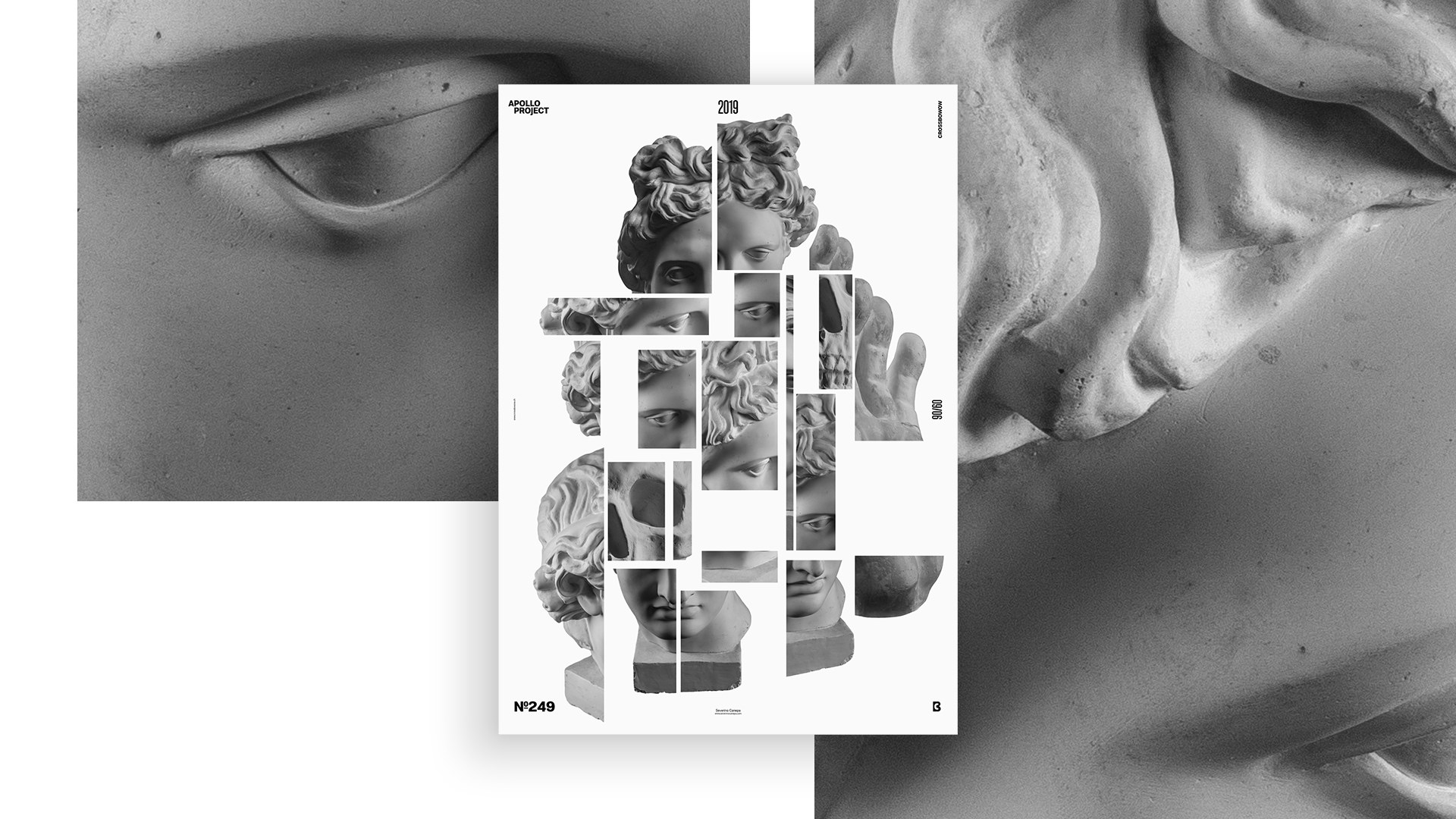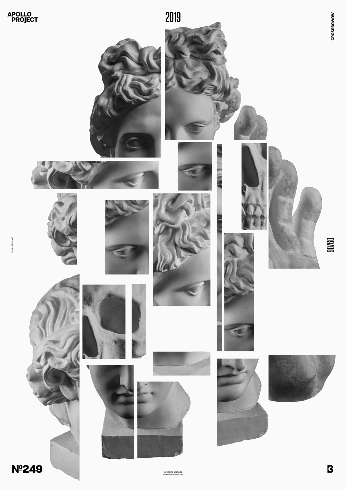
Two posters ago, I did some construction with different pictures of Apollo. The result was so lovely that I decided to try it again with a different mindset and idea. The result is good; as usual, it deserves more working hours.
The Design

The concept is pretty simple, and I am sure you already saw something similar—nothing new under the sun! However, the composition, images, sizes, and arrangements are different.
I imported all of my pictures of Apollo and started to select the area inside. I copied and pasted some parts and disposed of them near each other. The important thing is playing with the negative space between the rectangles. They create most of the poster’s dynamic. The rectangles of Apollo play a role, too, but they have less impact than space. The most impact you can generate with them is to contrast each piece with a large difference in size.
Speed Art Poster #249
Another day, going late to bed. There are many things to do, and not enough hours in my day.
If today’s poster is not too complicated, look at Speed Art Video #249 for inspiration.
Come here to check poster #250 tomorrow! Have a nice day!

