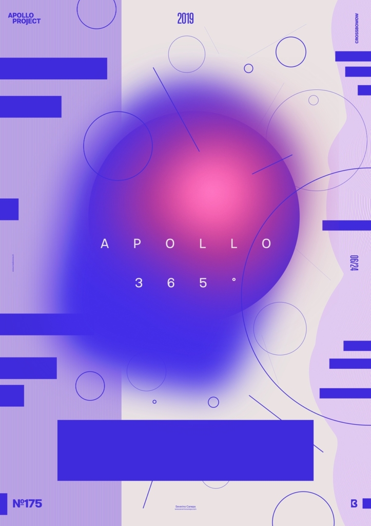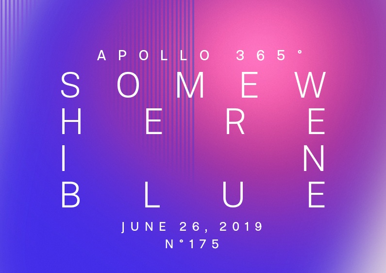
The first day of the week was good for designing a poster without using Apollo’s picture. The result is a geometric design in blue and purple colors.
The design

I let my mind go everywhere she wanted. I tried to relax and bring back the enthusiasm I felt during the first days I started this Challenge. Except for the fact that I don’t want to use Apollo’s picture anymore on my posters, I am feeling friendly with them. Apollo is a burden, and I am thinking about making some 3D version of its face to get more pictures to play with—do it; this is a good idea!
I started by setting a light grey but warm background with a slight red inside the color because I knew I wanted to use blue. Then, I created a blue circle. I duplicated it and applied a Gaussian Blur to it. I changed its form, duplicated it again, and used a Noise Filter. For the rest, I played with shapes and patterns.
Speed Art Poster #175
Like every day, you can watch me work on this poster design in the Speed Art Video.
I see you tomorrow for the number 176!

