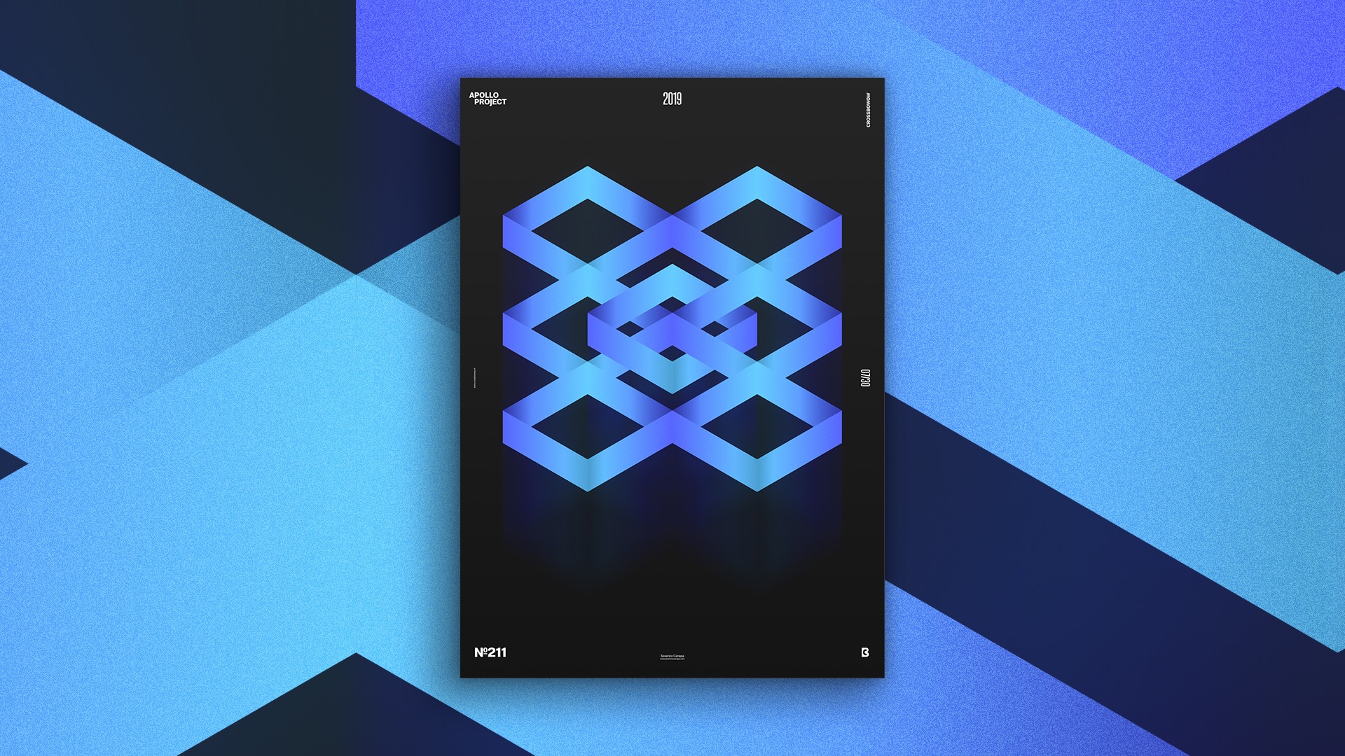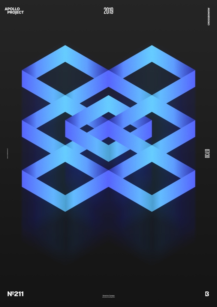
Poster Rounded Edges #5 is a minimalist, clean design with an optical illusion! I am proud of the result and was also surprised.
The Design

I approximatively knew what I wanted to create with today’s poster. I have to thank my sketches for that reason! I started the design by trying to create a rectangle only with strokes by following the guide of my isometric grid. After making some imperfections, such as shadows that didn’t fit precisely the blue stroke layer or even two anchors not perfectly posed on each other, I finally started it over.
Once I did it, I duplicated the square and played around with its shapes to see what I could create until I found the result you can appreciate on the left. Without forgetting, I tried to incorporate some of the rectangles I previously created on the other posters. It was unfortunate and unnecessary to catch attention, and the canvas needed no additional forms to be nice.
Once I finished the design in Adobe Illustrator, I passed it through Photoshop to polish the global look. I added noise and blur Filters above and under my geometric optical illusion. Those effects bring other depths and textures to the poster, and that’s welcome.
Speed Art Poster #211
I still feel sick, and I fell asleep around 5 a.m. It was the occasion to contemplate the sun’s rays through heavy fog! The atmosphere looked yellow and brought weird lights.
Except for that chapter, I made the speed art video number 211. And guess what? I met some problems again! With Quicktime, which didn’t want to register the video, only kept the last two minutes of a 20-minute record. So frustrating!
You will miss the Photoshop part that I described above in the video.
Thank you for being there, and I’ll see you tomorrow for poster number 213!

