I realize it would be better and more straightforward to design this Poster Mini-Series with Illustrator instead of Photoshop. Firstly, because I am more familiar with Illustrator, this design challenge equalizes my knowledge of Photoshop with Illustrator, and secondly, because it is logical.
The Design

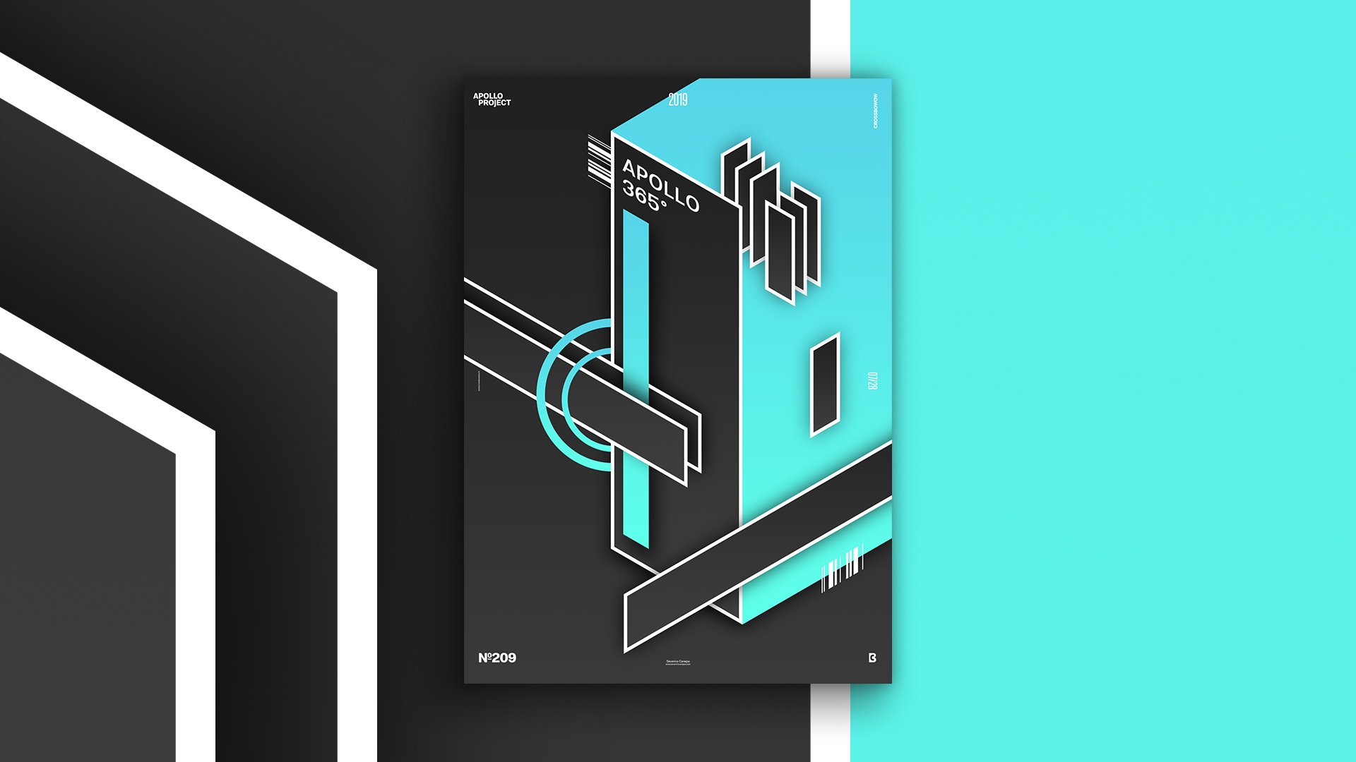
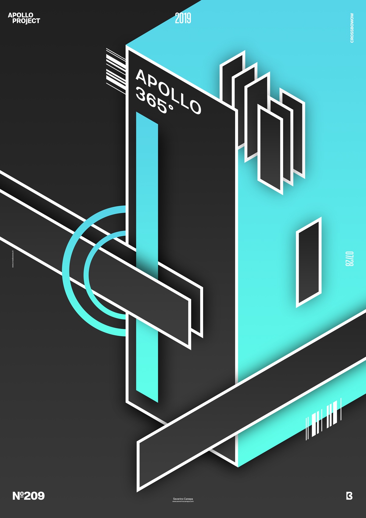
To create this poster about isometric design, I used small geometric forms and colors to contrast large and small. It also looks a bit minimalistic only because I wanted something sober. The few elements I used resonate together and follow each other in one line or another, like imperceptible rules.
I like the large blue gradient, which gives the principal rectangle a sense of speed and movement from point A to point B. The smaller rectangle inside this blue gradient and behind the large rectangle suggest that the gradient isn’t in three dimensions and brings the wow effect to the poster.
When I tried to create an open square, I noticed I was not using the right software for isometry. I decided to continue with Photoshop and finish today’s poster.
Speed Art Poster #209
A good day to design a Poster!
If you are interested in how I created the Rounded Edges #3 poster, watch speed art video #209.
Have a nice day, and see you tomorrow for Rounded Edges #4.

