A word about the Design
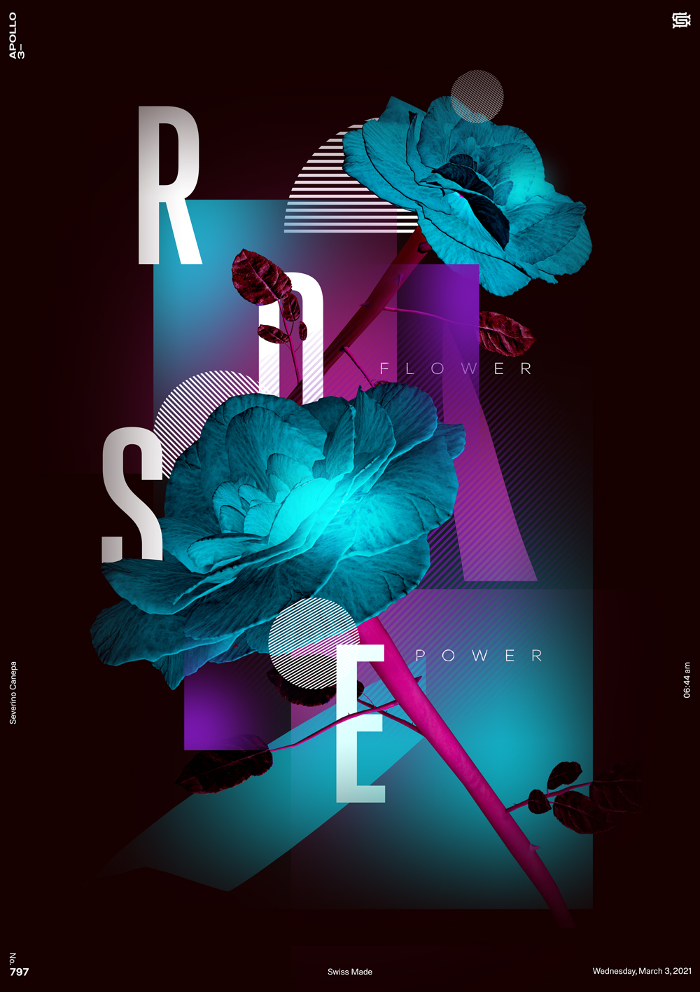
I attempted to create a design inspired by the one I made yesterday, and I must admit that I made a better creation the day before.
It was the beginning. I was fresh and motivated, without any expectations about the result. Instead, today, I had expectations, and they were maybe too heavy to deal with. This could be why I could be happier with the design. The composition works well. The poster is nice, but less nice than yesterday. The composition needs freshness.


