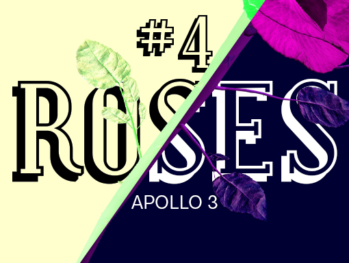
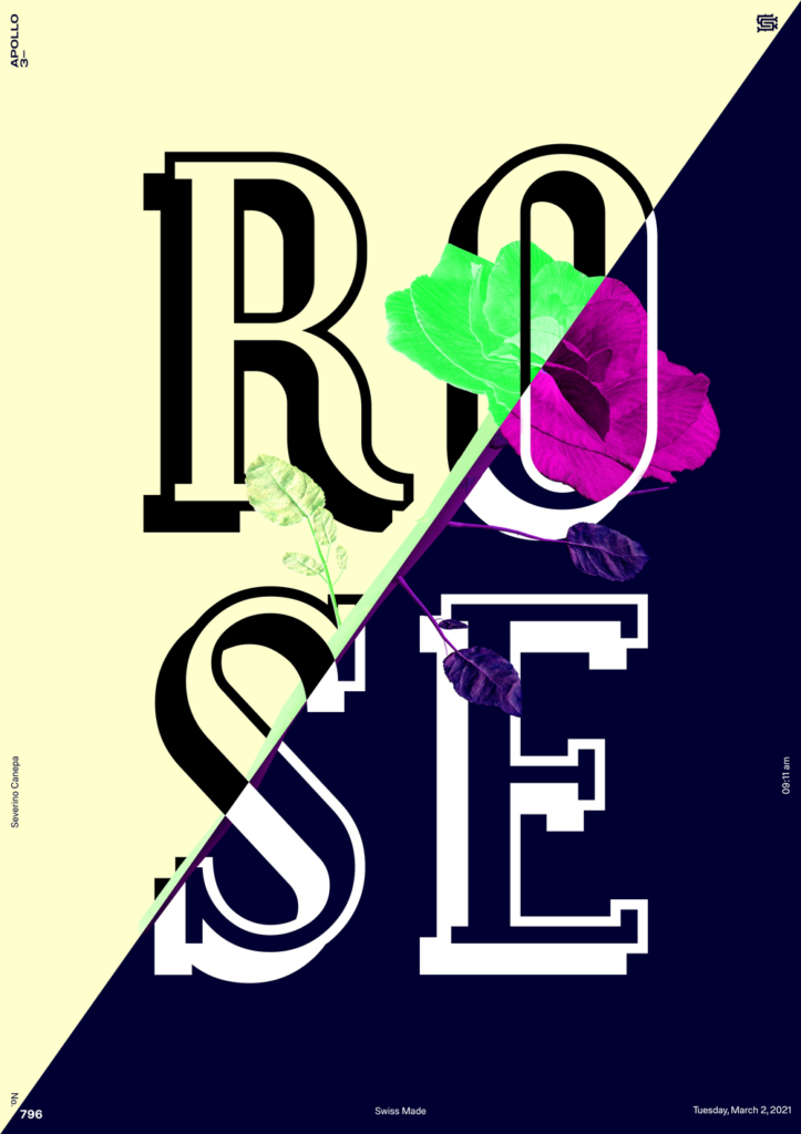
A word about the Design
I like the color contrast on today’s poster: the pastel yellow and the deep blue marine work perfectly together. The serif font is also a good choice. I’m unsure about the slanted separation of the two colored areas. It might look better if it were slanted vertically or horizontally.