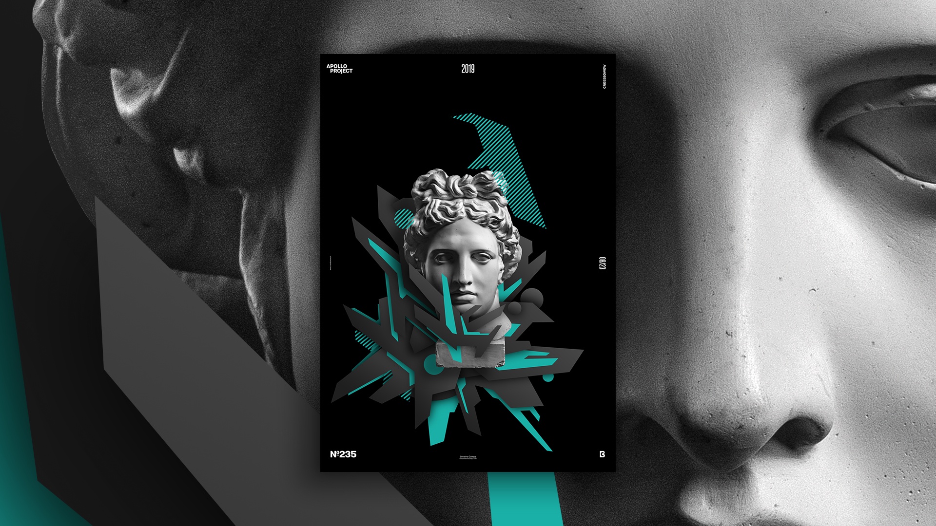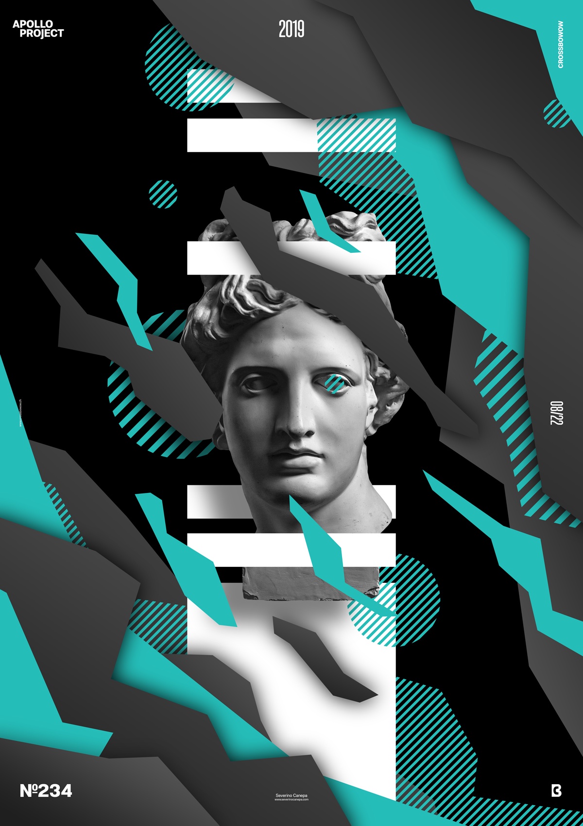
It’s another short day to design a poster. I am on poster number seven of the mini-series Ridge, and I continue to explore a mix of geometric shapes with a futuristic style. I don’t know if it’s a futuristic style, but the sharp angles and style make me feel that way.
The Design

As a color, I chose another kind of turquoise color, which looks like yesterday’s design with a bit bluer inside. When I saw the design now, after I finished the design and had a break, I noticed that Apollo was not well placed in my focus point. The focus is on the left, and Apollo is in the middle. I also noticed only now that I should use the image of Apollo to generate geometric shapes, too. The poster may look better, and I should add color and set a blend mode.
When you do something else for a moment and return to your work, it is as if you have a new eye for your design. The mistakes become apparent, and some details jump to your eyes. The details you didn’t see with your nose too close to your computer. Something to care about sometimes and to remember! When you are busy and in a hurry, you miss some things, such as a bit of detail, and you start to forget the simplest tricks.
As previously stated, I play with the shapes and superimpose them on each other to create depth. The geometric shapes and their sharp angle direct the eyes in all directions from the outside and redirect them to the focal point when the eye follows them inside. I did it a little today, but I should have used more shapes in front of Apollo, so why not duplicate him several times here and here? I am writing that for tomorrow’s poster.
Speed Art Poster #235
Holidays make my day shorter! Whatever time I have to spend designing a poster, I use it efficiently as much as I can. I said it before, but the more time you spend on something, the better it will usually look!
Here is Speed Art Video #235. It is available on YouTube. Look at how I created today’s poster, and come to my website tomorrow to watch Ridge #9.

