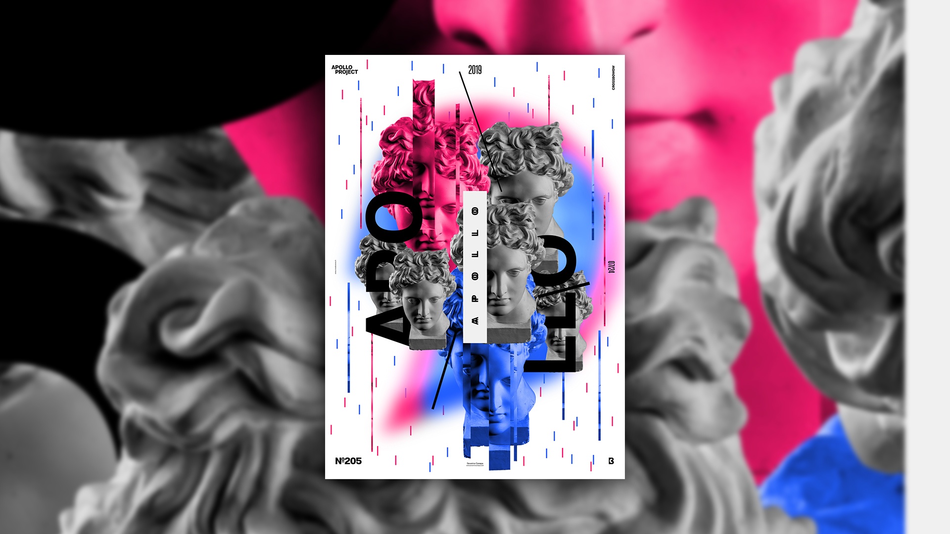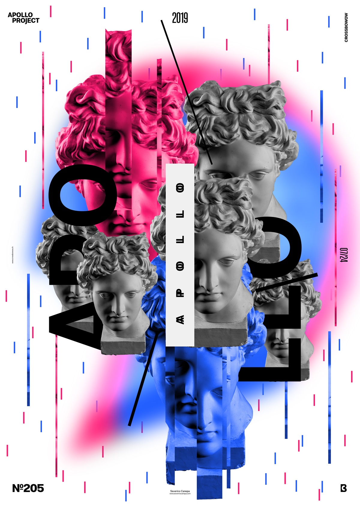
I let my imagination go everywhere and came up with a new and fresh poster design freely made without constraints—except for using Apollo’s Picture and Molde Typeface!
The Design

As often with the Apollo 365° self-imposed challenge, I don’t know what I will create. It is the same for me; it is a surprise . Sometimes, this strategy is good, and sometimes, it is not. This strategy pays off today because the poster has depth, is playful , and is visually attractive.
If you take a look at the speed art video, you will notice that I was about to create something that looked different from the one I finally created. I made some large grey rectangles on the background, and I started to cut inside Apollo’s head without a reason until I noticed it.
Then I started over and placed several of Apollo’s heads on each other in different sizes. I had a title with a white rectangle and added more significant types in between. To finalize the design, I added two colors to two statues and thin rectangles in blue and red as a rainy background.
I was researching aestheticism with this design, and ideas came individually while doing the design.
Speed Art Poster #205
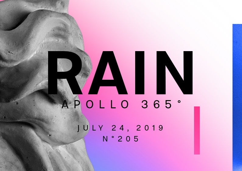
Today was a hot day for designing the Rain Poster. As usual, you can look at Speed Art Video #205 to see the steps I took from start to finish of the creation process.
See you tomorrow for poster number 206!

