Today, something made me very angry. I was recording my screen until I needed to stop it, and then suddenly, an incomprehensive message from this fuc**** app named QuickTime Player appeared. From twelve minutes or around of my video, only two were recorded. I opened Google directly and asked which app was best for screen recording.
The Design

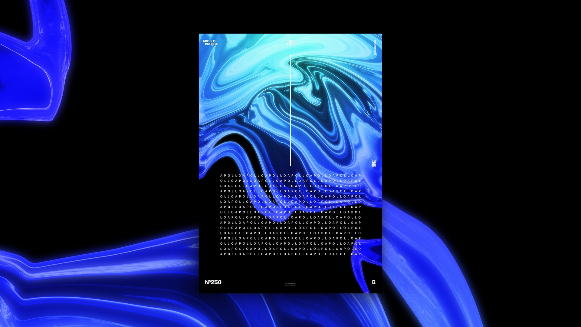
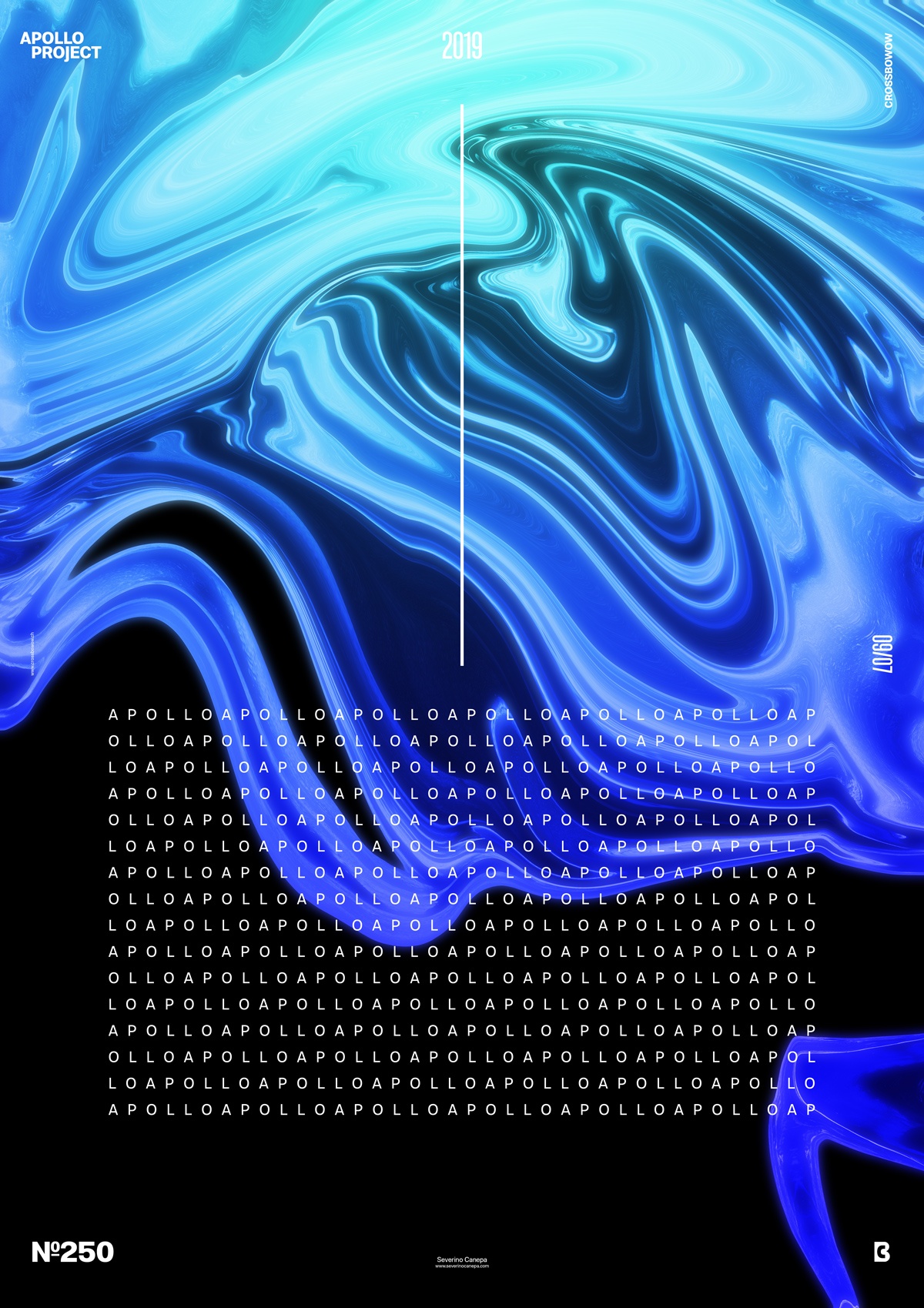
It is not my first time using Photoshop Filter Fluidity to modify an image. The process is simple and only depends on how you use it and the time you spend changing your image. Whatever you do, the result often looks like a fluid. I created a large rectangle to cover the result of the Fluidity Filter and set it over blend modes to colorize the picture. I didn’t want it in greyscale; I put the rectangle to a dark blue to light blue gradient over it. Then, I duplicated the gradient rectangle and the image and merged them. I hit the Filter Gaussian Blur to generate a blurry effect and set it with a blend mode. That’s how I made the blue fluid look a bit shiny.
To Finish the poster, I added a text with several “Apollo” inside that I placed on the bottom of the canvas to contrast the organic shape on the top. The result is a minimalist poster design that looks strong and enigmatic. I also tried to add one or two lines, but they didn’t work well. These few elements on the poster were okay, and I decided to stop.

