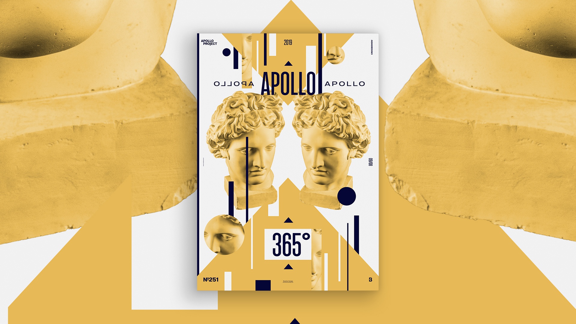
I am still in a rush for another project, but on Sunday, whatever the weather, I find time to make a poster daily! That is the challenge, and if you don’t know about the self-imposed challenge I named Apollo 365°, you can read more about it.
The Design

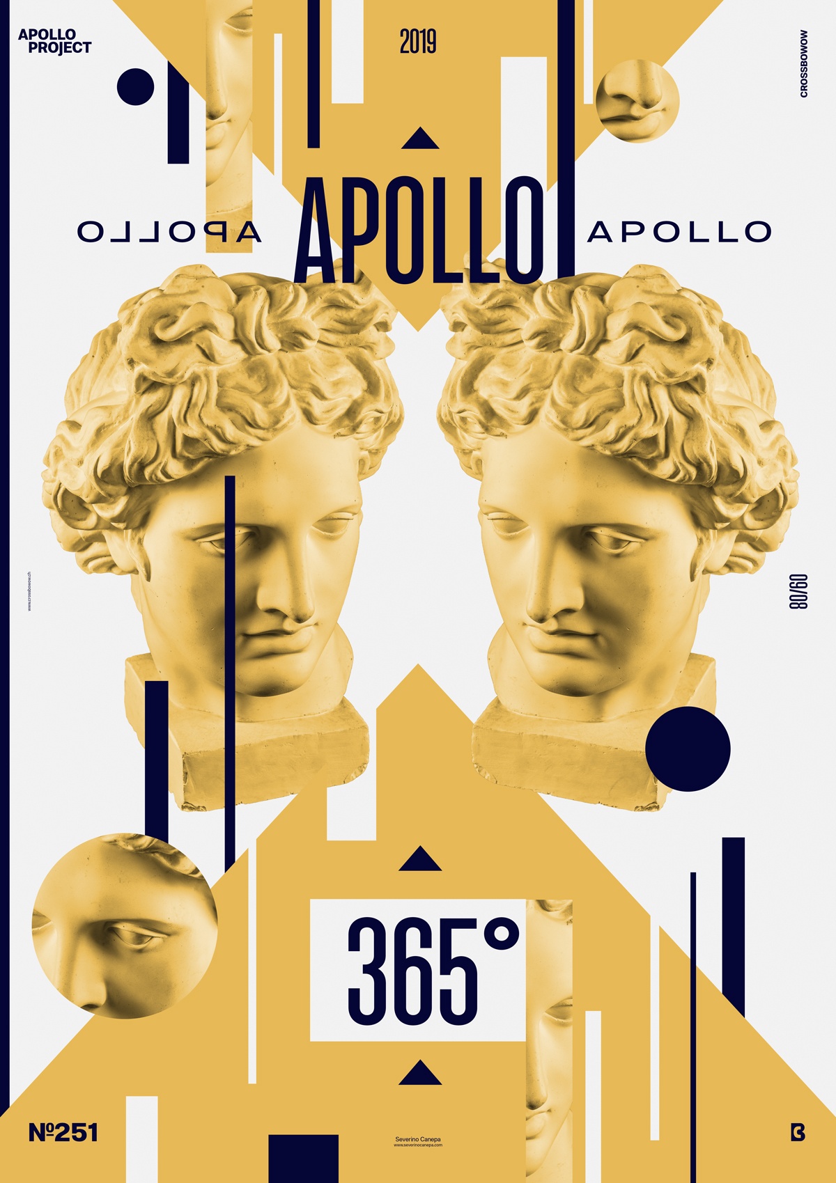
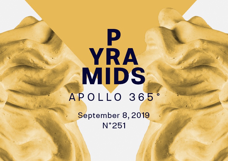
To realize today’s poster, I wanted to use a shape I usually didn’t deal much with during the Daily Design Challenge Apollo 365°. This triangular form looks like a pyramid, so the poster 251 was named “Pyramids.” It wasn’t that smart, but at least it makes sense!
I Used horizontal symmetry by reflection in the center axis with the two pictures of Apollo because the triangle made me think about that—again, I stayed simple. I also turned the text near the title to strengthen the effect and the other shapes but with symmetry based on an oblique axis. I used the same number of shapes on both sidesbut with different sizes and thicknesses.
That’s all for this poster. The color choice came naturally. I added a Noise Layer over the background that I set to Blend Mode and a small percentage of opacity to add a bit of texture.
Speed Art Poster #251
A sunny day was spent designing a poster and a logo and carrying my daughter. What else? A little bit more sleeping time, maybe.
Here is the Speed Art Video #251; nothing is missing this time! You will watch me working during the entire process. No shit happens with the Quick Time Player app today!
Have a nice day, and see you tomorrow for poster number 252!

